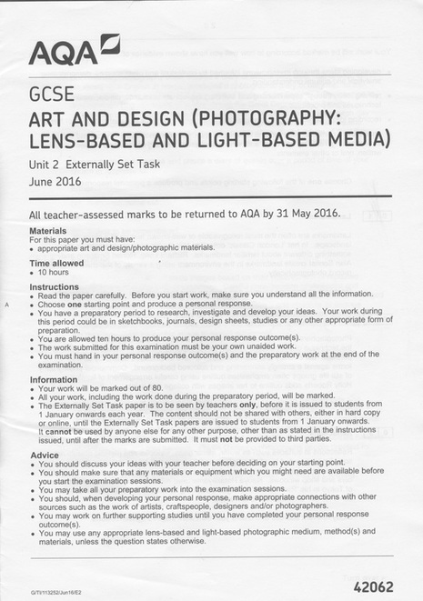
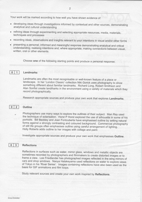
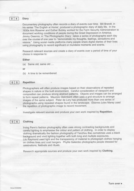
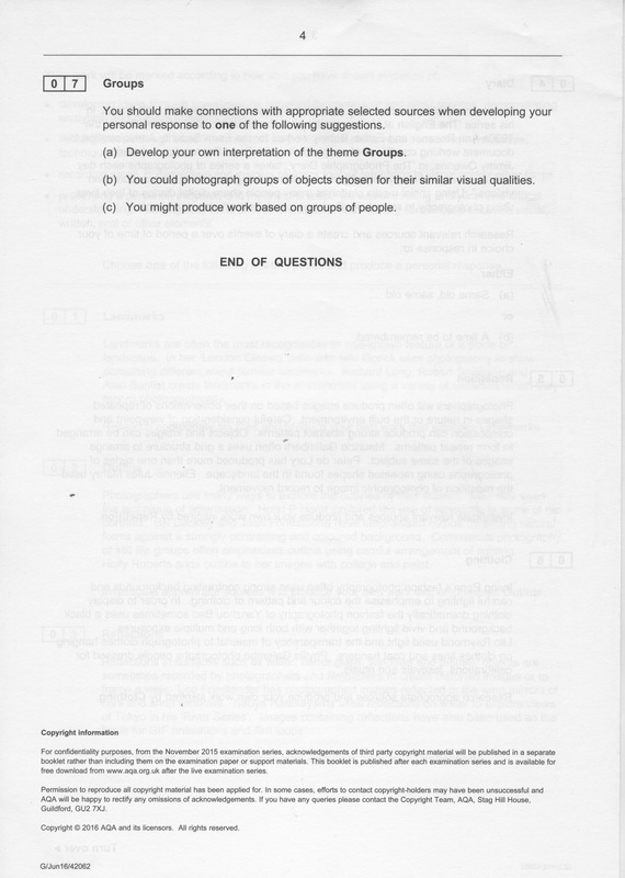
Unit 2: The Externally Set Task 2016
|
|
|
|
Repetition - Why did I choose it?
I have decided to focus on the theme 'Repetition' for my externally set task. I have chosen this theme because I had worked on repetition in Unit One and wanted to develop my skills by exploring the different ways of making images linked to repetition. It can also give me more understanding and experience about this topic, and give me more knowledge about what 'repetition' means and how I can produce strong abstract pictures.
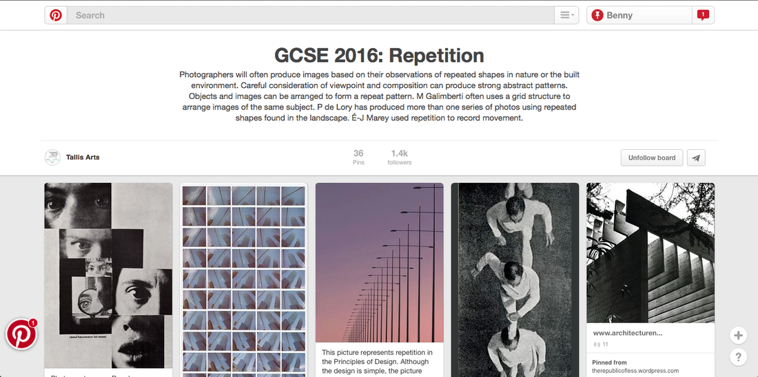
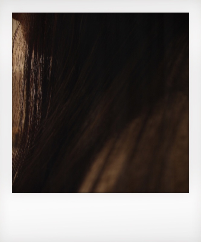
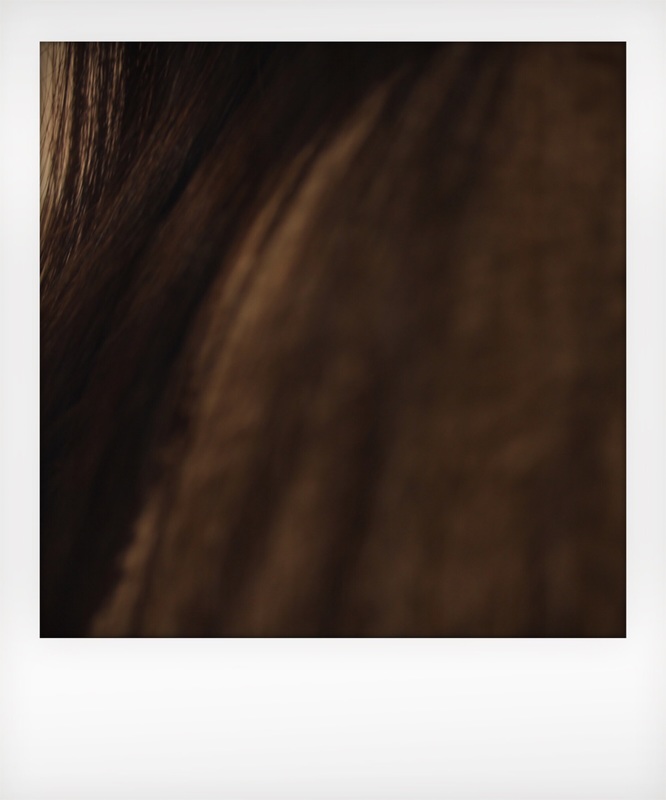
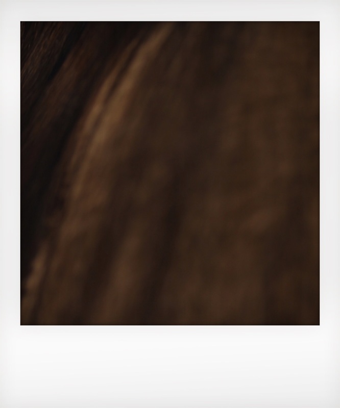
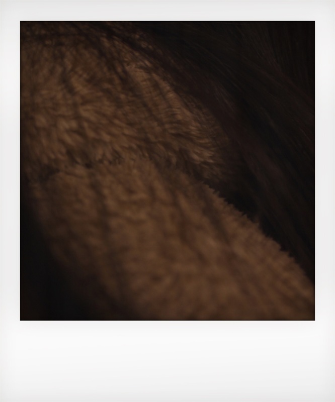
Repetition
Click on the image below to view on my Pinterest board.
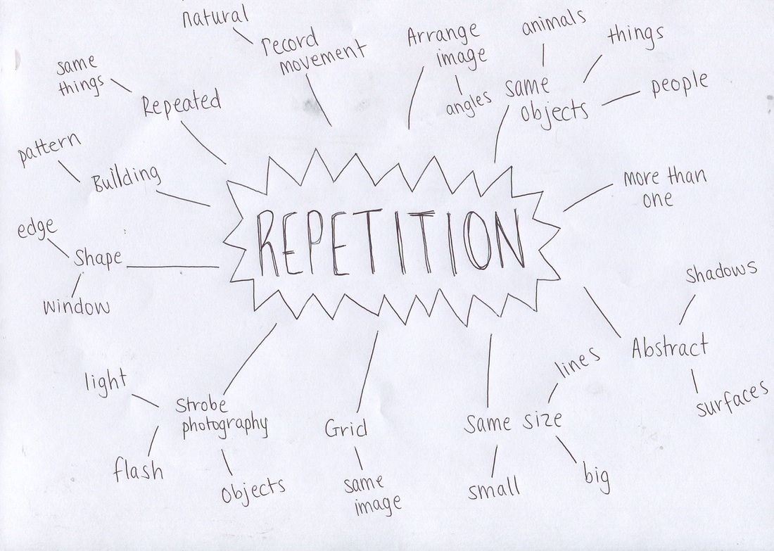
Mindmap
I created a mind map, showing some of my ideas for repetition.
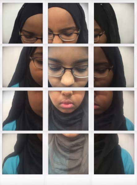
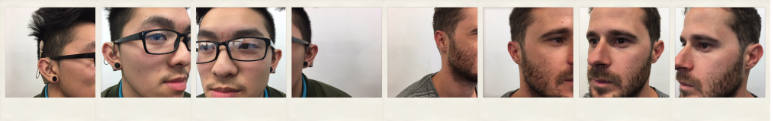
Artist 1: Maurizio Galimberti
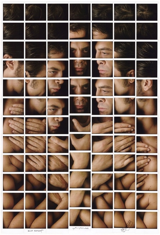
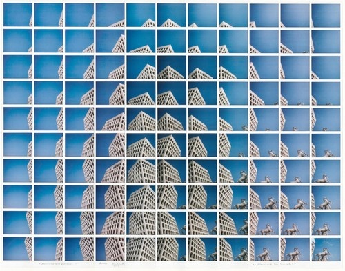
When I saw his work, I thought it is definitely repetition because all the images are exactly the same size and repeated in different ways. He uses small images to make up one large piece. His work is very geometric: all parts of the image are linked in a grid of identically-sized squares. The subject of the picture is the same - it's just made up of different parts of the whole image taken from different angles.

|
|
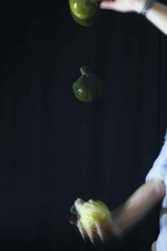
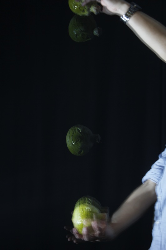
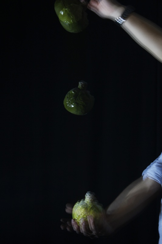
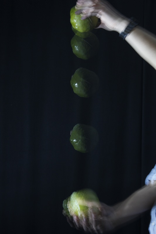
Artist 2: Etienne-Jules Marey
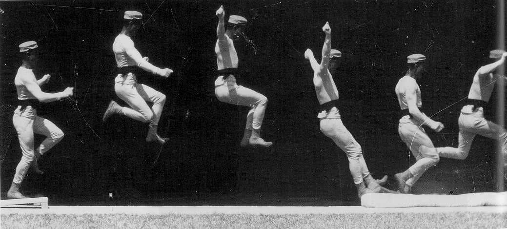
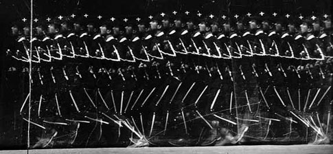
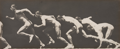
The image shown is movement using time lapse. The shape is more organic because there are different levels and not just a straight line. The image has a sporty look to it because it is very active. I find it quite inspiring and it makes me want to have a go at doing it myself.

|
|
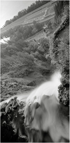
Artist 3: Peter de Lory
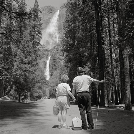
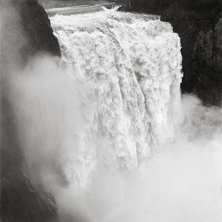
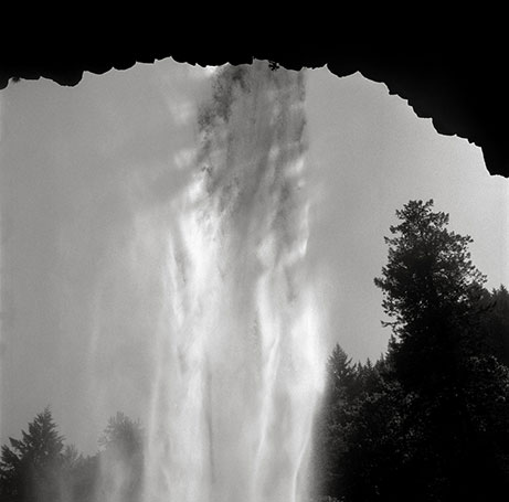
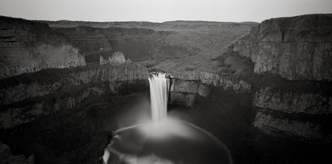
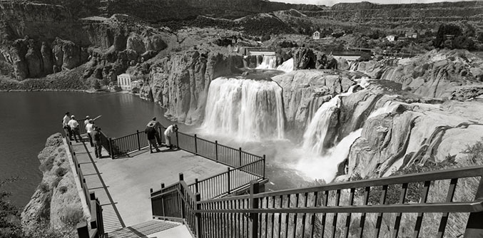
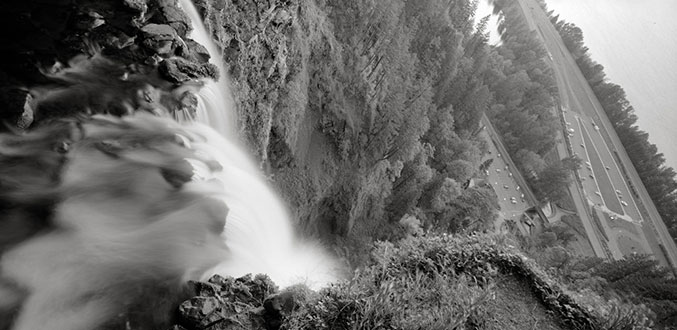
When I saw Peter's work for the first time, it made me feel confused because I didn't find any repetition in it; it didn't match the theme. But then I realised that the pictures are of the same waterfall but are taken from different angles. I find it really interesting because he used black and white, which makes the images look more old fashion.
|
|
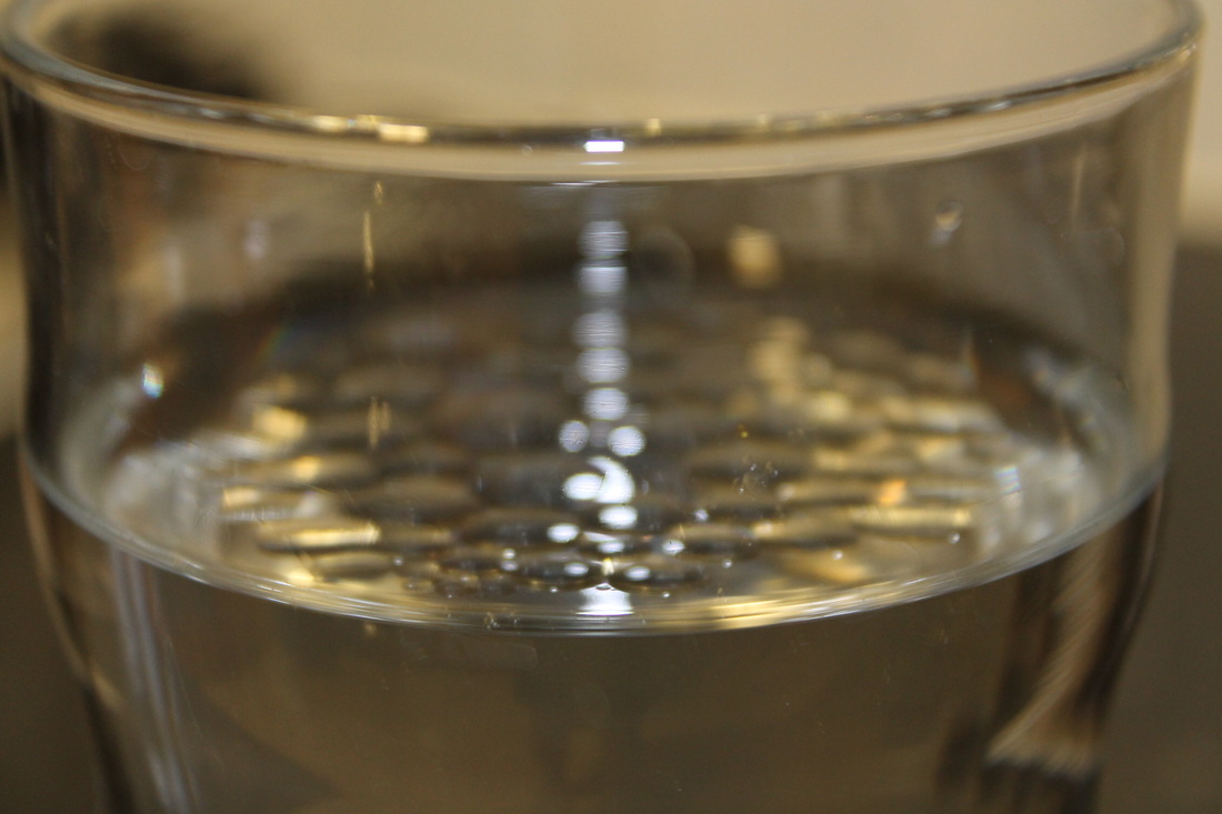
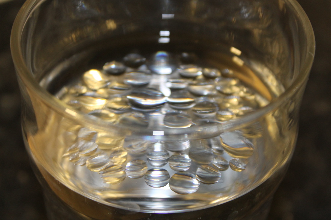
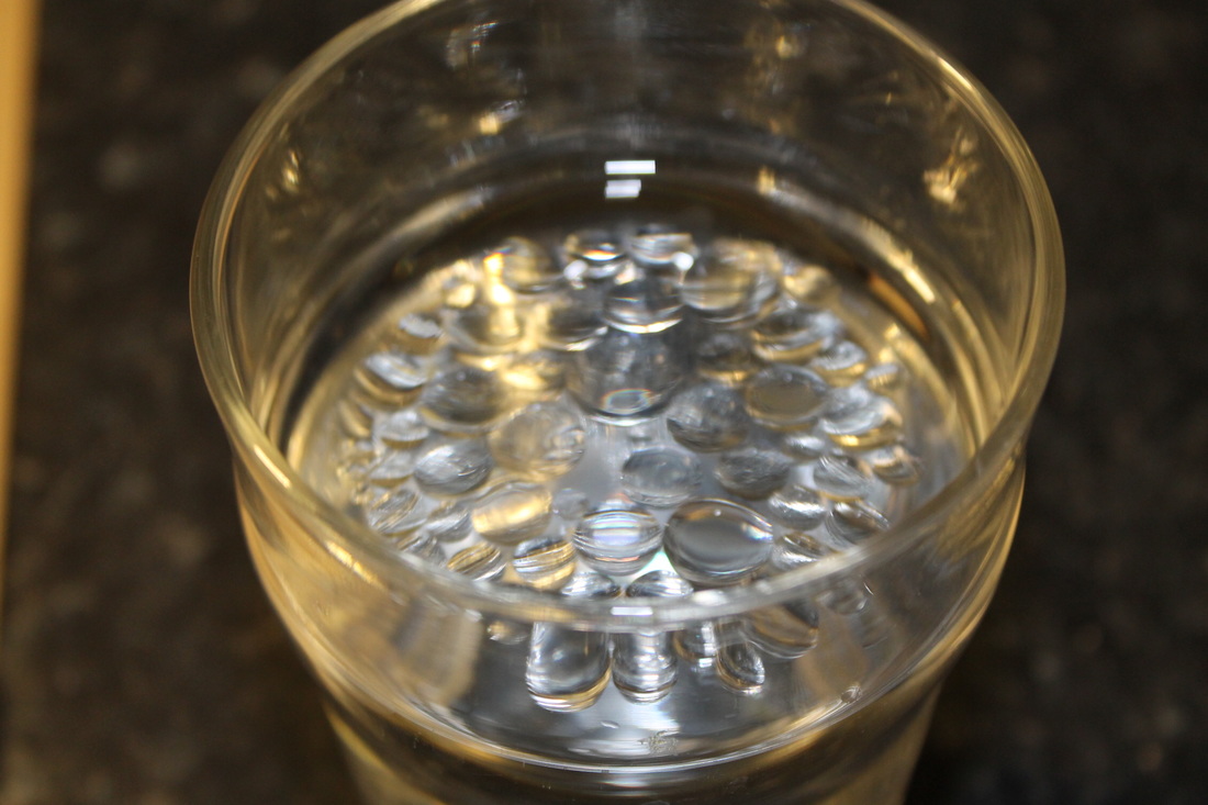
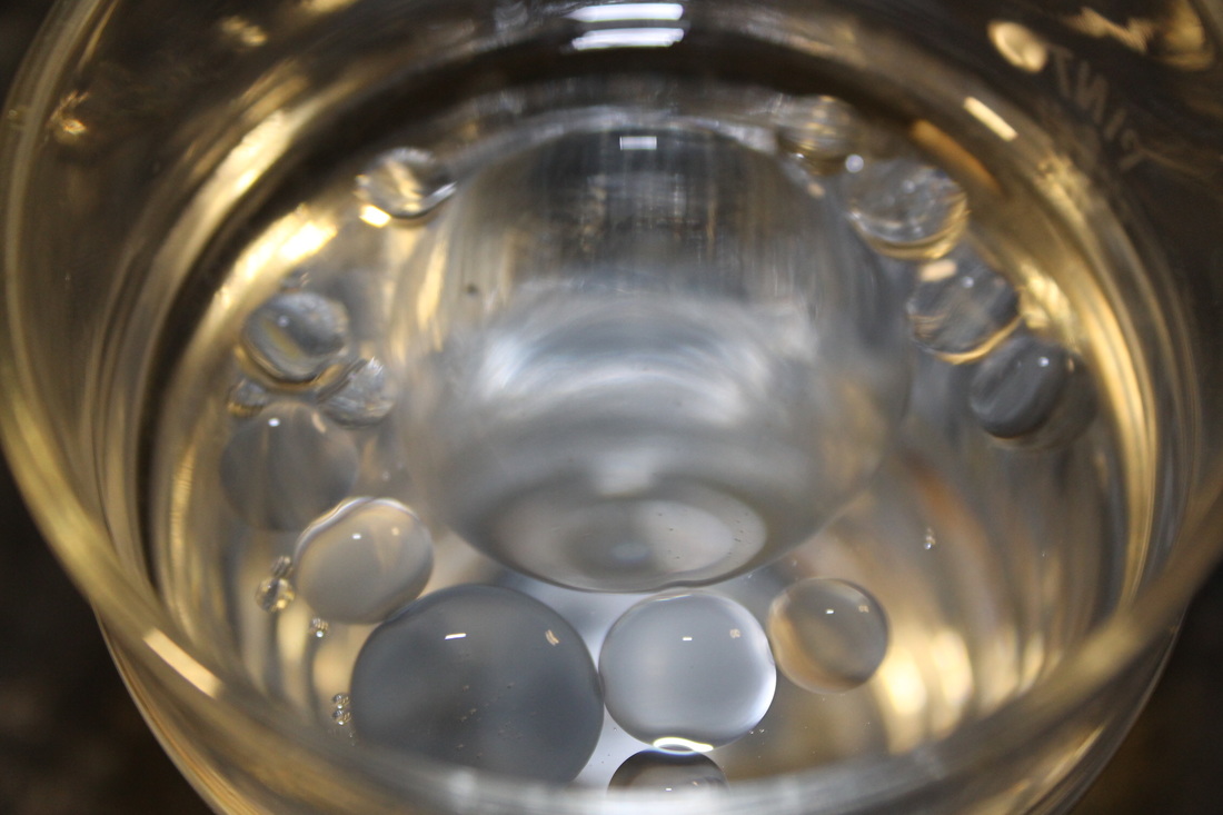
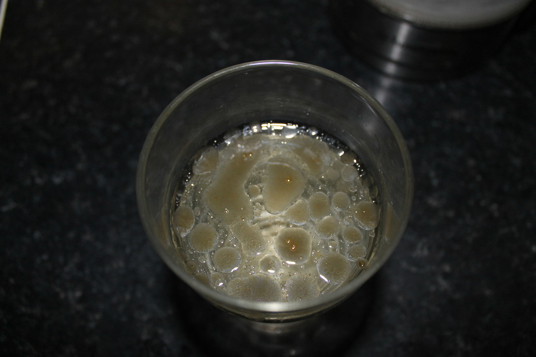
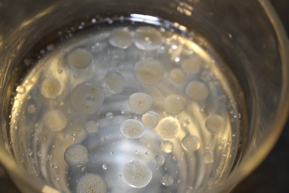
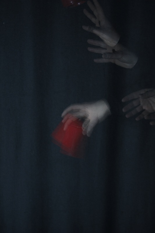
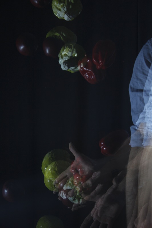
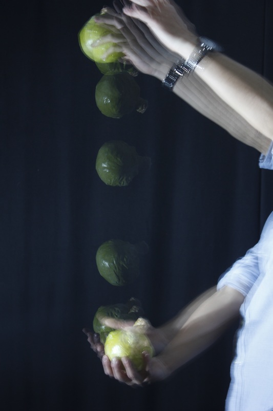
Oil and Water
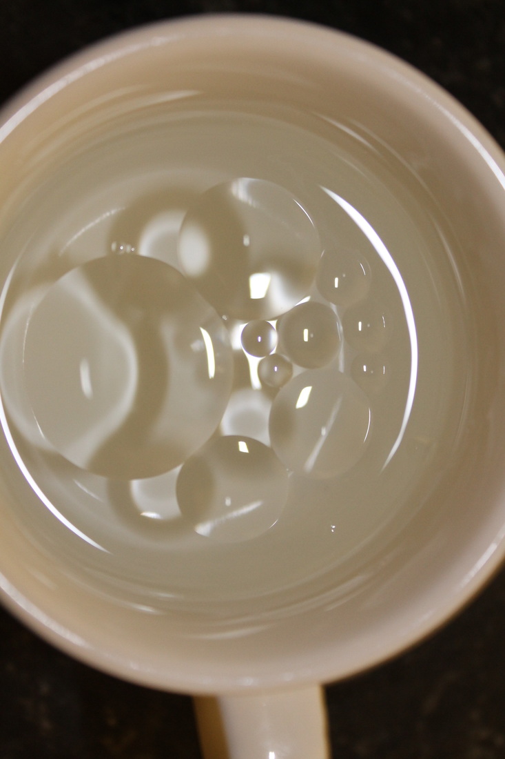
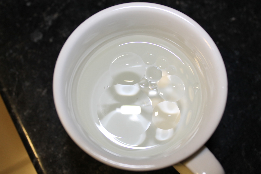
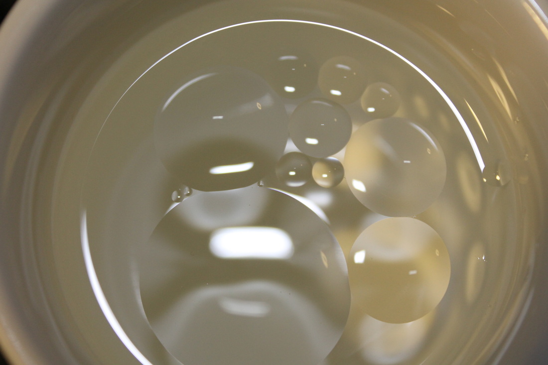
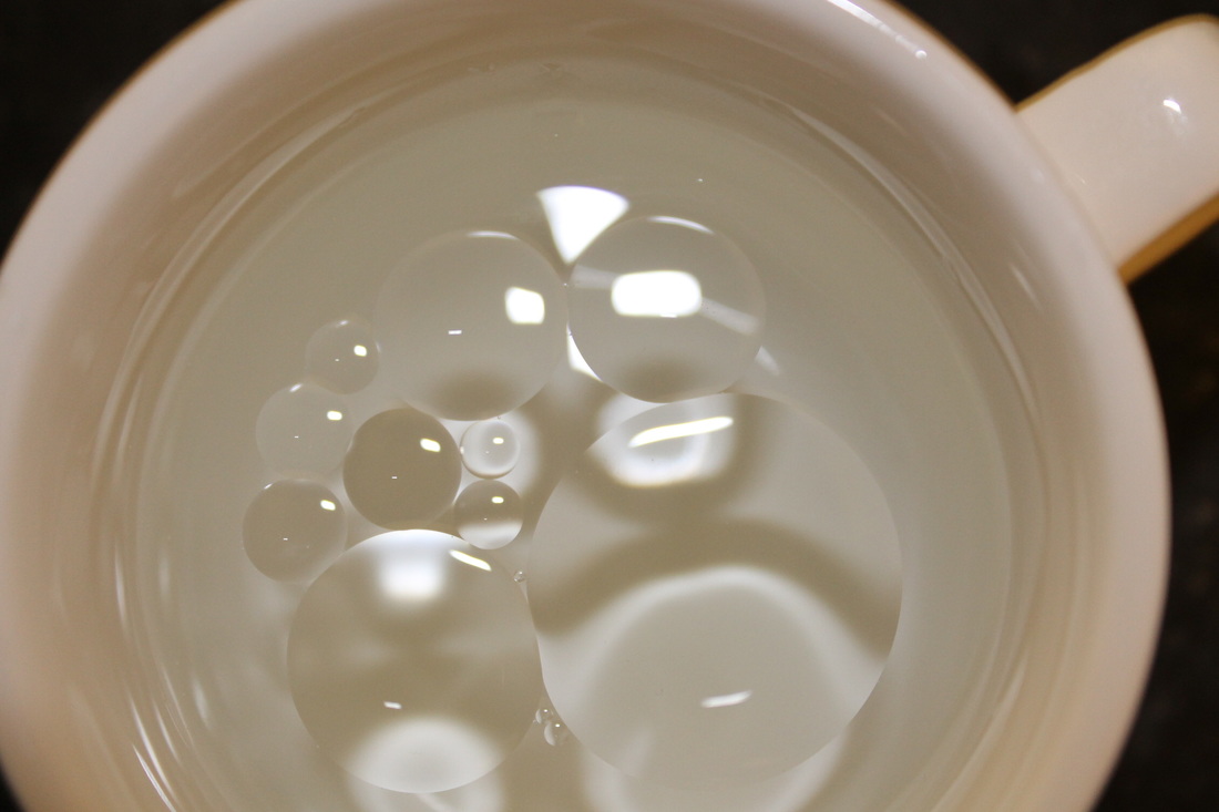
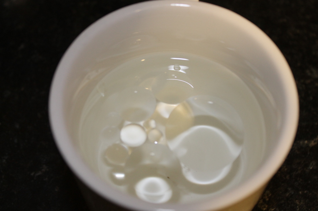
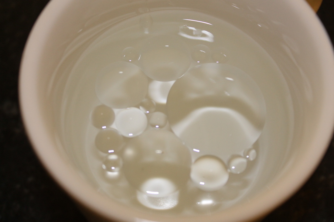
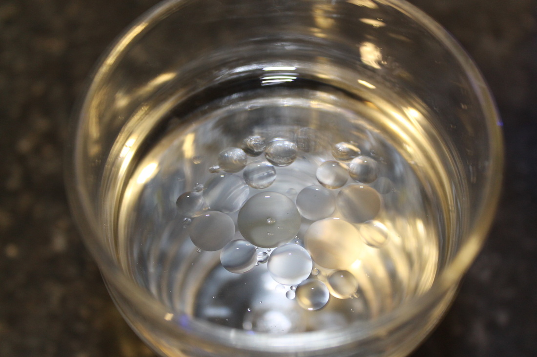
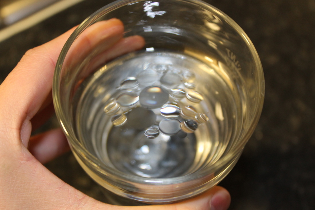
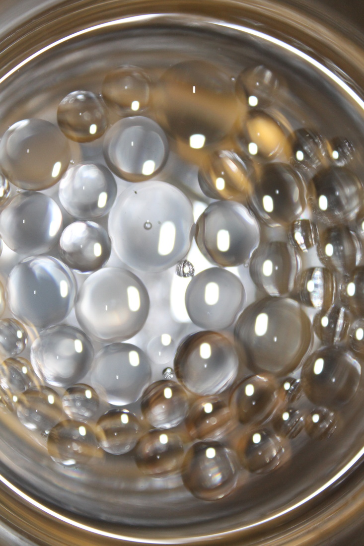
Vanilla Flavouring tests
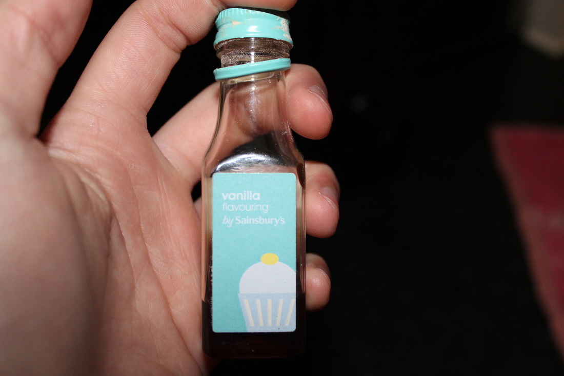
I would like to try something different. I'm using vanilla flavouring because I don't have any food colouring.
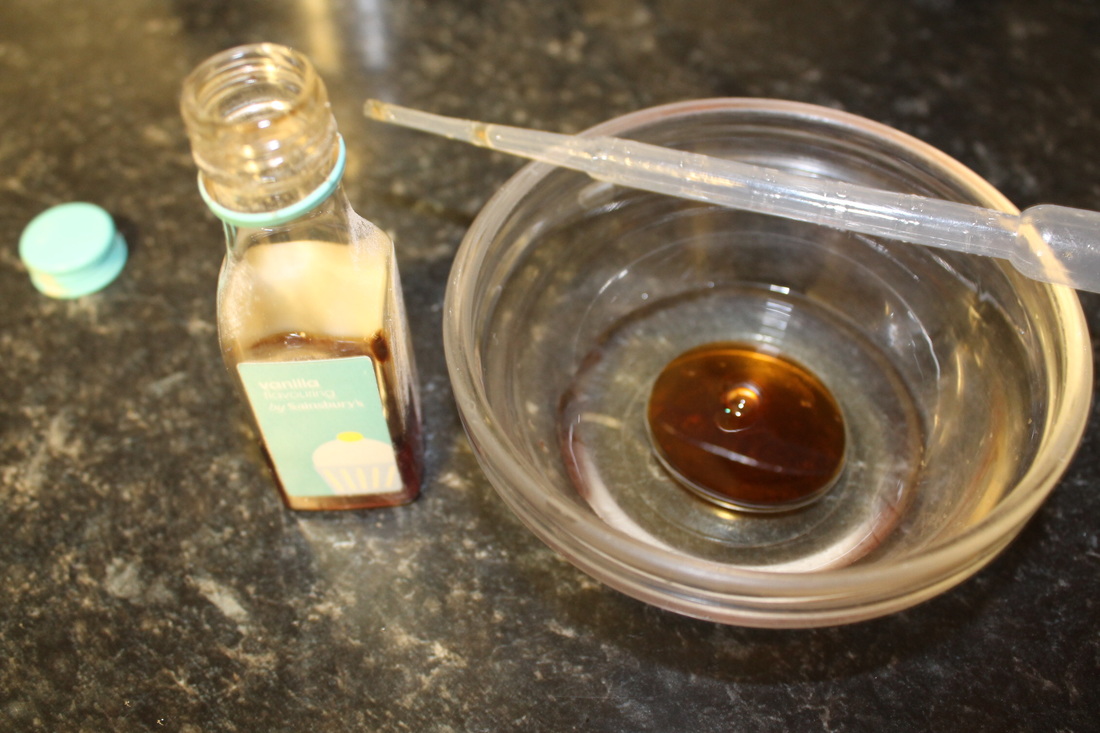
I realised that vanilla flavouring has no oil in it, so I had to add oil and mix the two together.
|
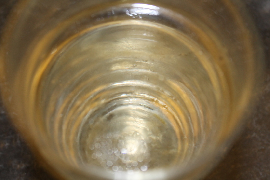
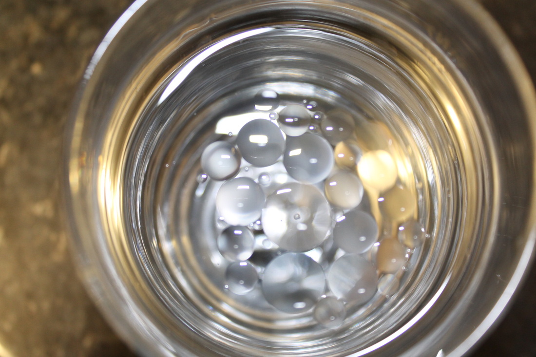
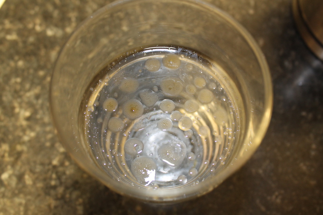
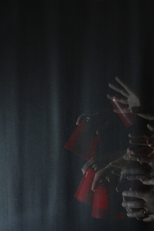
When I tried using a drop of vanilla flavouring the experiment failed.
The result was excellent!
|
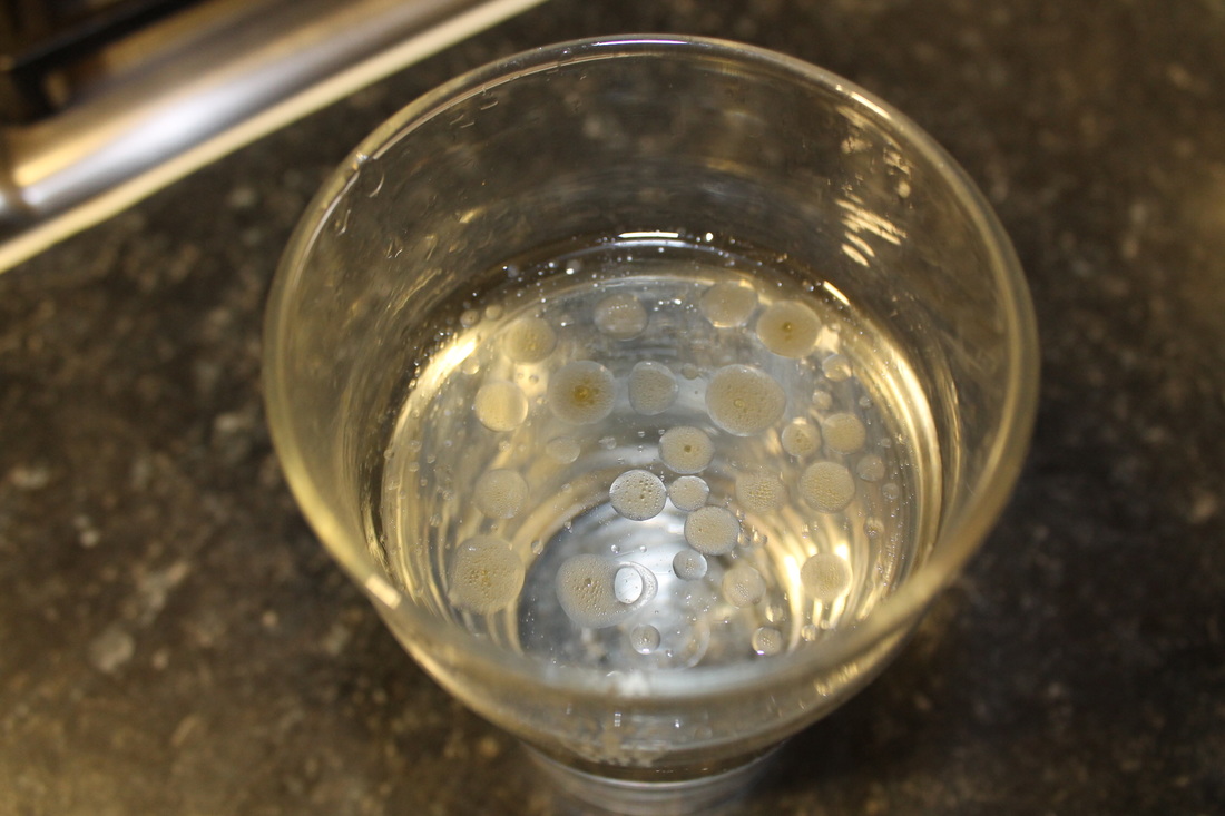
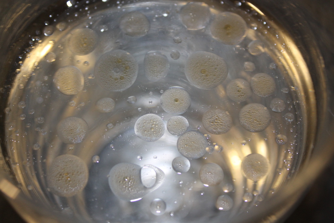
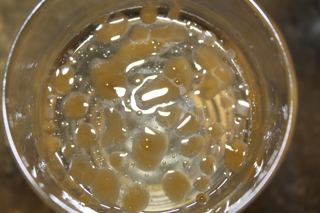
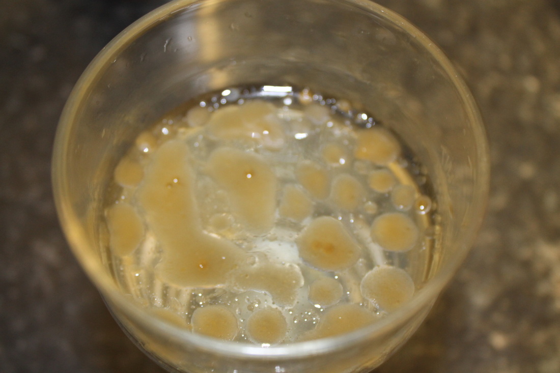
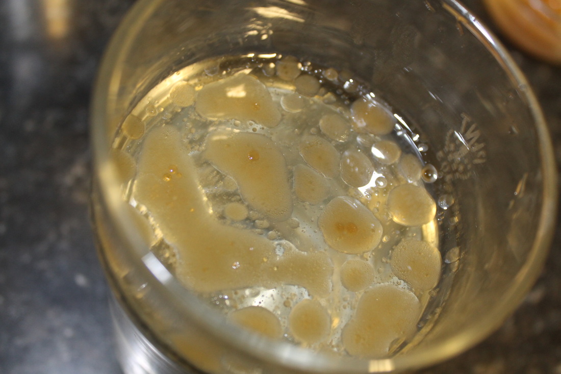
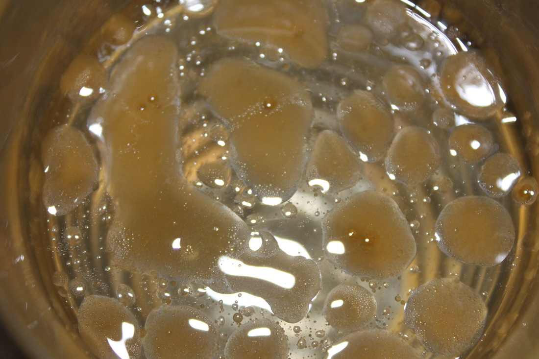
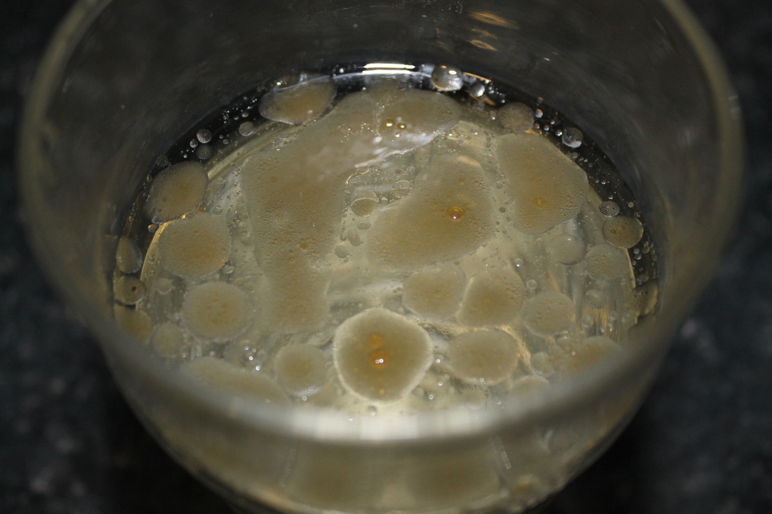
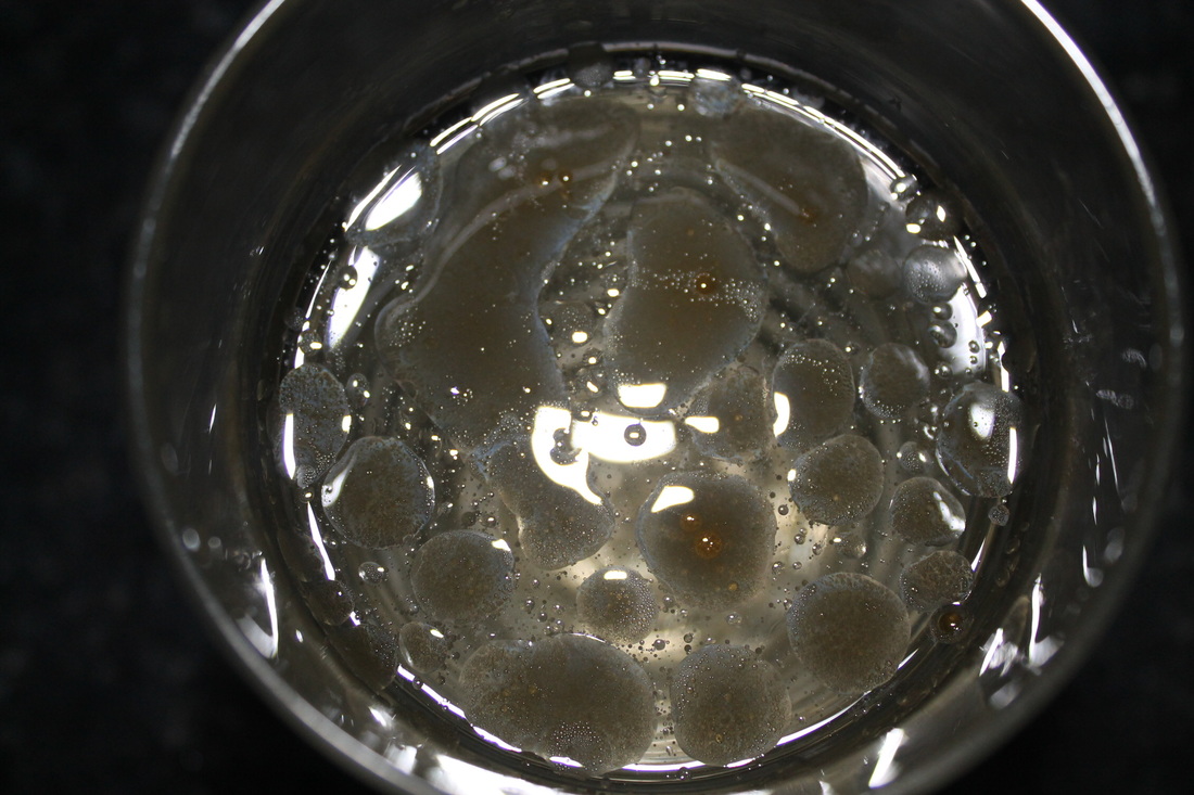
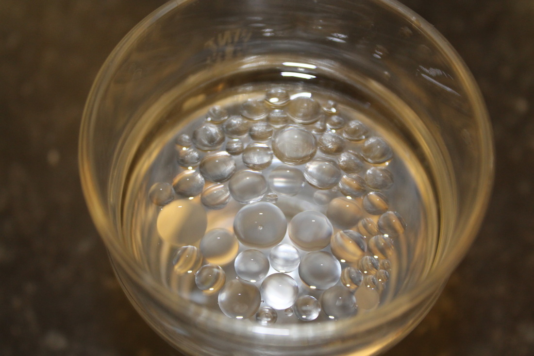
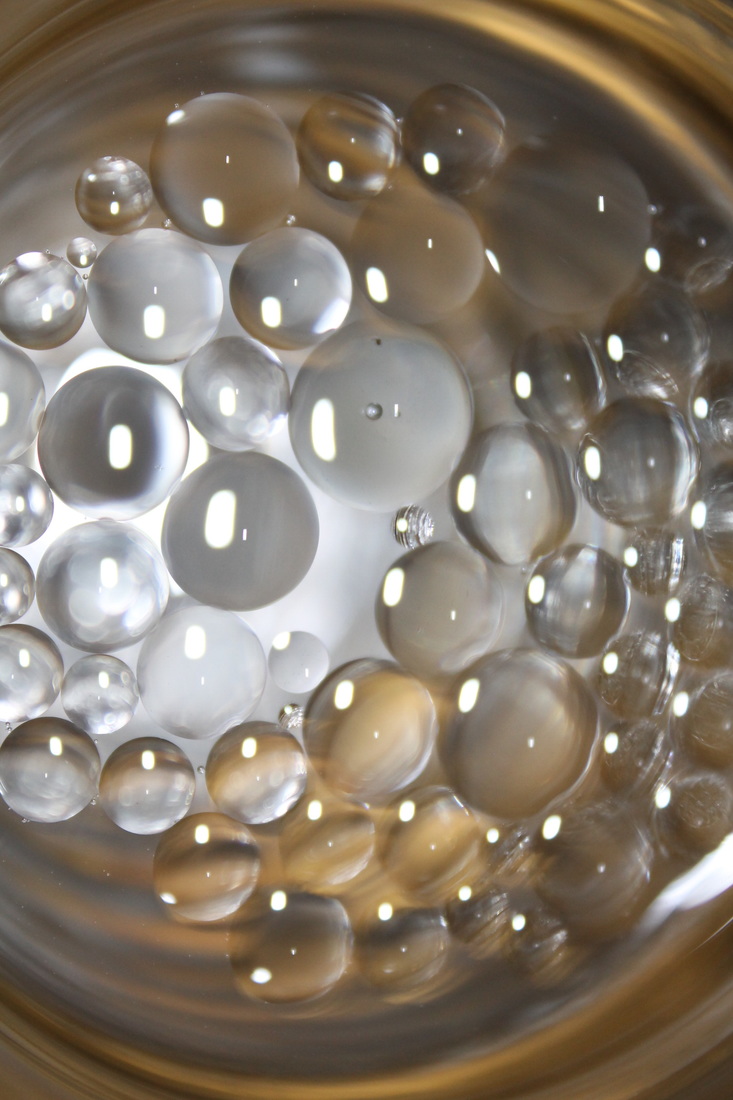
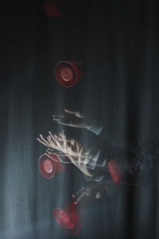
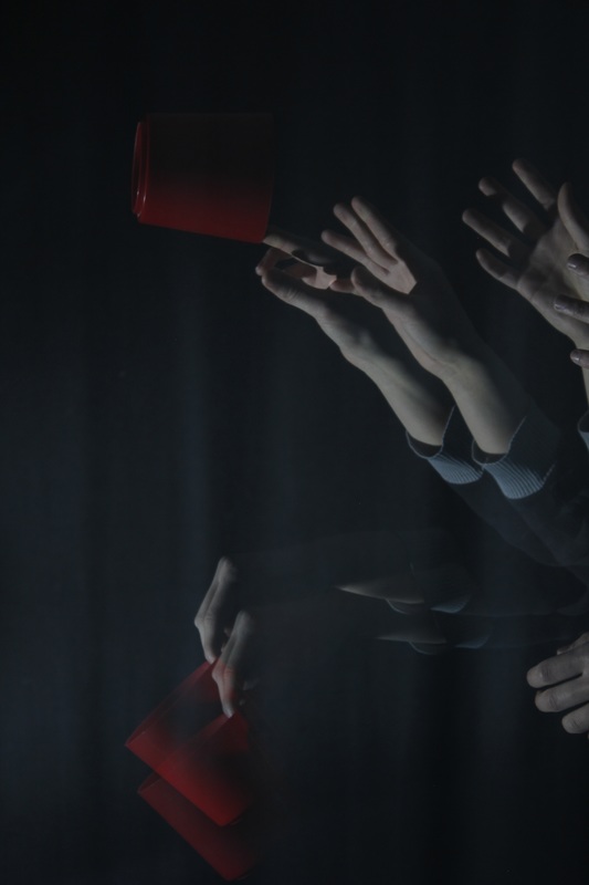
I carried on with the experiment and got some great shots! The shapes created by the oil are organic and have a natural look to them. I think frogs eggs or bacteria on a petri dish. This technique could be useful for making a background that could be used in a 'double exposure' image created in photoshop.
Tryout Maurizio Galimberti
|
|
|
|
|
|
|
|
|
|
|
|
|
|
|
|
|
|
|
|
|
|
|

|
|
Evaluation
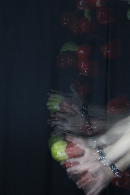
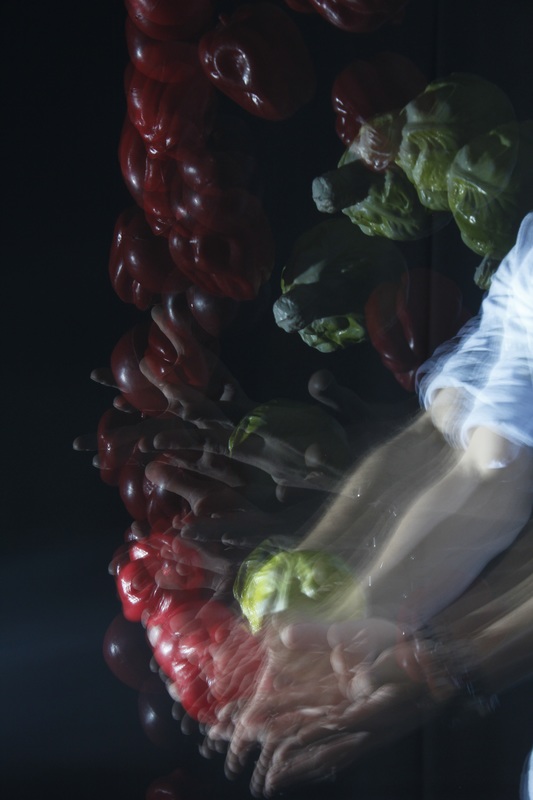
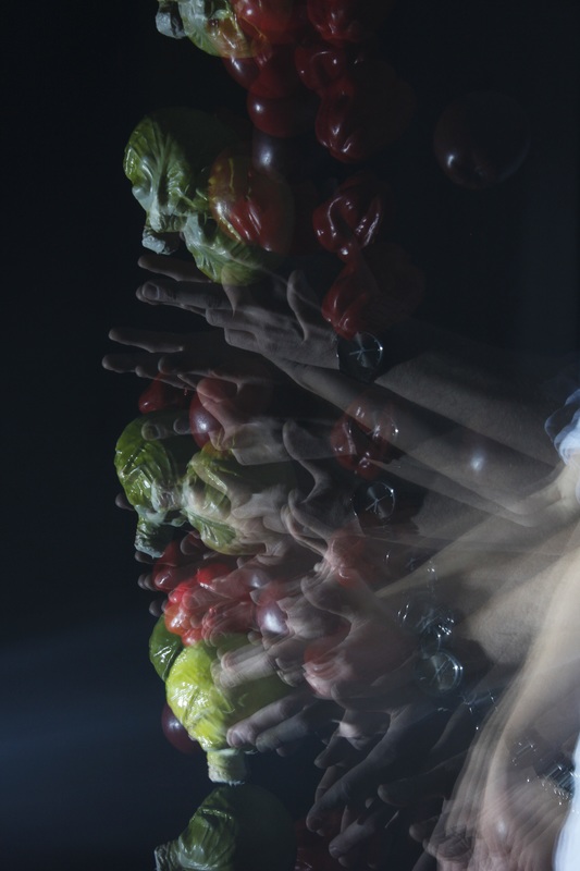
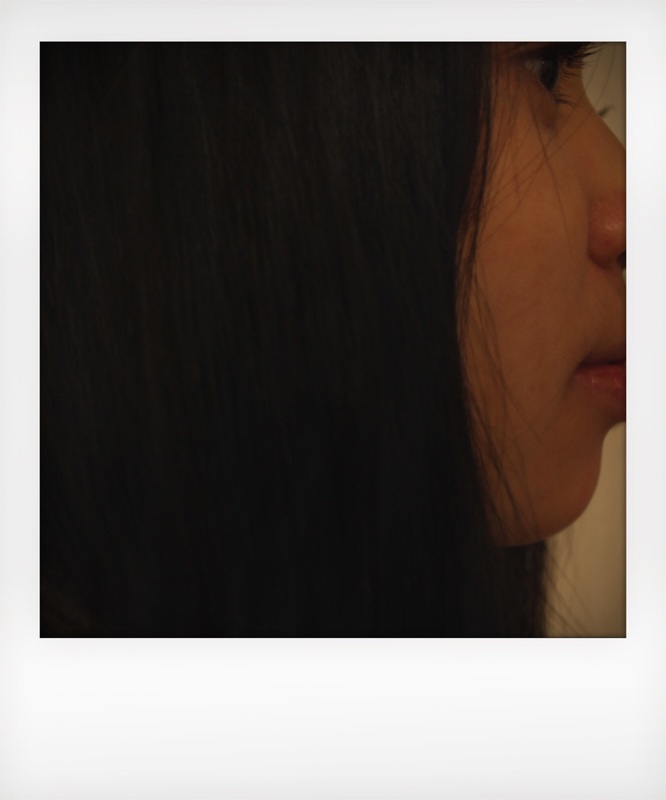
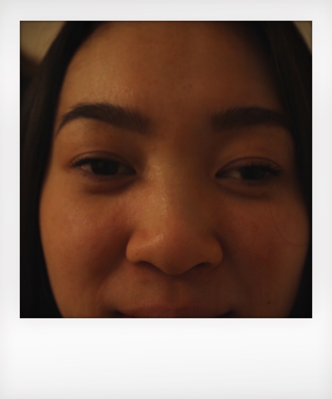
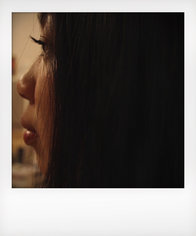
I want to try and create photographs using inspiration from Maurizio's work because they are a perfect example of my chosen theme -repetition. I felt inspired to create my own images. When I tried to make my own images at home I found it really difficult. It was challenging because I used my iPhone camera to take the pictures which meant I couldn't see myself or control the different angles or depth of field. Next time I will choose to photograph someone else which will enable me to have more control over the final images. The next challenge I faced was creating the same size and shape of each picture. I wanted to know how Maurizio Galimberti created his work, so I researched about his methods on youtube. Although this was informative it was also disappointing as I found he used a special camera which I do not have. I think I did well but I have areas that I need to improve in. I found this process really difficult to do and felt deflated by my results. I will revisit this technique once I have researched a bit more. In the meantime I have decided to move on to a different artist - Etienne-Jules Marey.
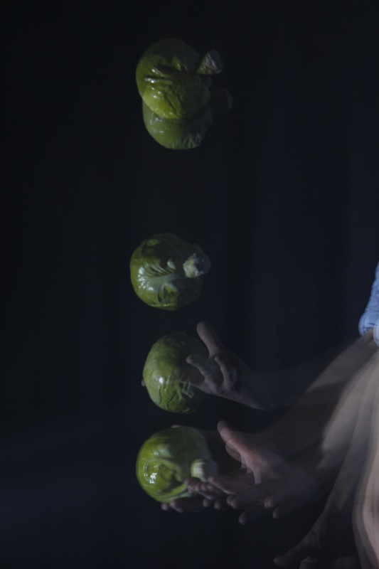
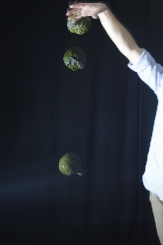
Step by step
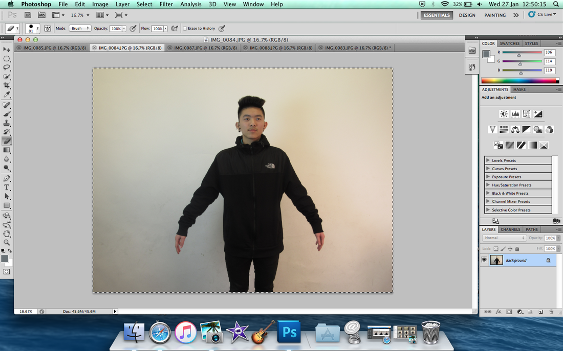
I took a photo to use as a background.
|
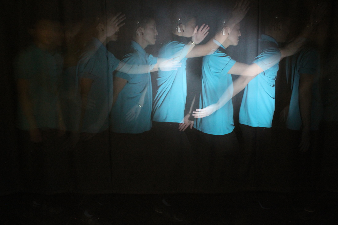
I then took a series of photos with my arms raised a little bit more each time. And then pressed cmd, while holding cmd I pressed A.
|
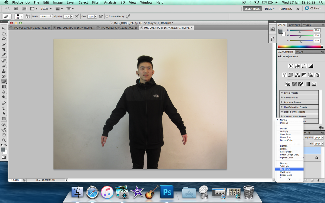
I clicked to hold the image, then moved it and put it into the background image which is the first one. Then go to bottom right corner, then you can see ''normal'' to change ''hard light'' from key points.
|
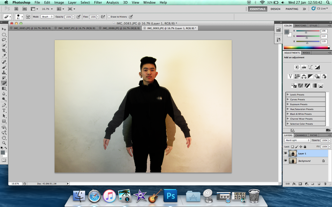
Then it's showed!
|
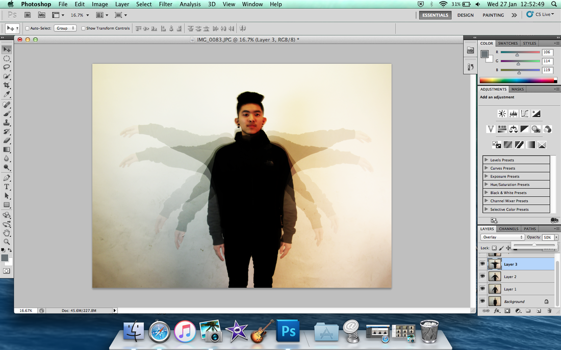
Do the same thing to repeating each image, but make sure every image moved to first photo only!
|
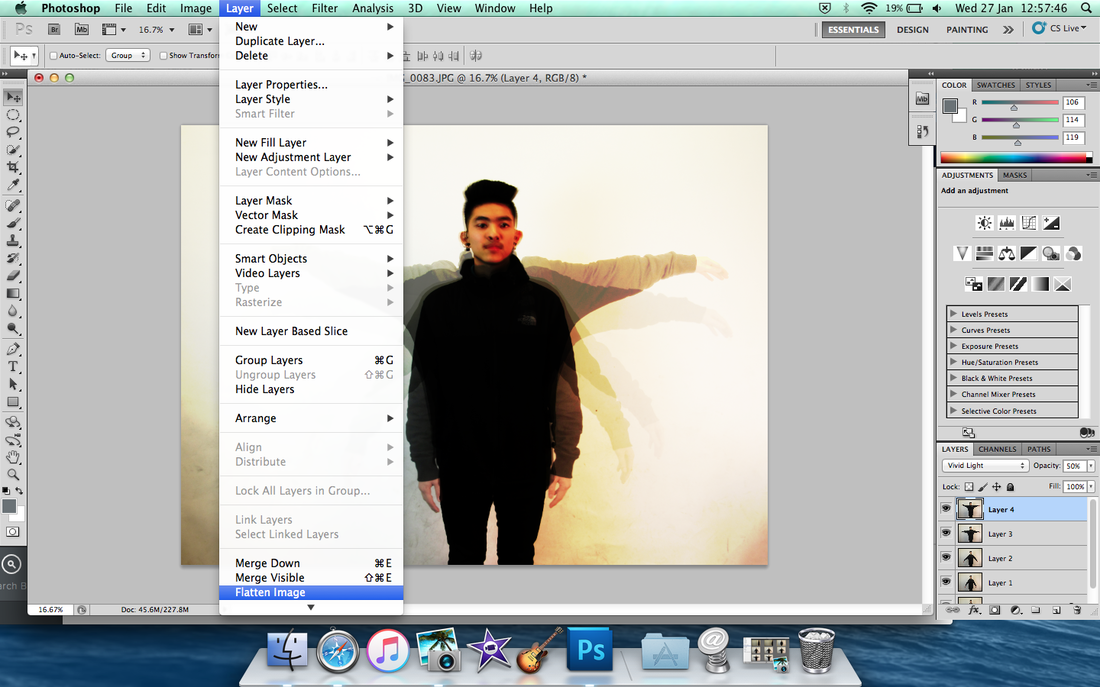
Then you did done all of them, then click Layer on the top side then drop down to click ''Flatten Image'' for everything into background.
|
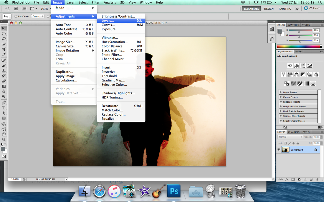
Then at least you did click Flatten image then after this you click by 'Image' at the top side, then click ''Adjustments'' to ''Levels''
|
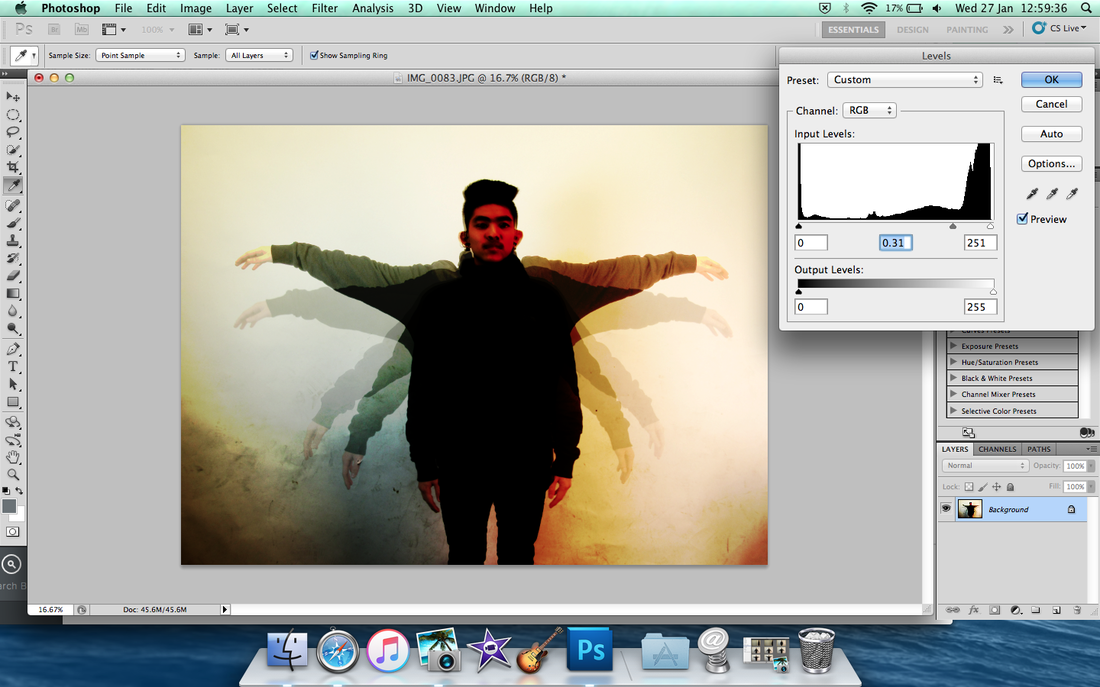
And it showed pop up, and change the levels by black, grey and white colours, move the arrow whatever to want, too dark or too light? But make sure it's look really good and impact the image like ''Wow'' because it can be effect the arm to disappear.
|
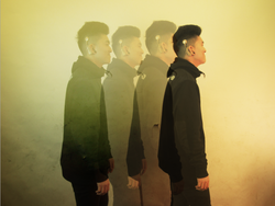
After you done it, then save it for uploading on weebly.
|
Other image for example
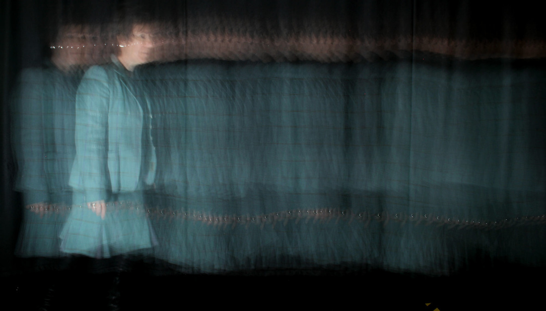
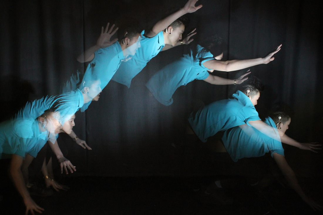
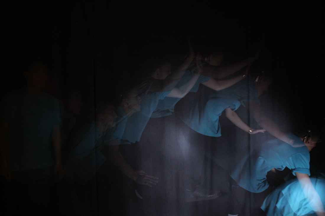
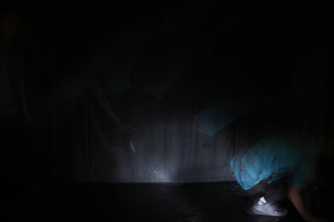
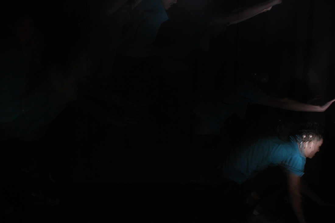
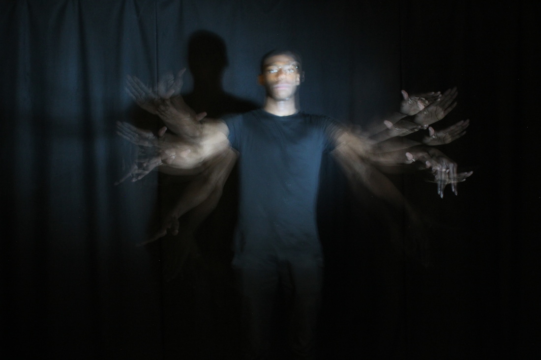
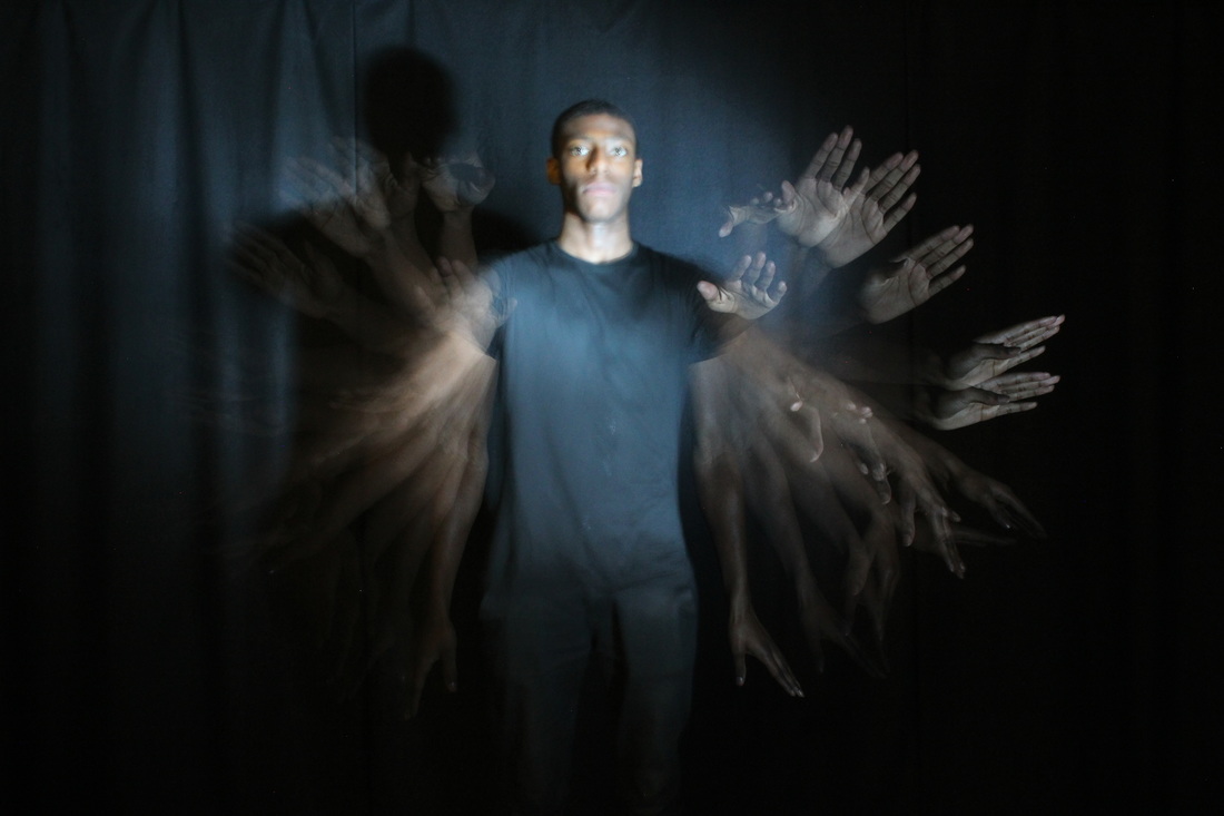
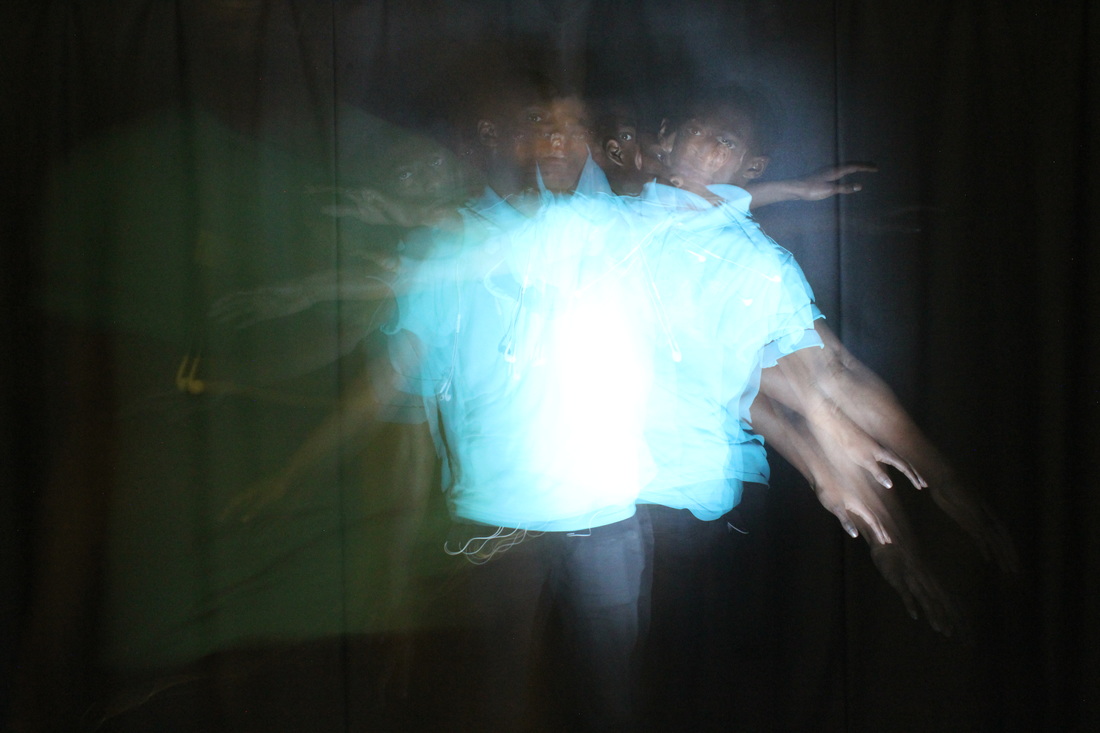
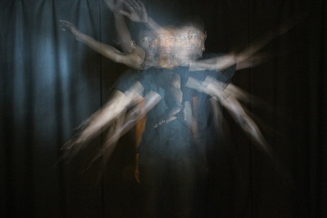
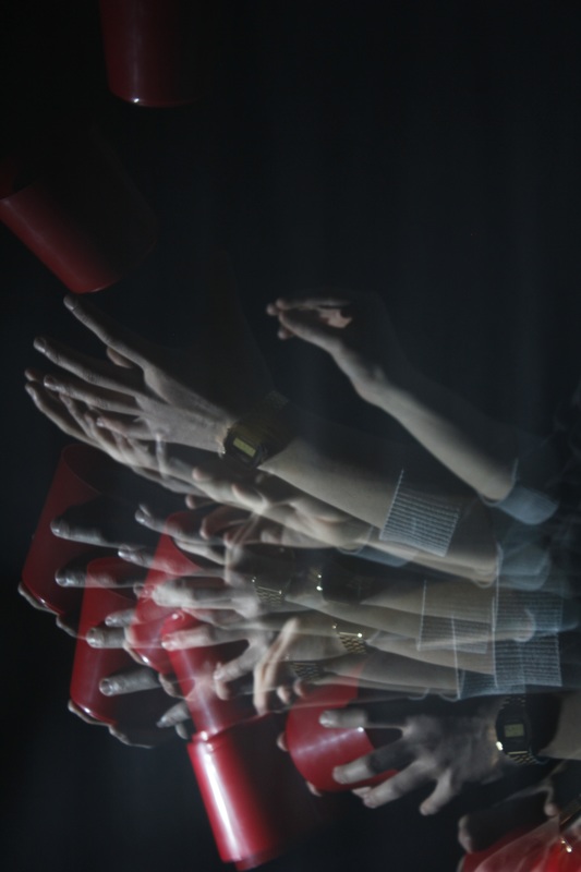
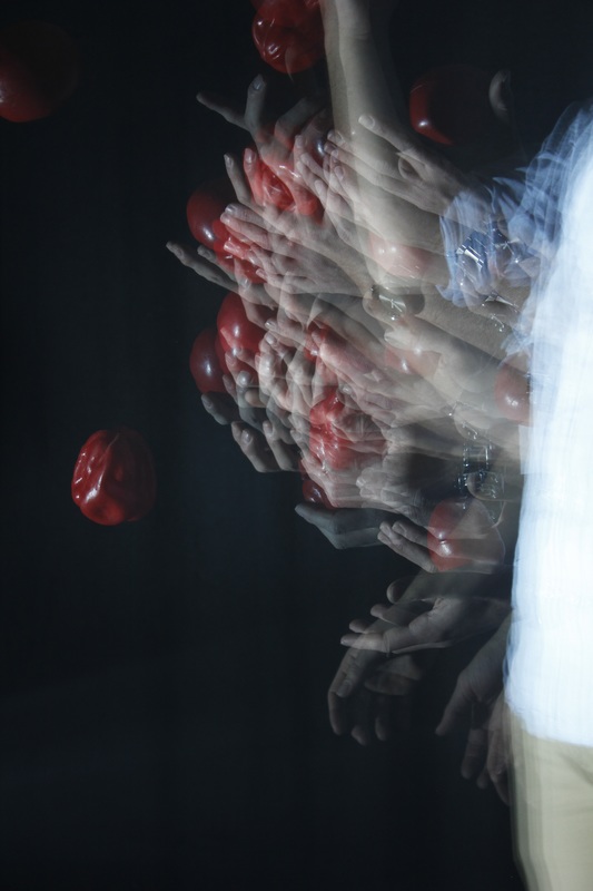
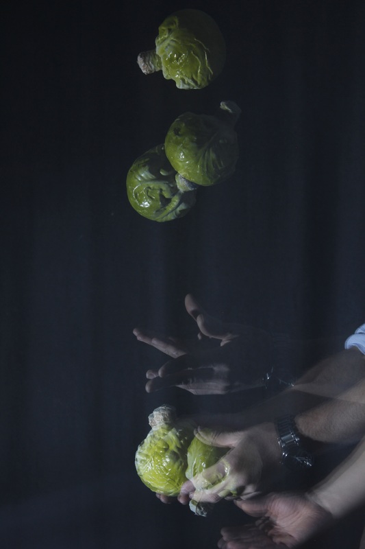
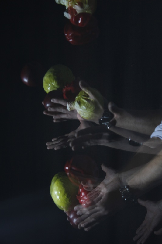
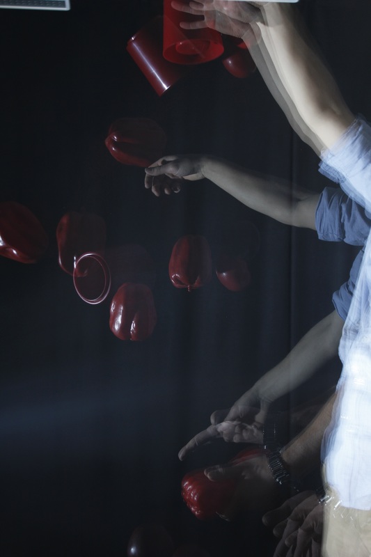
Strobe Photography
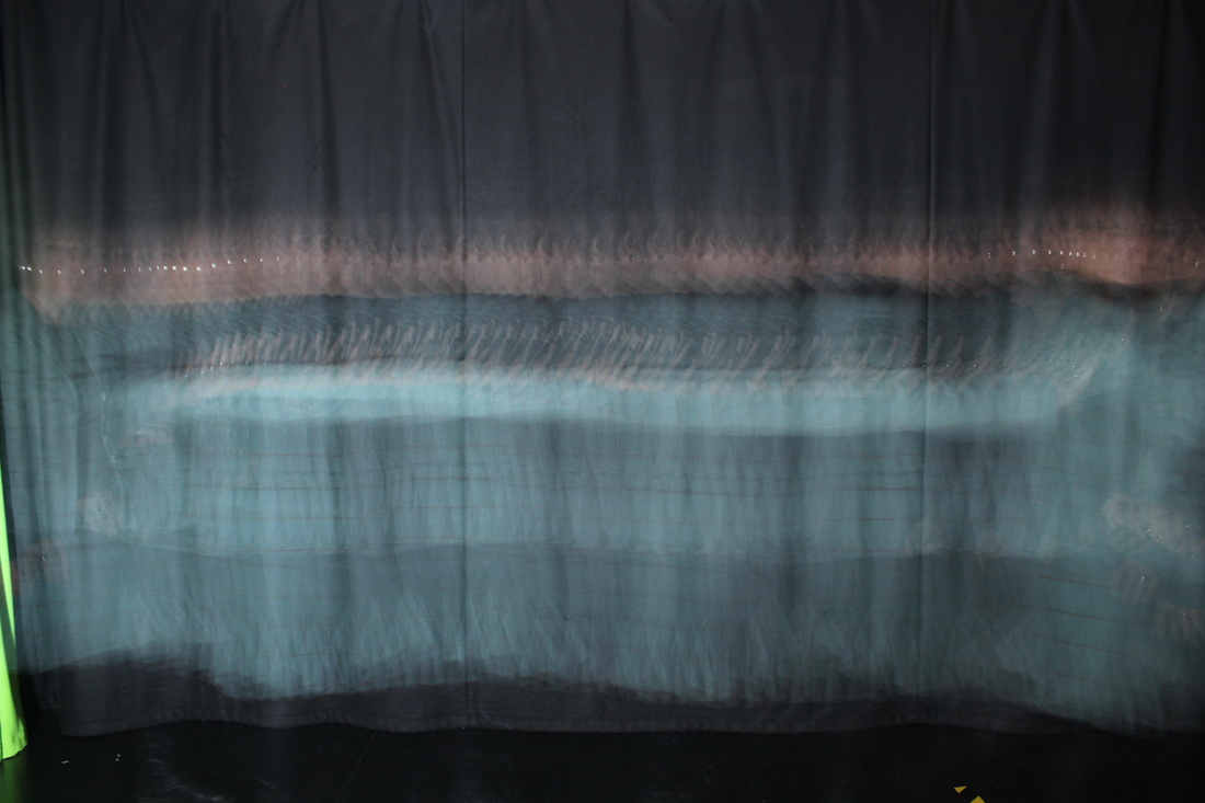

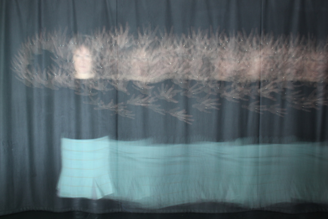
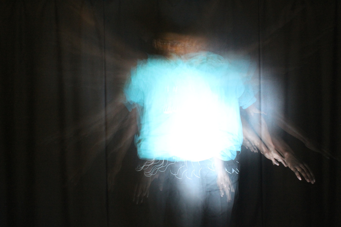
I asked the Head teacher if she would be willing to join in my strobe photography pictures as I needed someone to photograph. I wanted to show her how I created photos using strobe photography. I had first attempted strobe photography in year 9 but had forgotten a lot of the camera settings so I had to take a lot of practice photos until I found the right settings on the ISO, Aperture and Shutter speed. The first three images were practice shots before the head teacher joined me in the darkroom. All of these images show an improvement as I tried out the different settings.
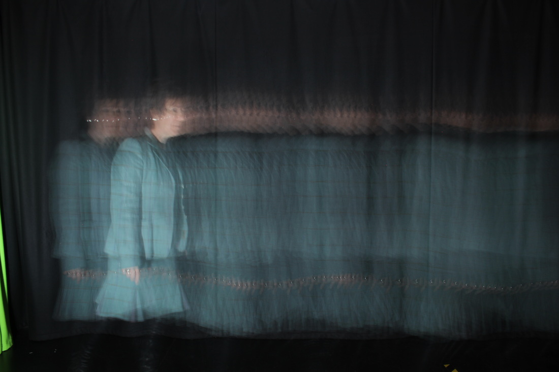
WWW:
I like the shape in this picture that is created when the subject moves her hands around. It creates rings that look like sparklers bouncing off the background creating light. Also her torso seems to disappear. I had asked her to take her jacket off as her top is black which matches the background. This made the picture look an bit more abstract and amazing.
|
EBI: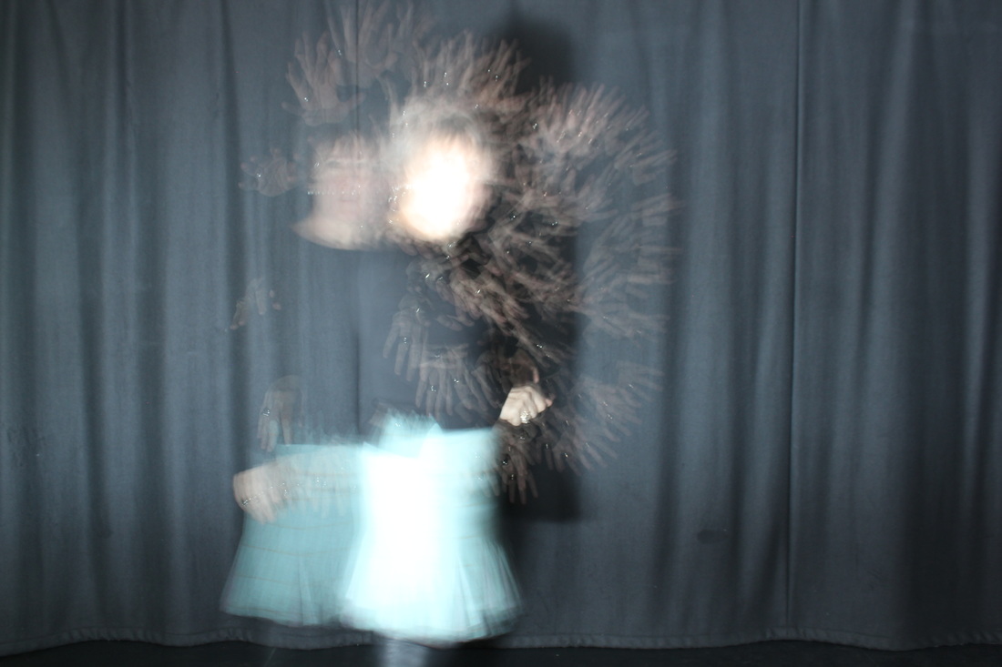
I asked her to stand still and move both her arms for a short period. The subjects face is over exposed, I need to dim the strobe and keep her moving to avoid this.
|
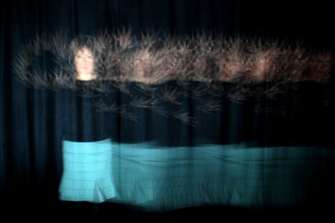
Compare which is the better picture

|
|
When I looked at first photo, It was really bright and looked a bit boring and plain but I do really want to make it look more interesting and exciting. I changed the second photo in photoshop to make it bolder and darker. I prefer the changes made to the second photo.
How I made it using Photoshop
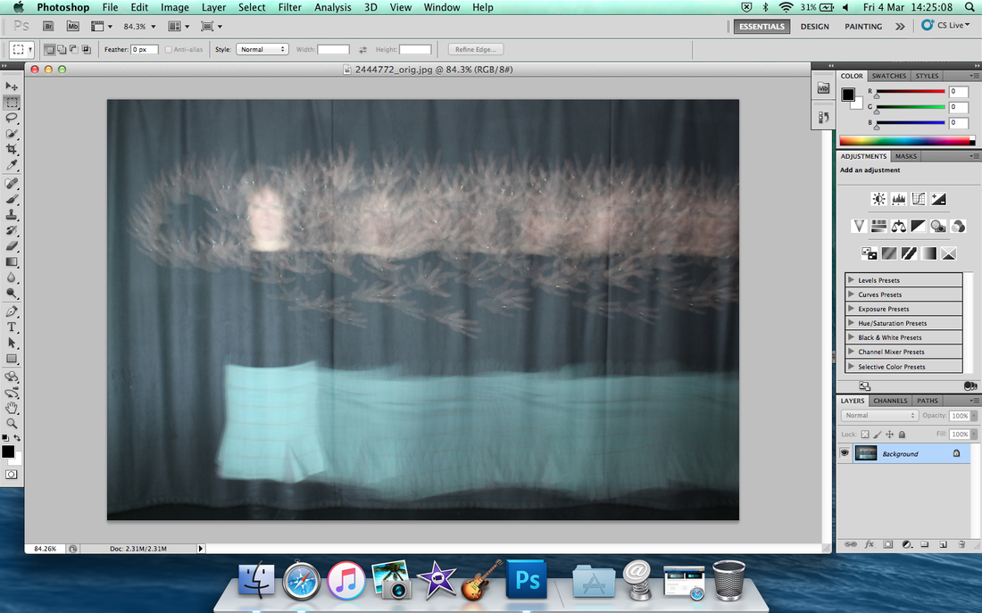
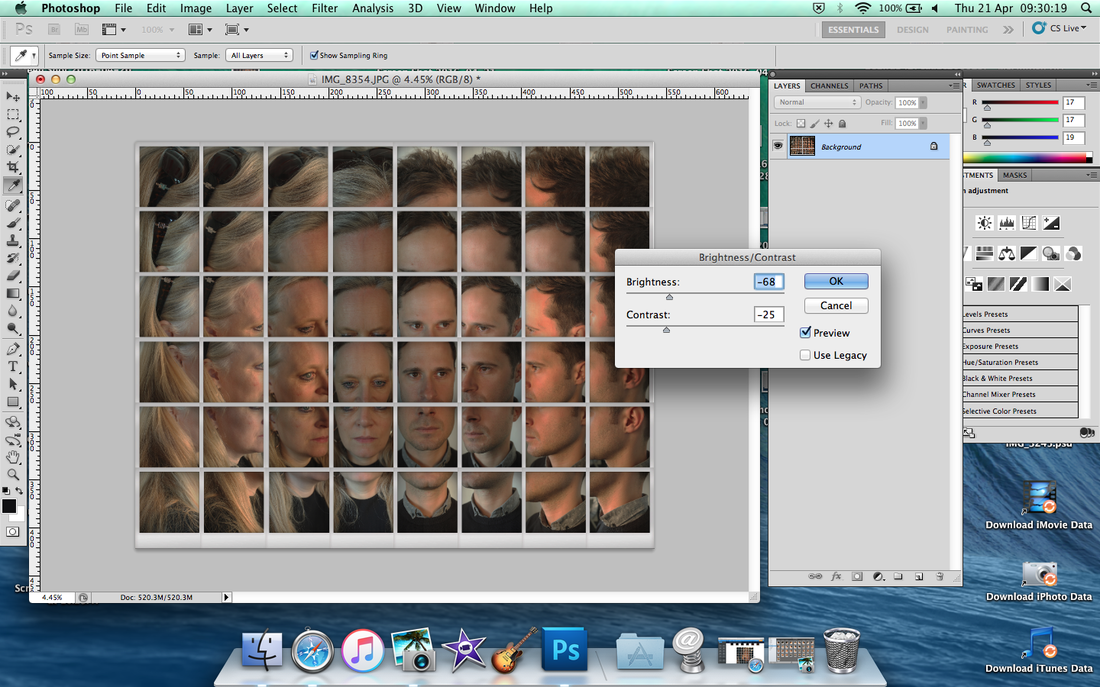
Chose any photo that you would like to improve.. I picked this picture.
|
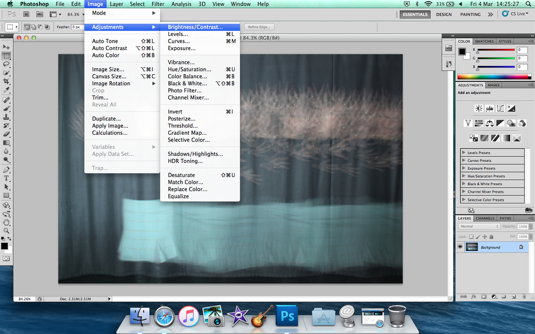
Go to 'Image' then scroll down to 'Adjustments' then click 'Brightness and Contrast'
|
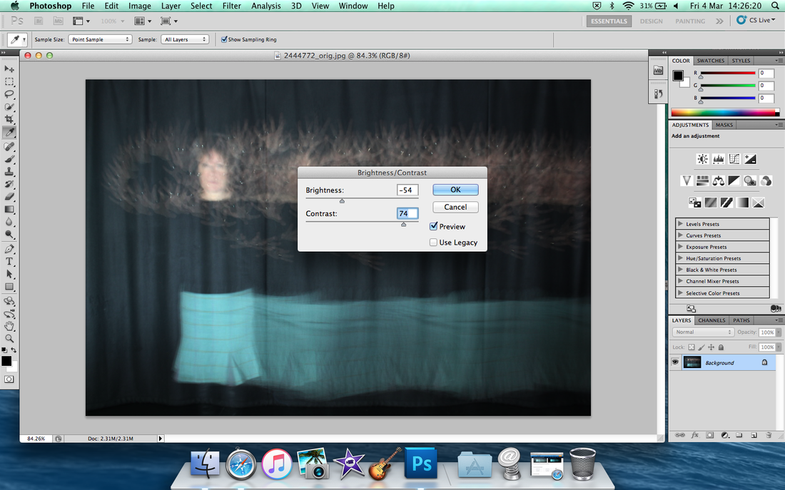
You can move the arrow to make the image darker or lighter by changing the colour to a , neither what you like, I prefer to use little dark colour to make it look more interesting and more big impact to the audience.
|
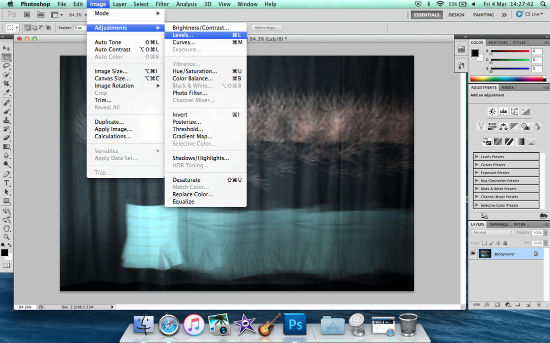
After when it's done the brightness then click 'Image' then scroll down to 'Adjustments' to 'Levels'.
|
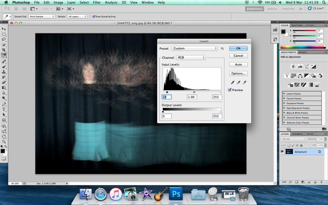
Change the levels of the light, I put little bit dark to make look more interesting.
|
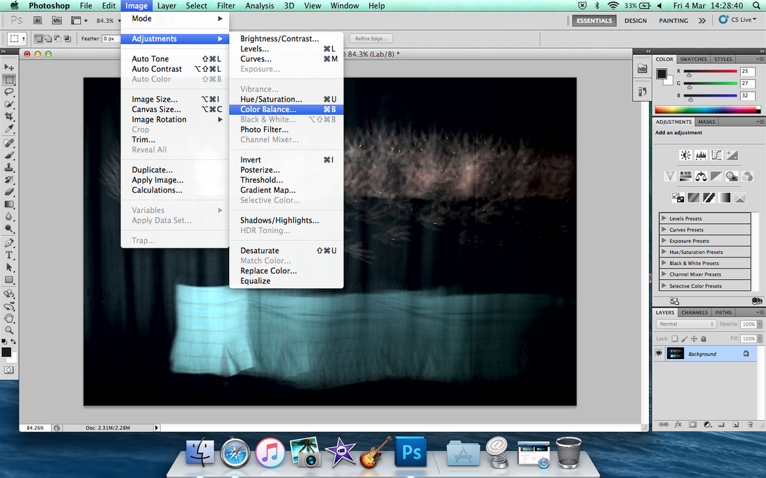
And then go to 'Image' to 'Adjustments' again then go to 'Colour Balance.
|
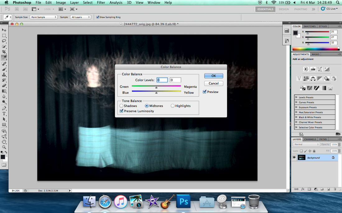
Move the arrow by the colour, I chose bit blue because it's suitable to match into her skirt and her body look disappear.
|
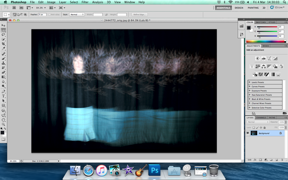
Then save it save web for weebly.
|
Other image for example
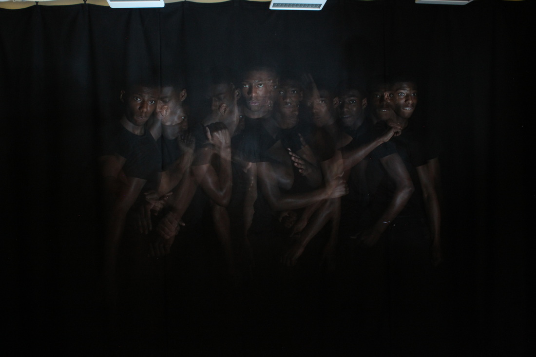
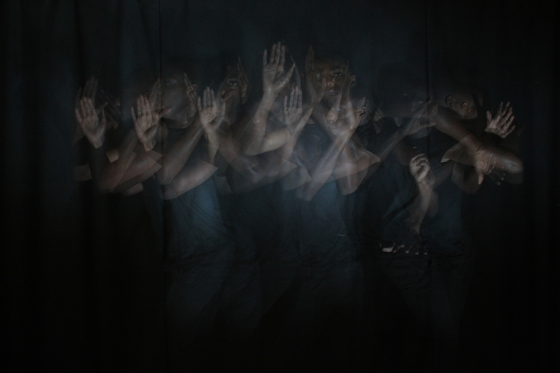
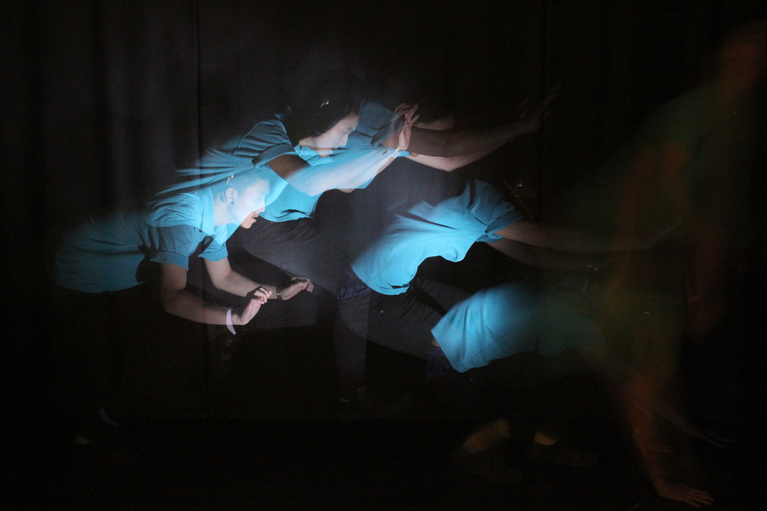
Peter and I's Photography


|
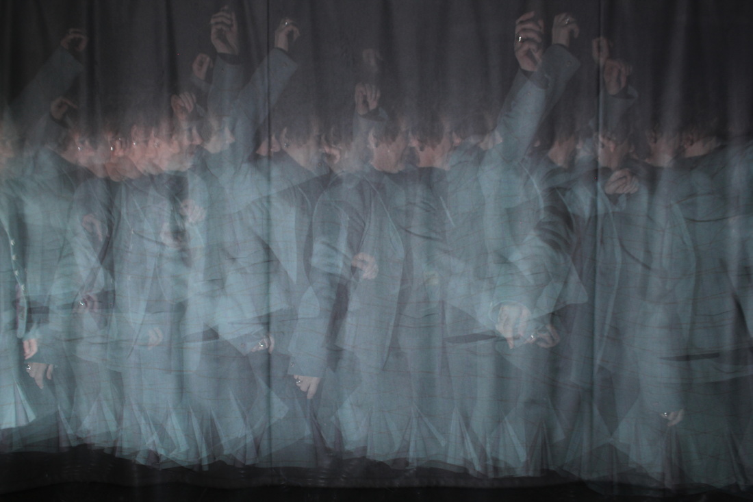
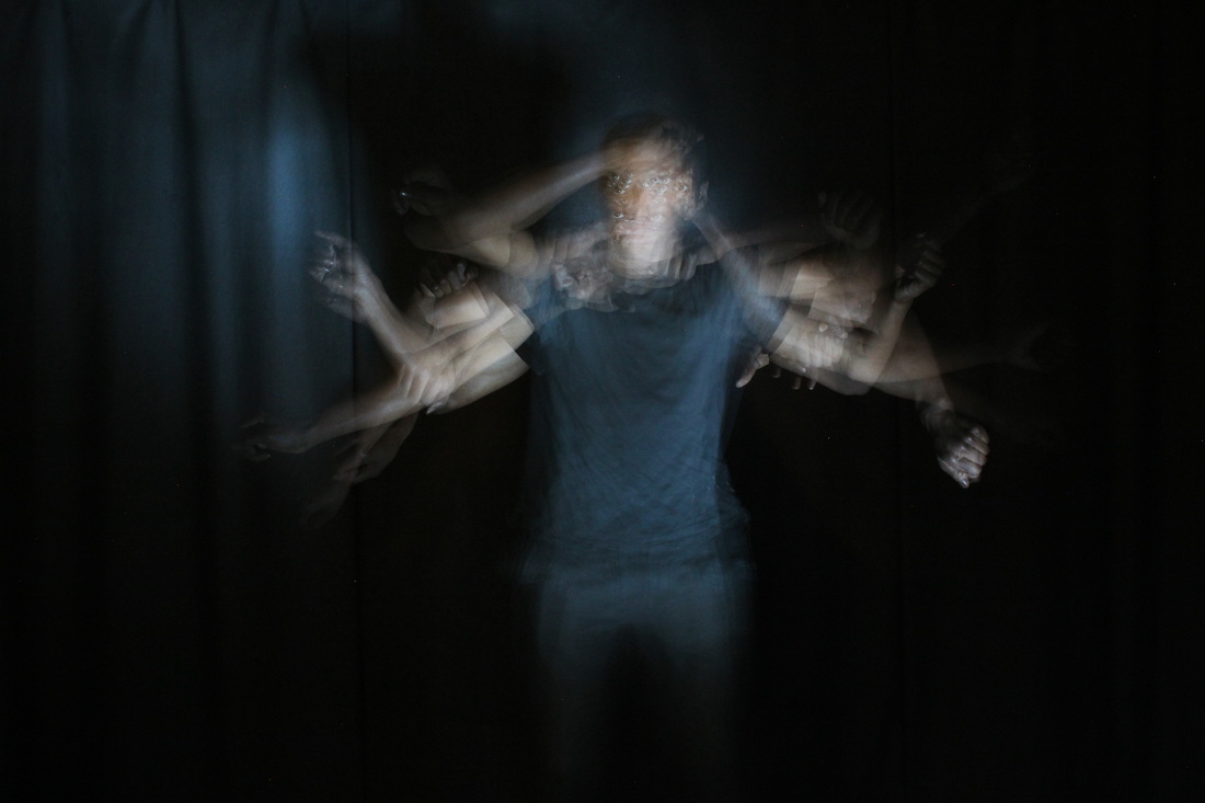
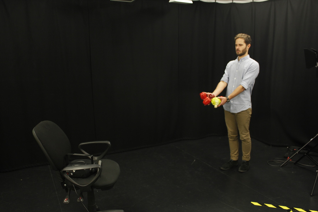
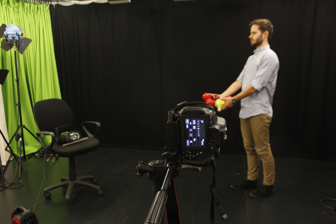
How to do strobe photography?I went to the special room called Broadcast Studio, The equipment I used are a camera, a tripod, a strobe light and a volunteer. This image shows how I used settings suitable for strobe photography. The camera is set to manual (symbol 'M') then I decide to do '8' seconds shutter, F9.0 and ISO - 3200. Also I can adjust the ISO as the shoot goes on if the images are too bright or too dark.
|
WWW:
I like this photo, look really good and look more professional. It's look like repetition and more space out, and the light too.
|
EBI: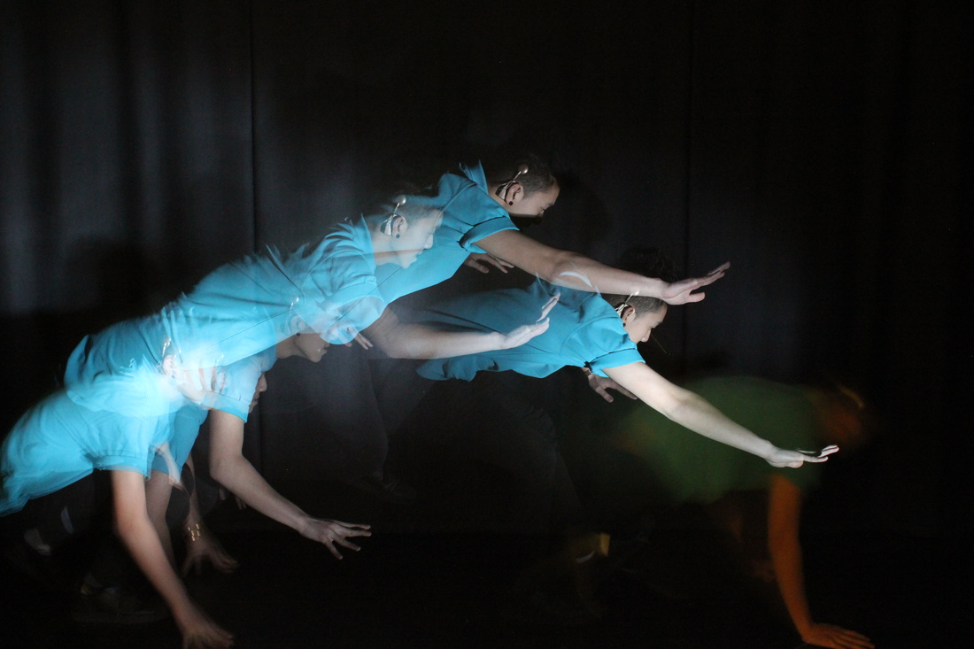
All i need to improve to make my jumps bit higher because I need to make it look really good jumps and full screen of image. Also I was stay still at the end and it look bit disturb, because I wasn't ready to jump after when the camera was started but I need to go after when I was jump.
|
This is how I need to improve to become a better photo.

At the start of photo, I decide to start slowly walking with move arm then after this I check the photo and it is shows too many but I have to keeping start again, repeating to make look better. But at the middle one are quite look good but I want to make my arm look more interesting so I use my arm move high as possible also the light needed be stop when walking through and when finishing, then turn the strobe off; for example last photo.
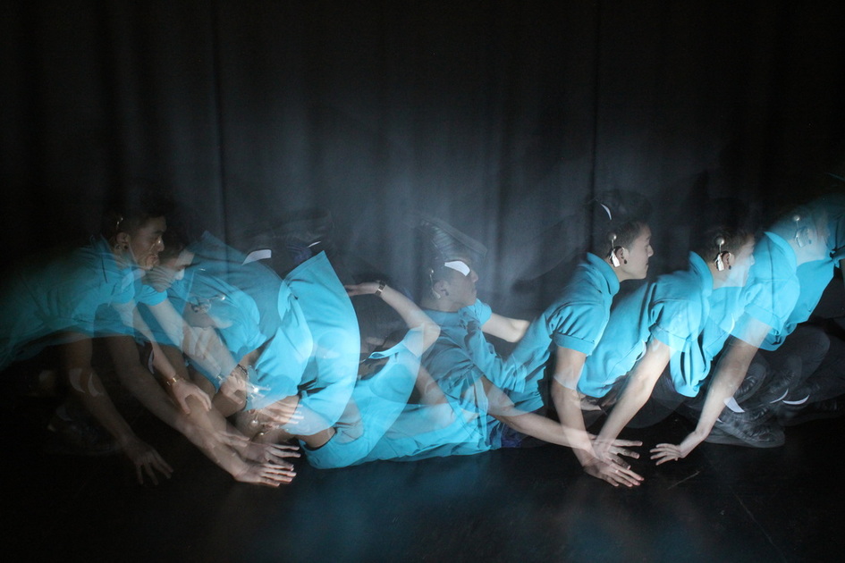
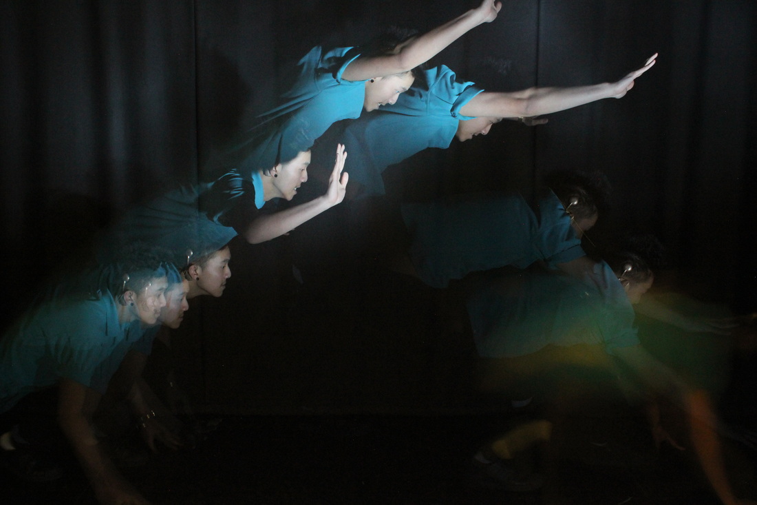
My best photo
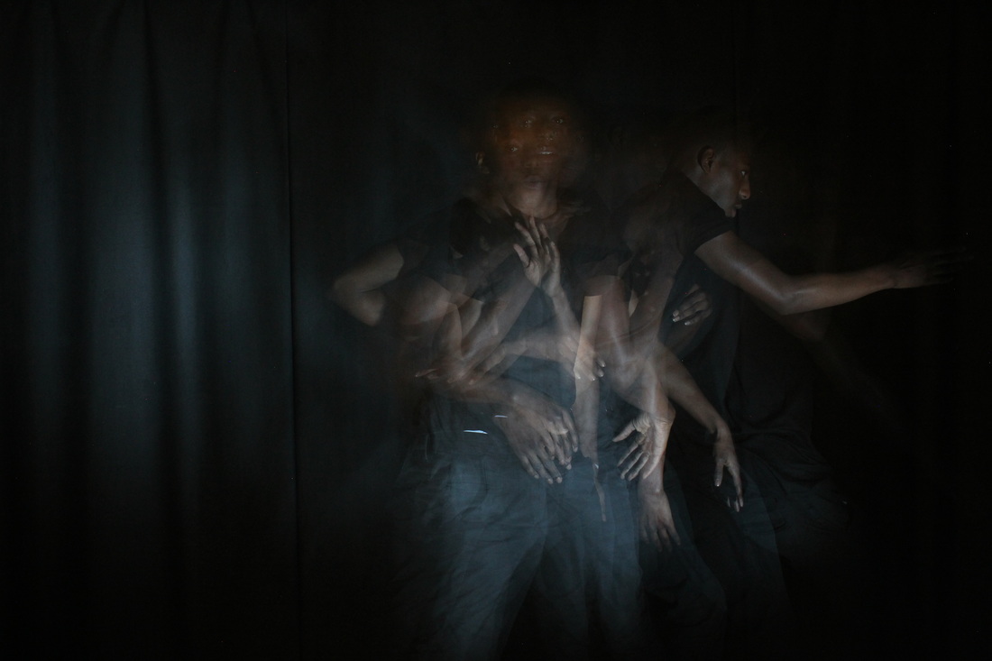
This is my best photo because that's how I like my way and I don't want to copy other people way, I liked to my own idea and creative. I think roll flip would be good idea, the floor is hard and it does hurt me little bit but it's worthing to having a go. The photo is shows how I focus on myself to roll because the room is very dark and unable be see where to go the way like proper roll not fail and I could remember which way and be perfect roll flip, the strobe light give me an headache too much! I do want to doing start more picture because I want to make sure to publish my work skills, could make it more impact picture like the light, colour into Photoshop which is will be looking good for my Repetition work!
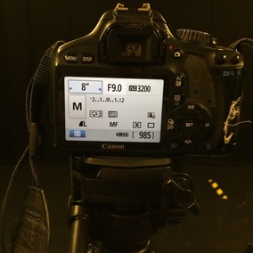
Equipment setting
|
|
|
This is show you how I did been setting the equipments setting for strobe photography. This is how I start to put the strobe on the chair because it can see the body with the thing could be balls or something which is linked ball and also doesn't matter which position but it had be straight to the the body. I decide not to that way to the background because it effects the light on the black wall which is you can see light on the wall, so I think which is the best to put stand different position. I use the tripod with camera on it, tilt the camera for only the body not face.
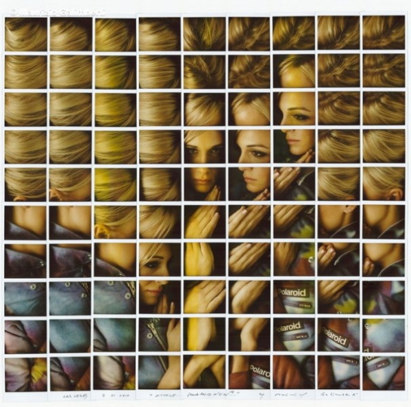
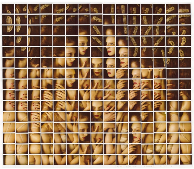
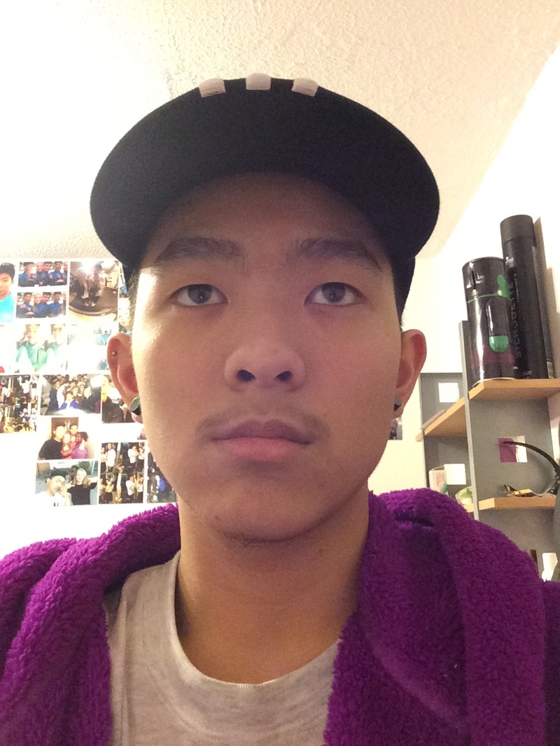
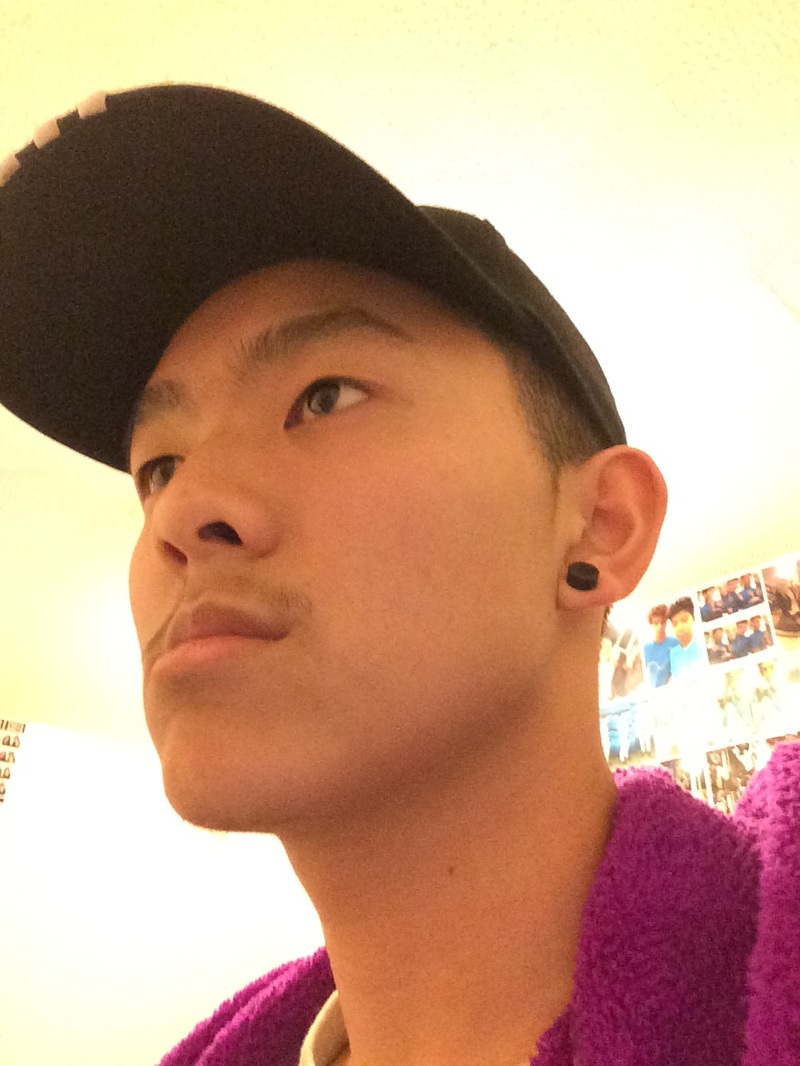
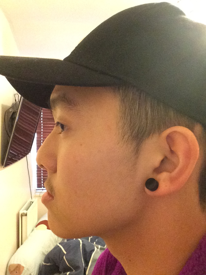
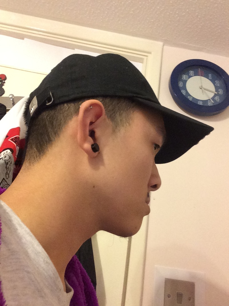
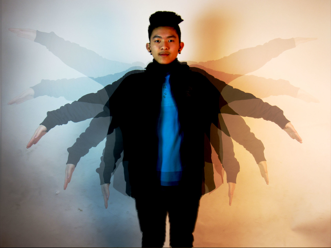
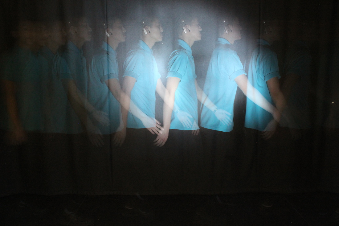
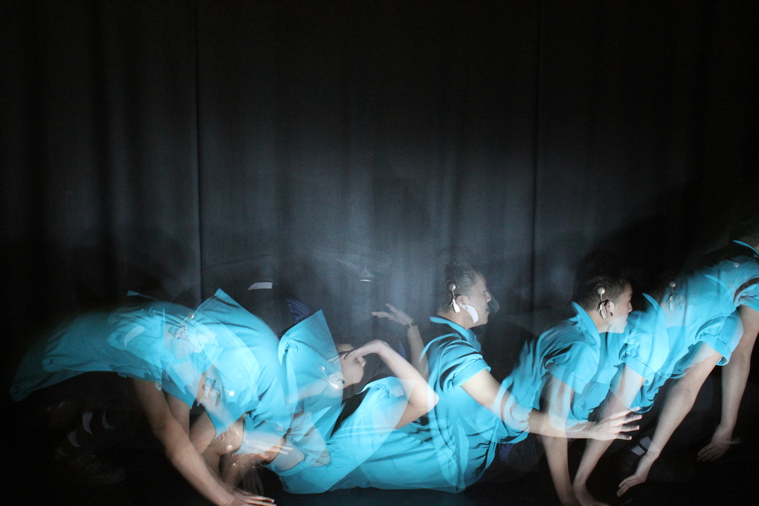
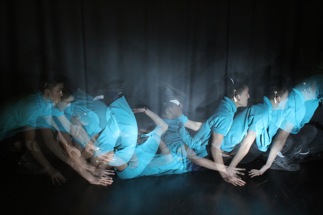
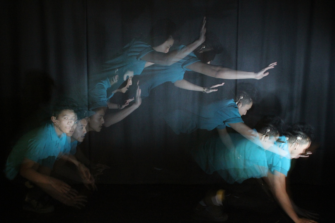
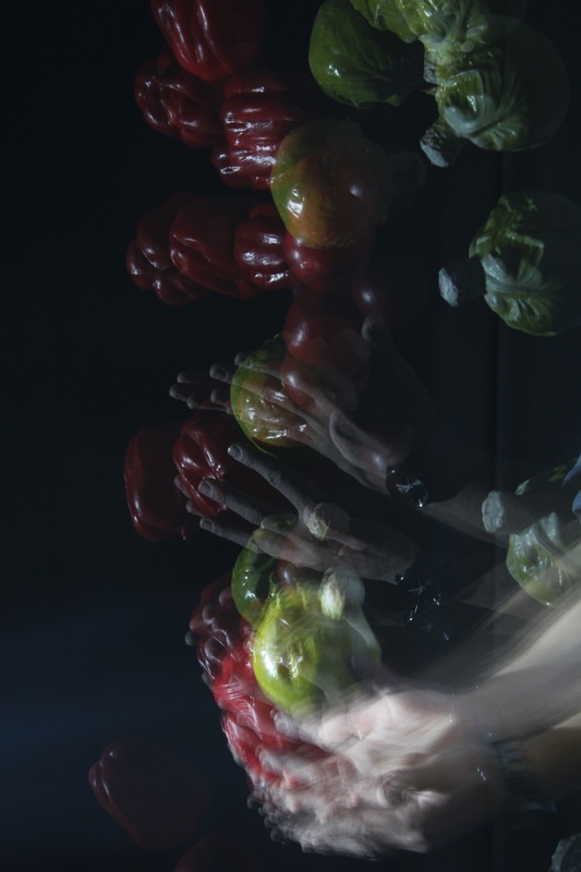
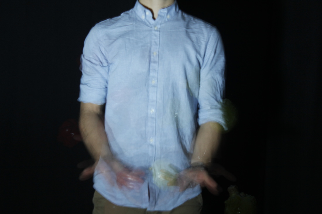
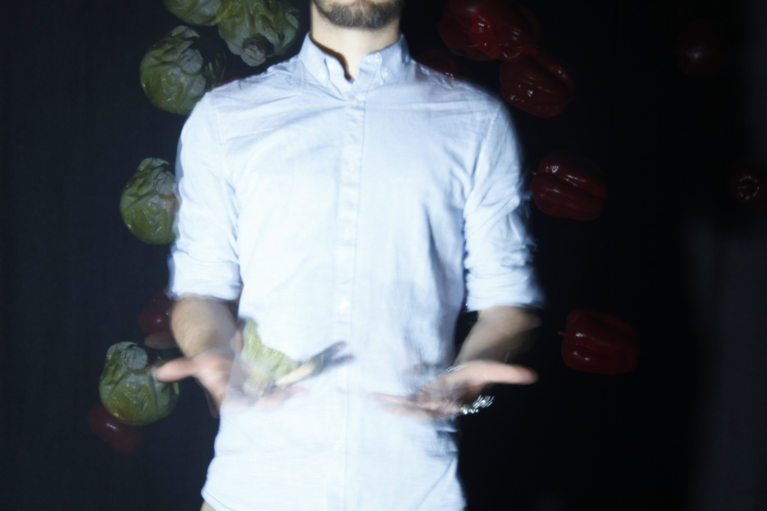
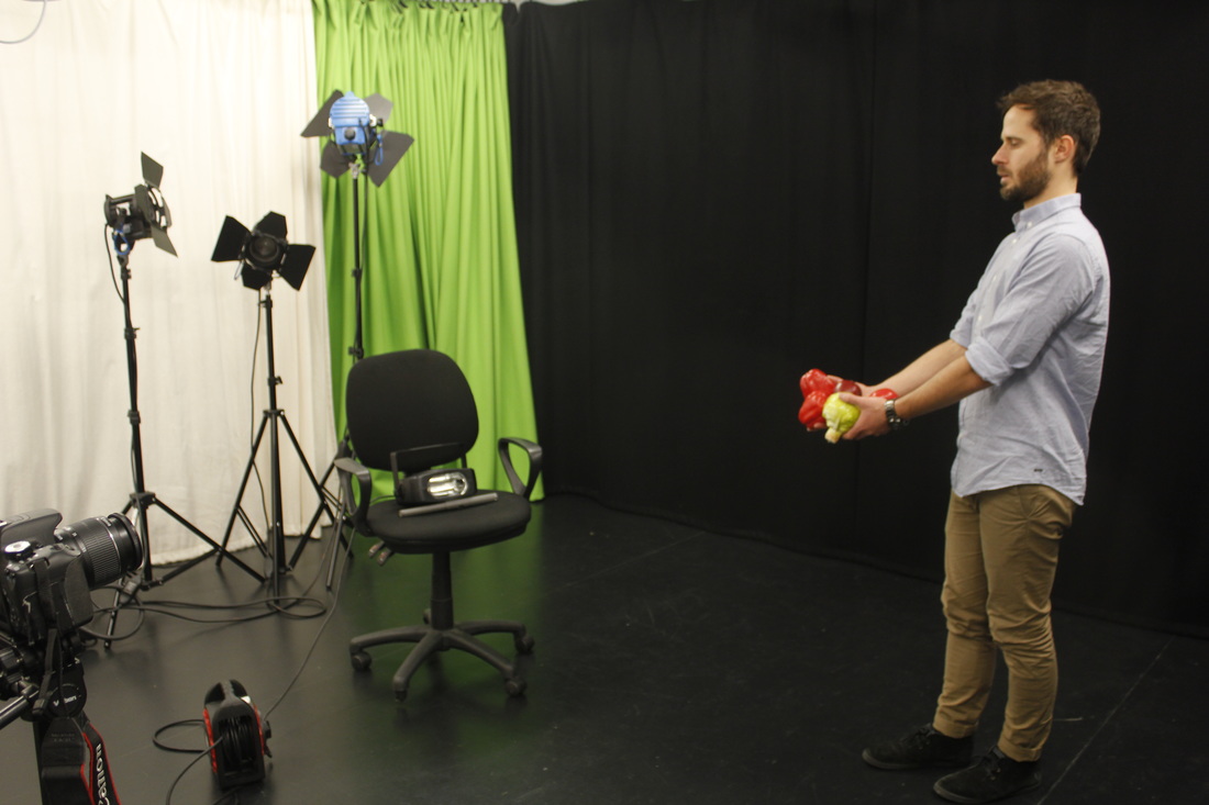
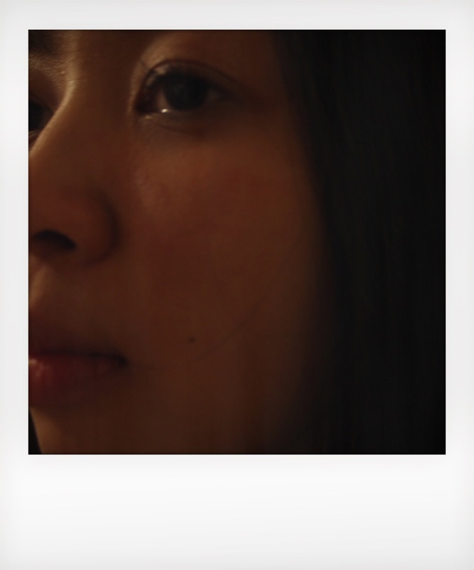
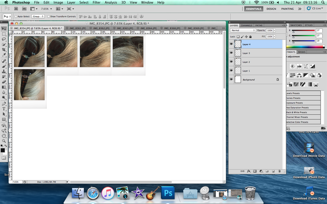
Come back to Maurizio Galimberti
I have come back to my earlier work inspired by Maurizio Galimberti. Iv'e decided to come back to this technique because I feel it is unfinished, I'm not satisfied with the way I left it. My research of other techniques has been productive but Galimberti's work is stuck in my head.
At first, I thought it looks easy to make like this but my work wasn't up to standard and I realised it was tough. I did mostly 'strobe photography' after my original efforts but it didn't give me much satisfaction - I feel good about coming back to this work. Building on what I'd learnt from my first experiments I have asked my teacher to give me advise on how to improve my skills. He showed me step to step how to arrange the images in photoshop and taught me about editing to make the photos more uniform and interesting. I'm motivated to make this style of photography work and want to prove to myself and my peers that I can create good work.
At first, I thought it looks easy to make like this but my work wasn't up to standard and I realised it was tough. I did mostly 'strobe photography' after my original efforts but it didn't give me much satisfaction - I feel good about coming back to this work. Building on what I'd learnt from my first experiments I have asked my teacher to give me advise on how to improve my skills. He showed me step to step how to arrange the images in photoshop and taught me about editing to make the photos more uniform and interesting. I'm motivated to make this style of photography work and want to prove to myself and my peers that I can create good work.
Step by step
|
            |
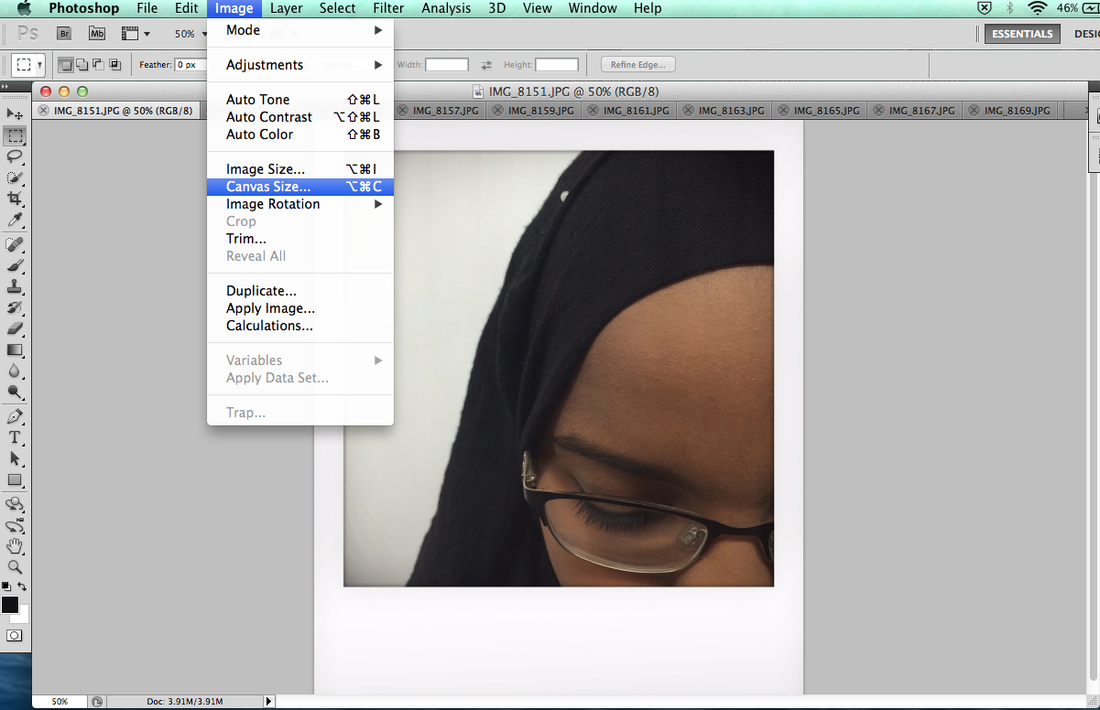
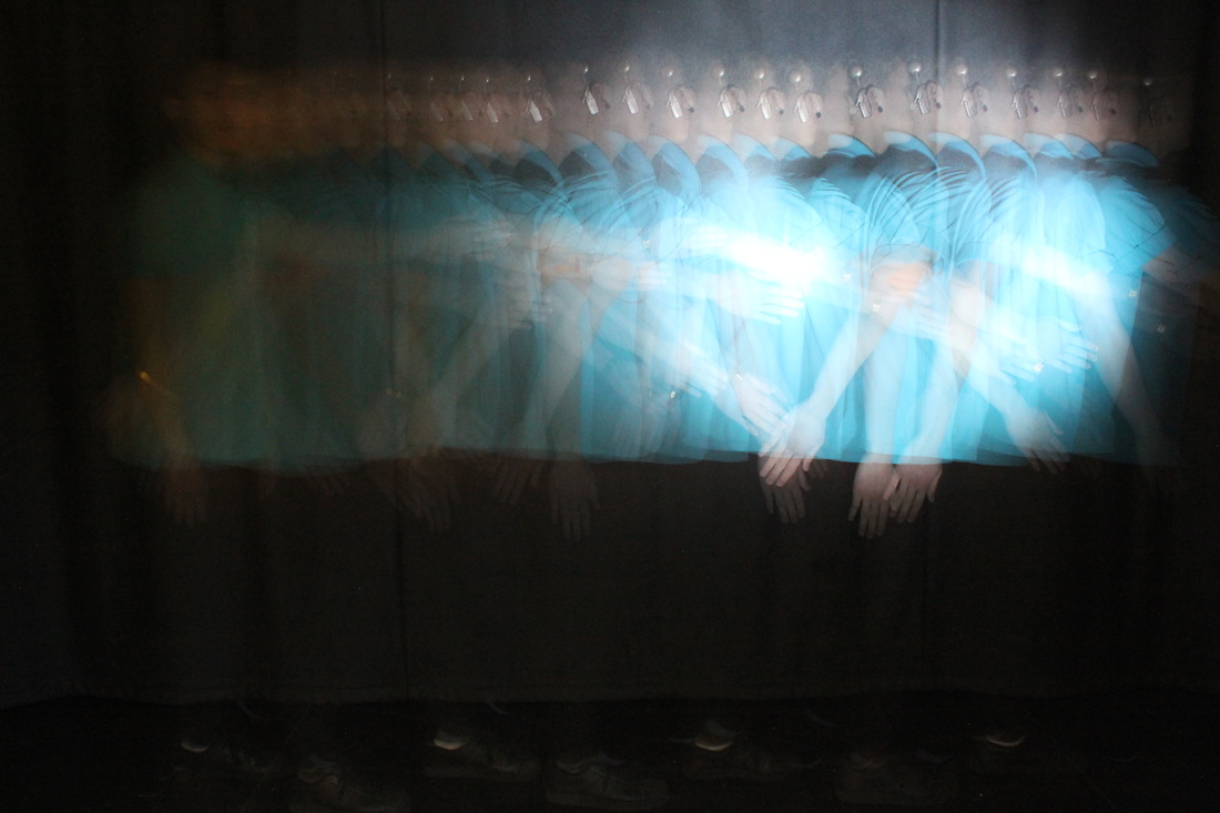
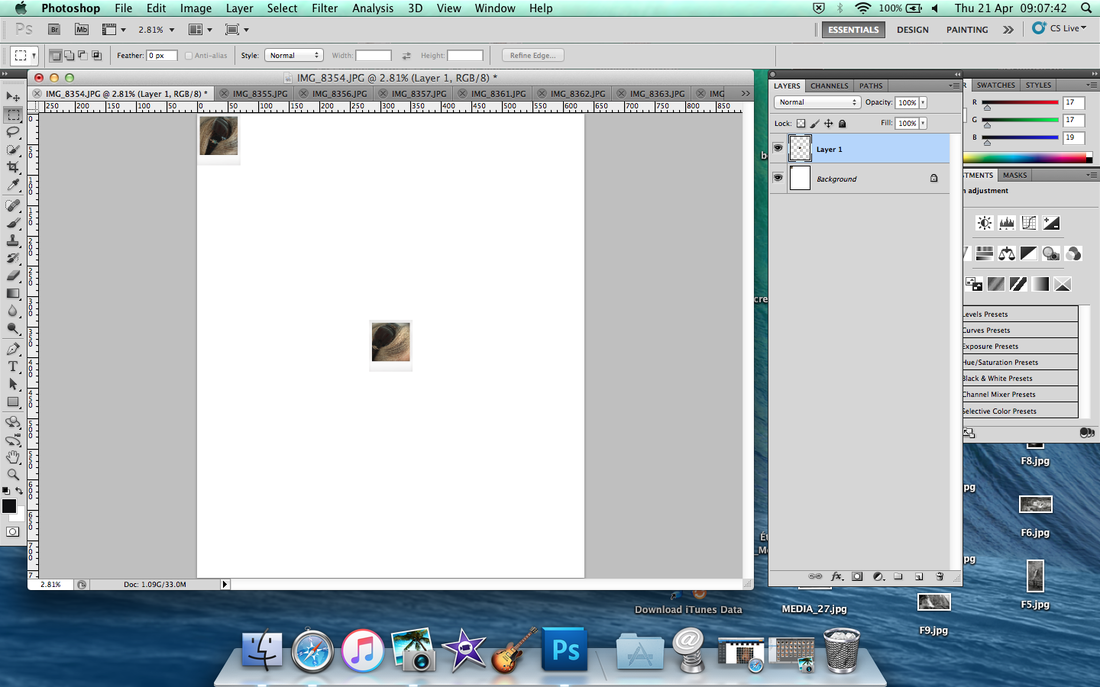
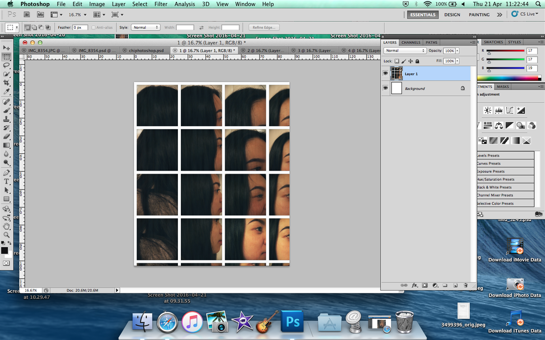
First thing to do, start with first photo because it was easy to order each grid. It created by Photoshop, go to 'Image' then scroll down to Canval Size.
|
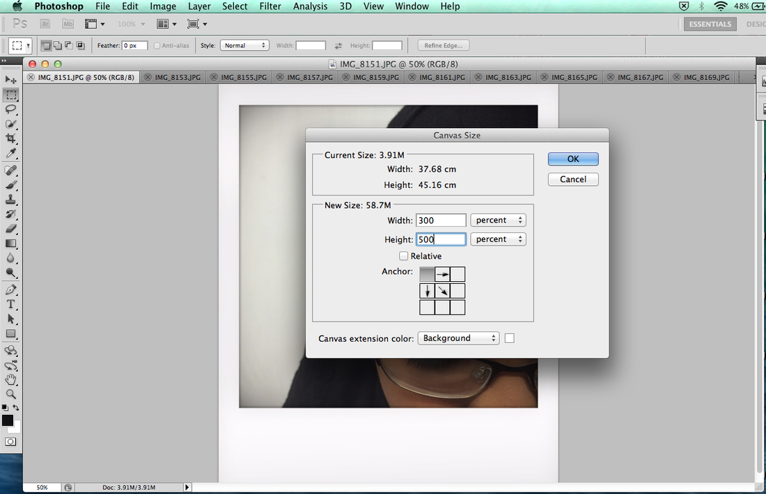
After when you click it then change to Percent from next to number. If you want 3 image in the row which is 300%, if you do 4 means 400% and same thing amount of row column. When you done it, then click the arrow on first one corner.
|
Put order each images, you can also do cmd A (whole photo) then cmd C (copy) and cmd V (paste) which is more quicker and easier to editing it. After you done all of them then click Image to Crop to cut down the white background.
|
|
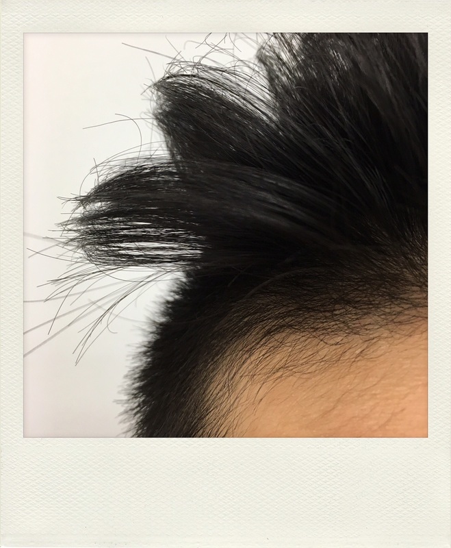            |


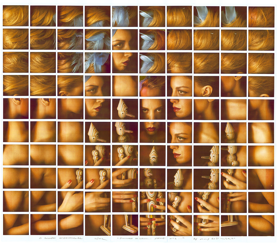
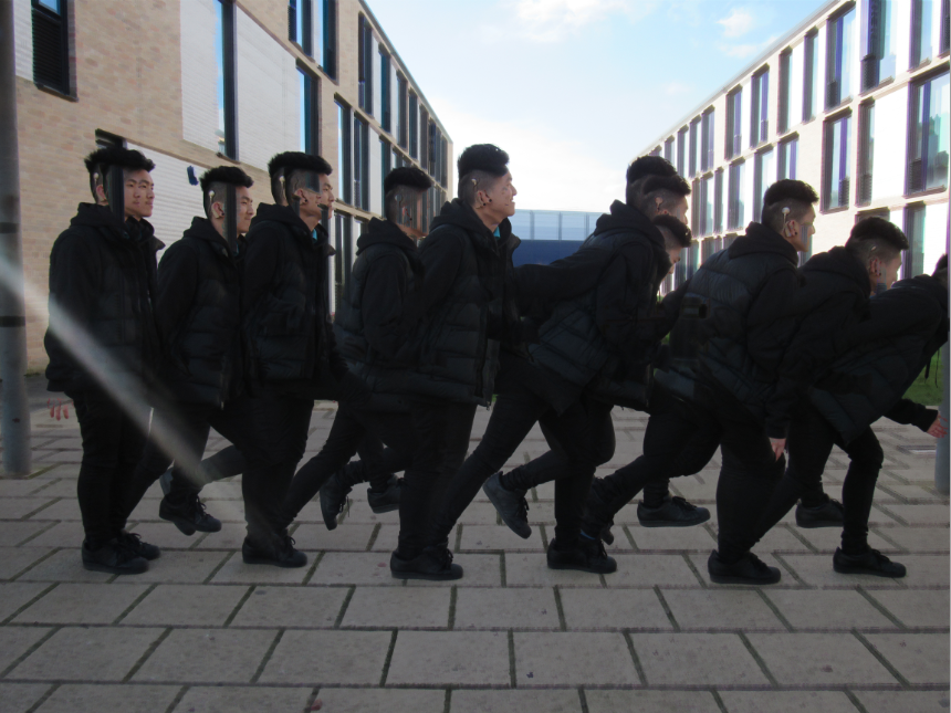
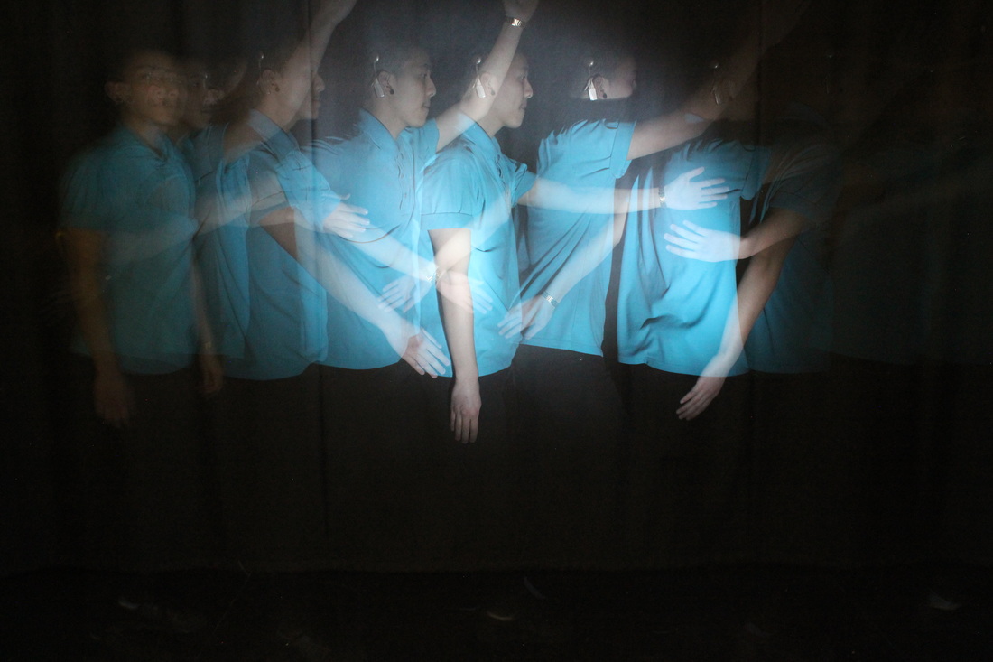
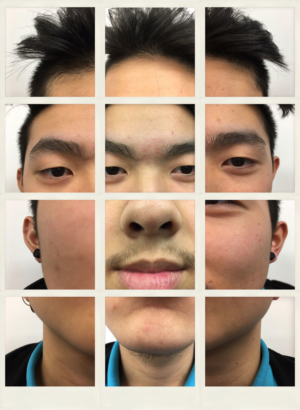
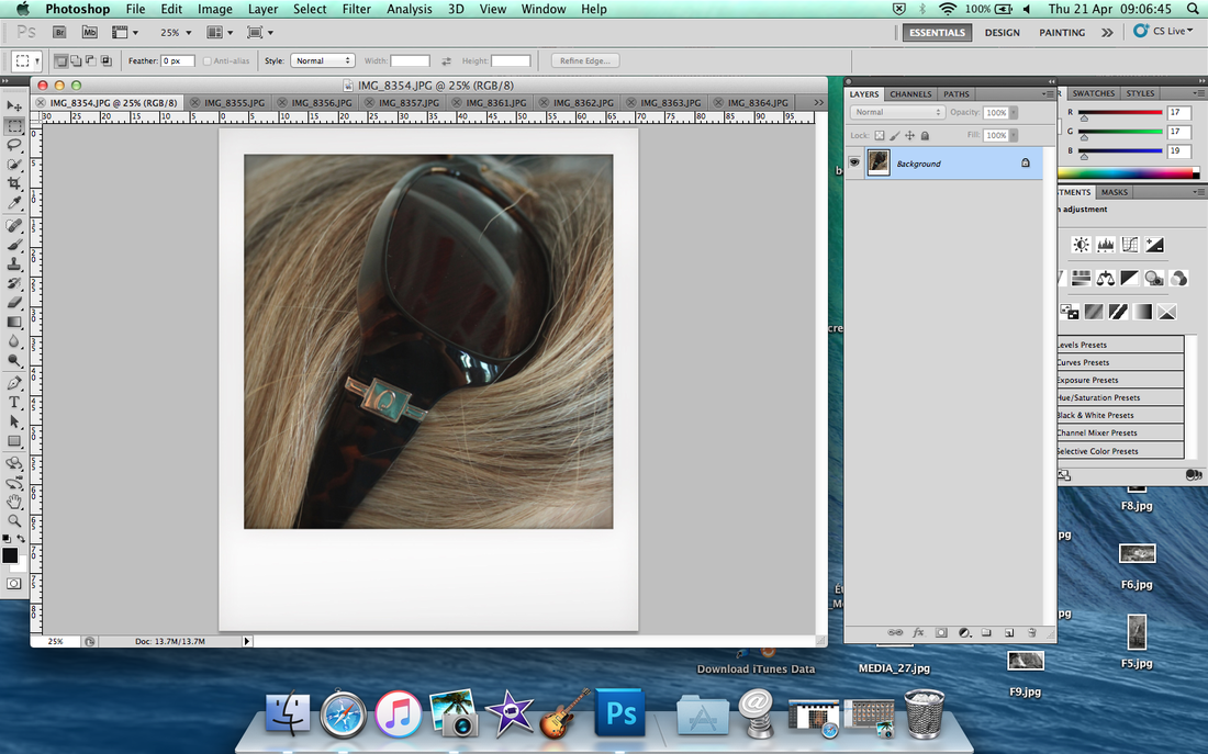
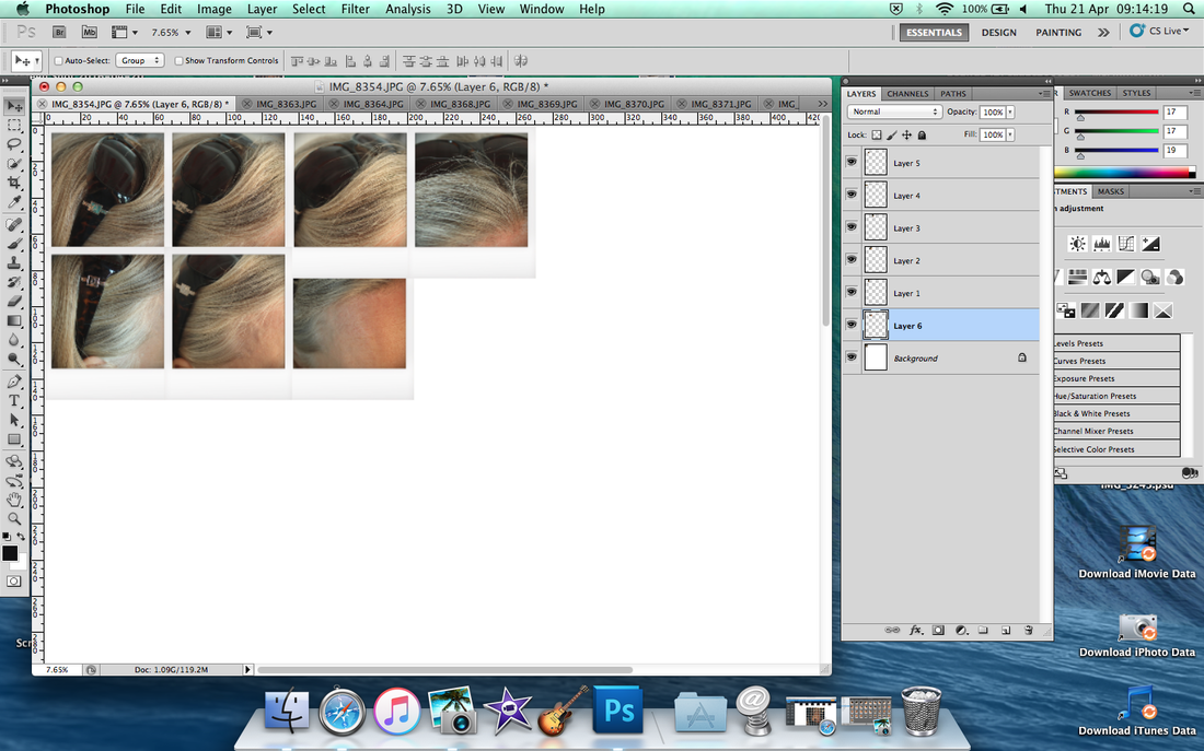
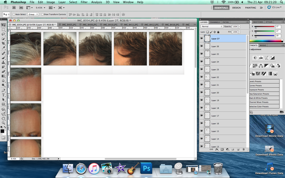
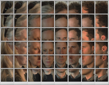
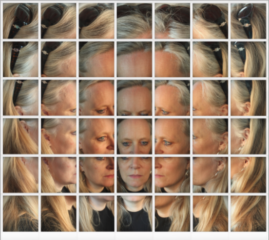
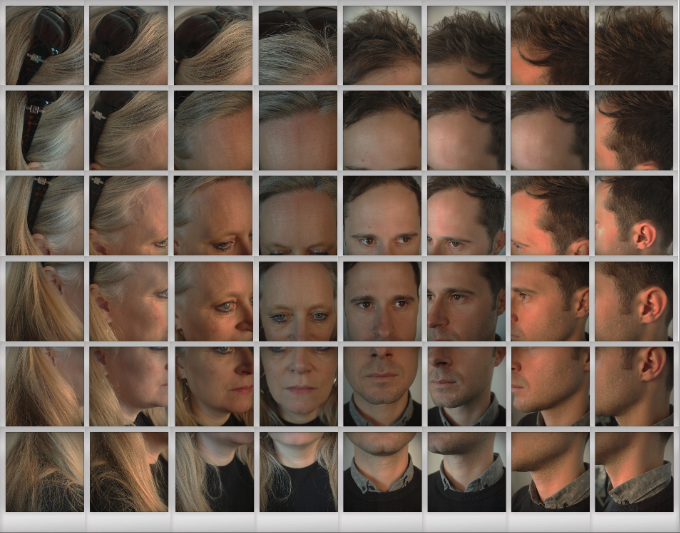
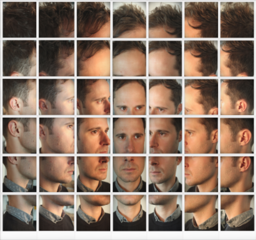
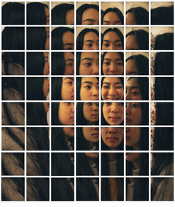
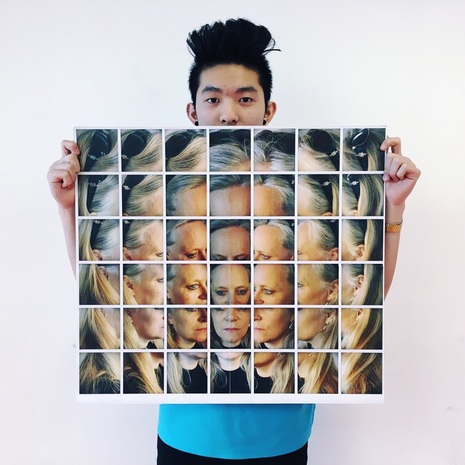
I chose this final image because it look really good to make altogether and I do this at home, take a picture of my sister's face. I thought I did something wrong like I didn't take a right shot each face but I'll have a go to make it in photoshop and it went so well.
First thing to drag the picture into Photoshop.
|
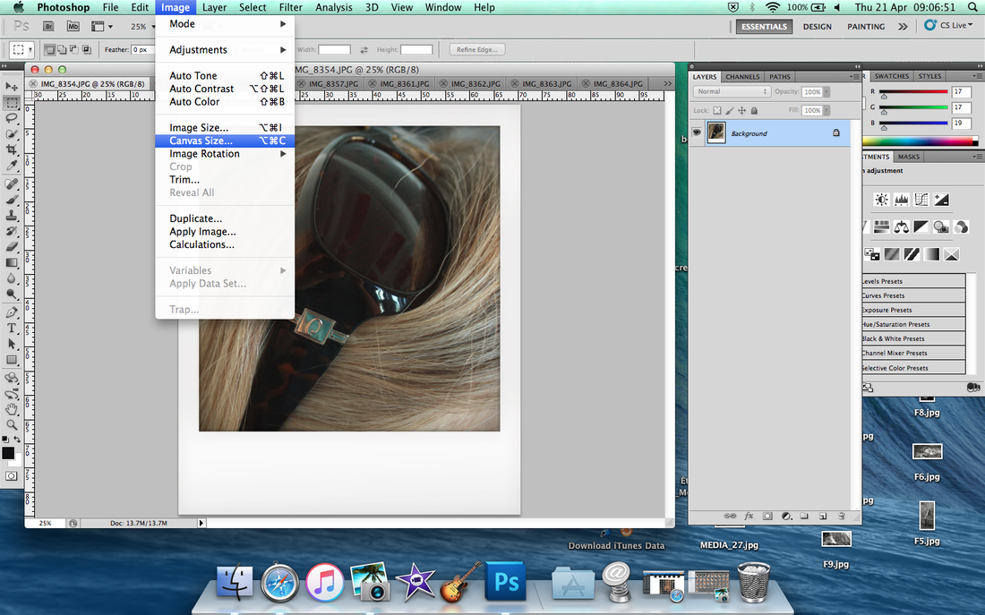
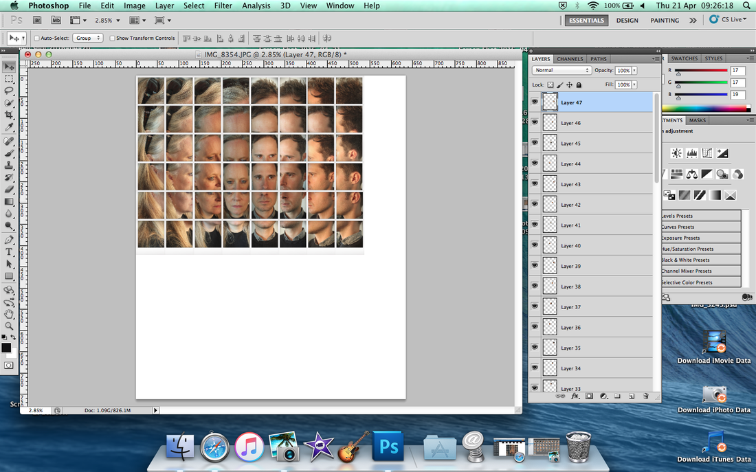
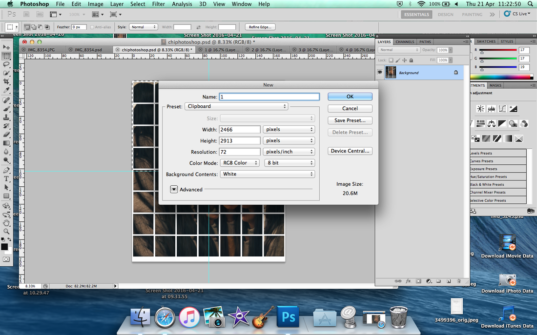
Click 'Image' from the top bar then scroll down and click 'Canvas Size'
|
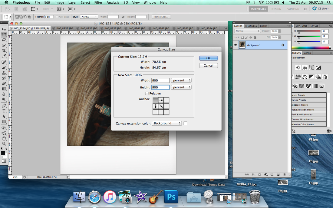
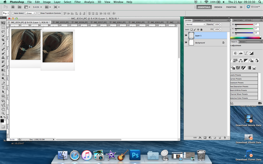
If you see the number of Width and Height, first to change percent then put 900% each box. For example, top row of 9 pictures which is 900% same thing as column. When you ready to put then make sure click the arrow from the top left corner.
|
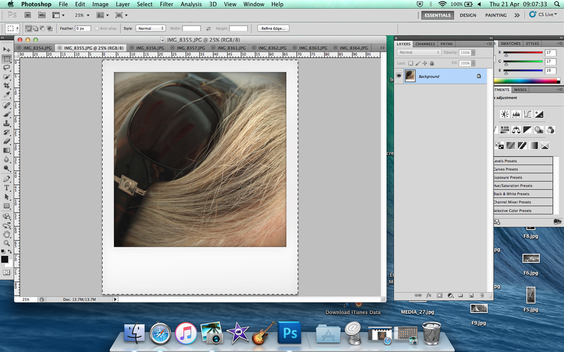
Press the keyword of 'cmd to A' and after that then press again 'cmd to C'
|
Then go back to Canvas then press 'cmd to V' to paste on it.
|
Make sure put overlap to and create a consistent boarder.
|
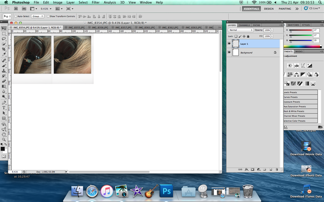
For example like this.
|
Consistent same method each image order.
|
Same thing as create a consistent boarder overlap.
|
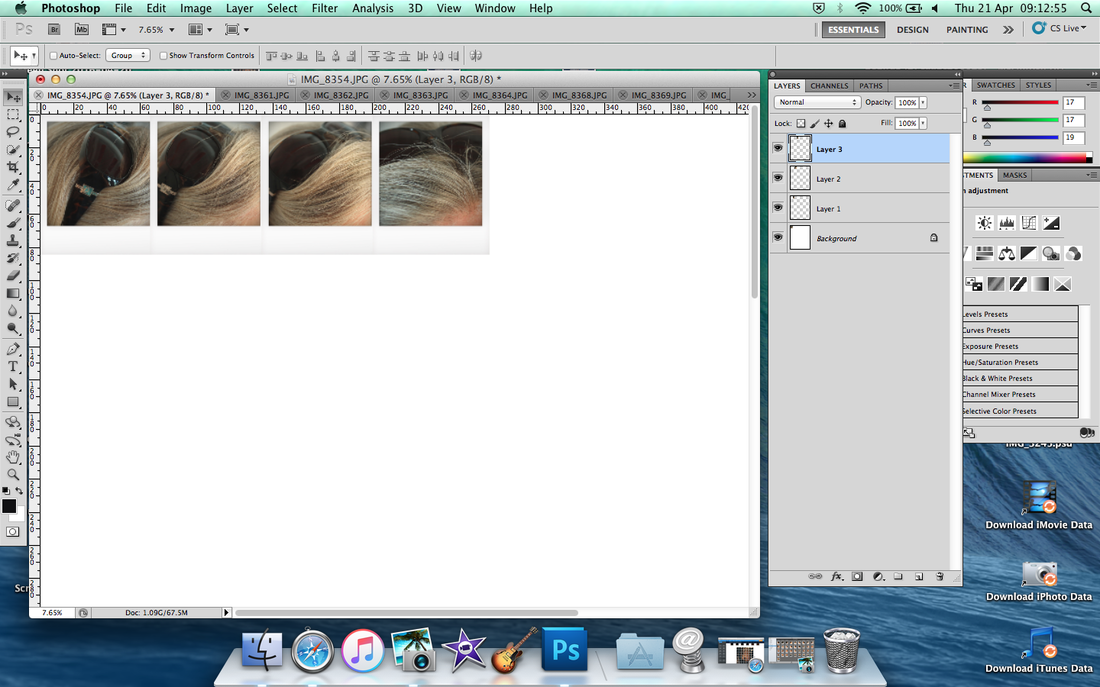
If it can't overlap like this, you have to move drag on the top.
|
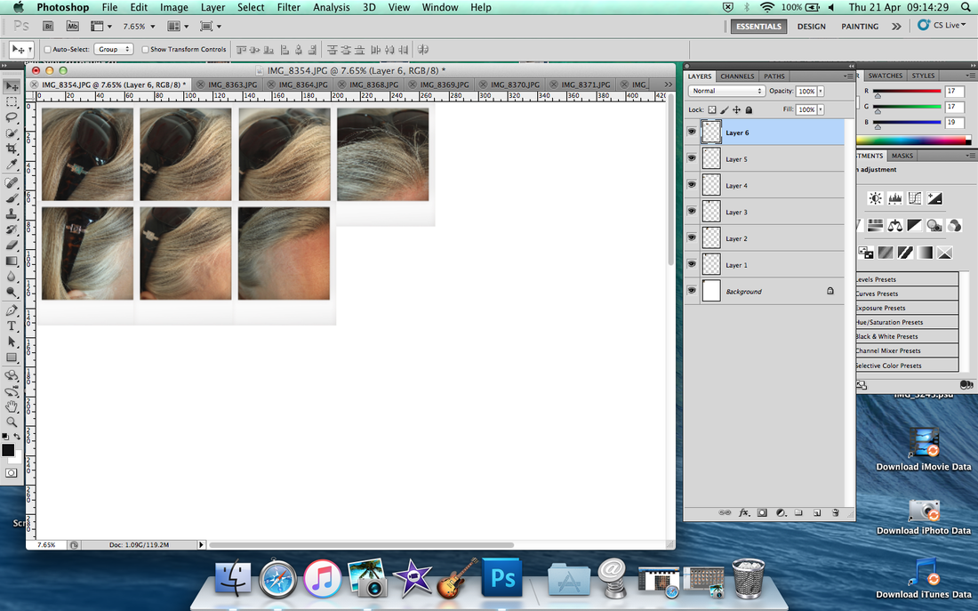
For example like this.
|
Consistance same method until when it done.
|
Move on the next part, exactly same method from the start like 'cmd to A', 'cmd to C, and 'cmd to V' etc.
|
So everything is done.
|
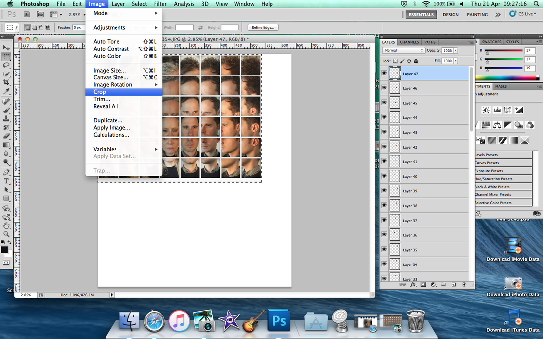
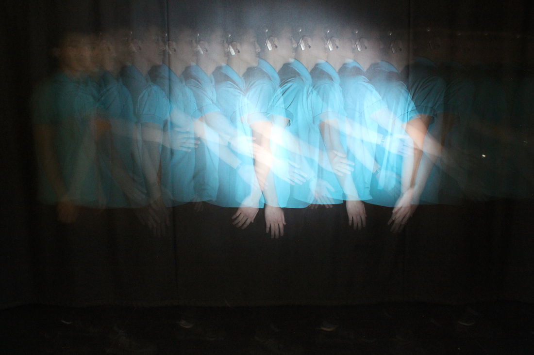
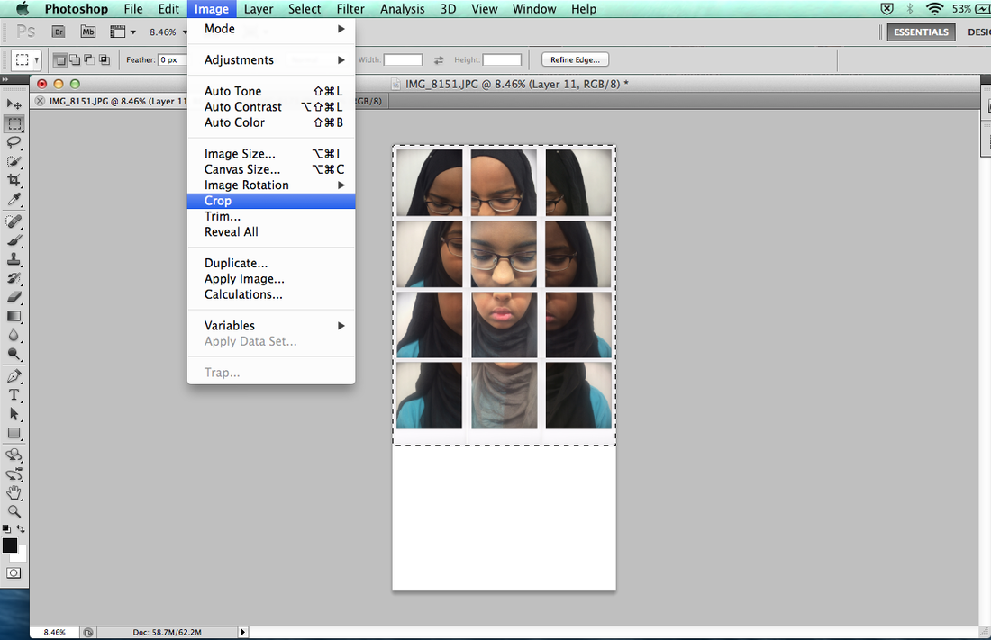
First thing, I want to remove the white thing background so I do select the image then click by 'Image' to 'Crop'.
|
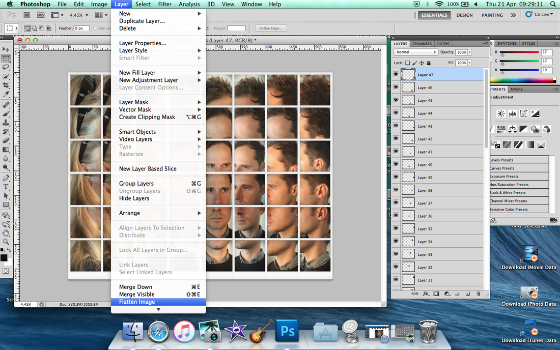
Click 'Layer' to 'Flatten Image' for all of the layer altogether in one image.
|
I decide that I want to make my image look more little bit dark which more look interesting.
|
Save it and also save the 'save web' to uploading on Weebly.
|
WWW and EBI
First picture
WWW - I think it's went well because the way I liked when it look more curve and make round good shape.
EBI - It could be better if without sunglasses because it look more interrupted.
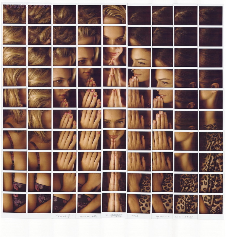
Second picture
WWW - It look more interesting to put 2 people altogether.
EBI - Different lighting of face, one of them dark and brightness as different colour tone.
Third picture
WWW - It look interesting because the way of random camera angle.
EBI - Needed be all same brightness because they have different type colour of light.
WWW - I think it's went well because the way I liked when it look more curve and make round good shape.
EBI - It could be better if without sunglasses because it look more interrupted.
Second picture
WWW - It look more interesting to put 2 people altogether.
EBI - Different lighting of face, one of them dark and brightness as different colour tone.
Third picture
WWW - It look interesting because the way of random camera angle.
EBI - Needed be all same brightness because they have different type colour of light.
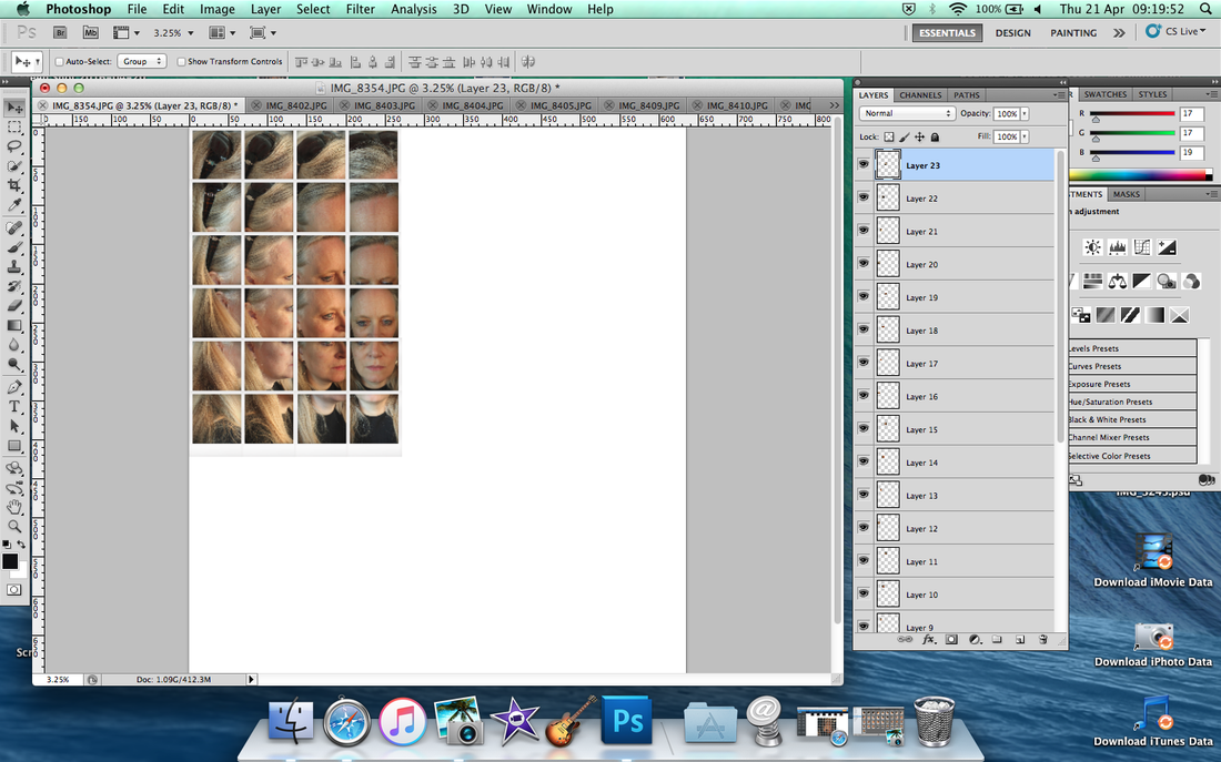
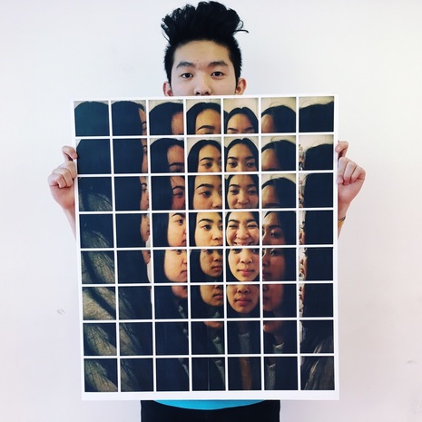
My Final Image
I am here to show you how to make A2 image.
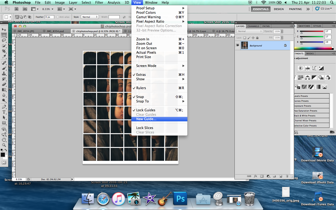
Click 'View' on the top bar and scroll down and click to 'New Guild'.
|

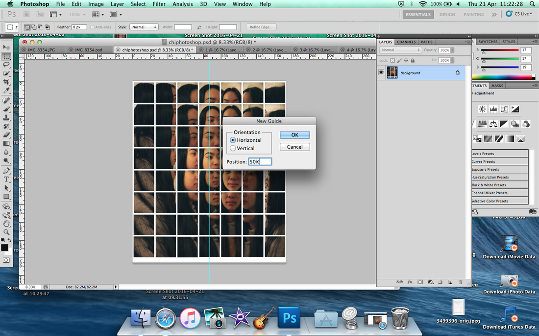
Setting the 50% (half) into vertical.
|
Setting the 50% (half) into horizontal.
|
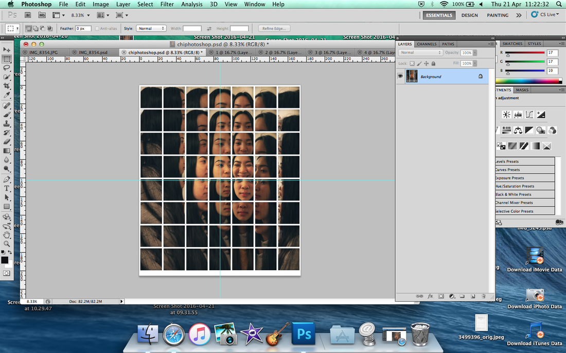
It'll show 2 blue lines
|

Select the first square and 'cmd to C' and 'cmd to N'
Then paste (cmd to V) and ready to print (A3).
|
Type the name, for example 'picture1' etc.
|
My Final Outcome
|
|
