Absurd
This is meaning of utterly or obviously senseless, illogical, or untrue; contrary to all reason or common sense; laughably foolish or false.
Pinterest Board
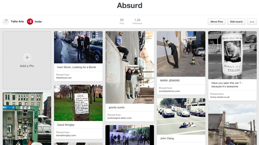
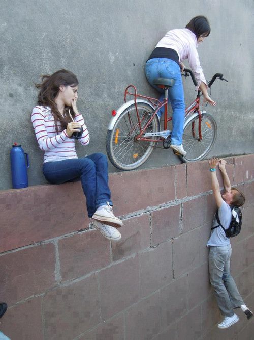
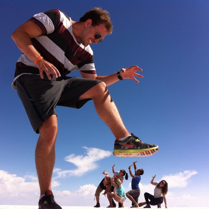
An Absurd Photographer Artist
|
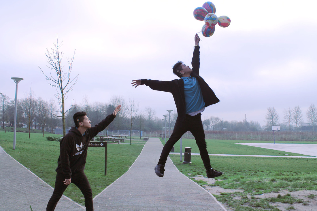
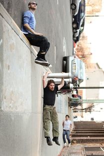
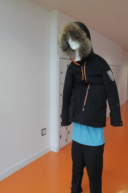
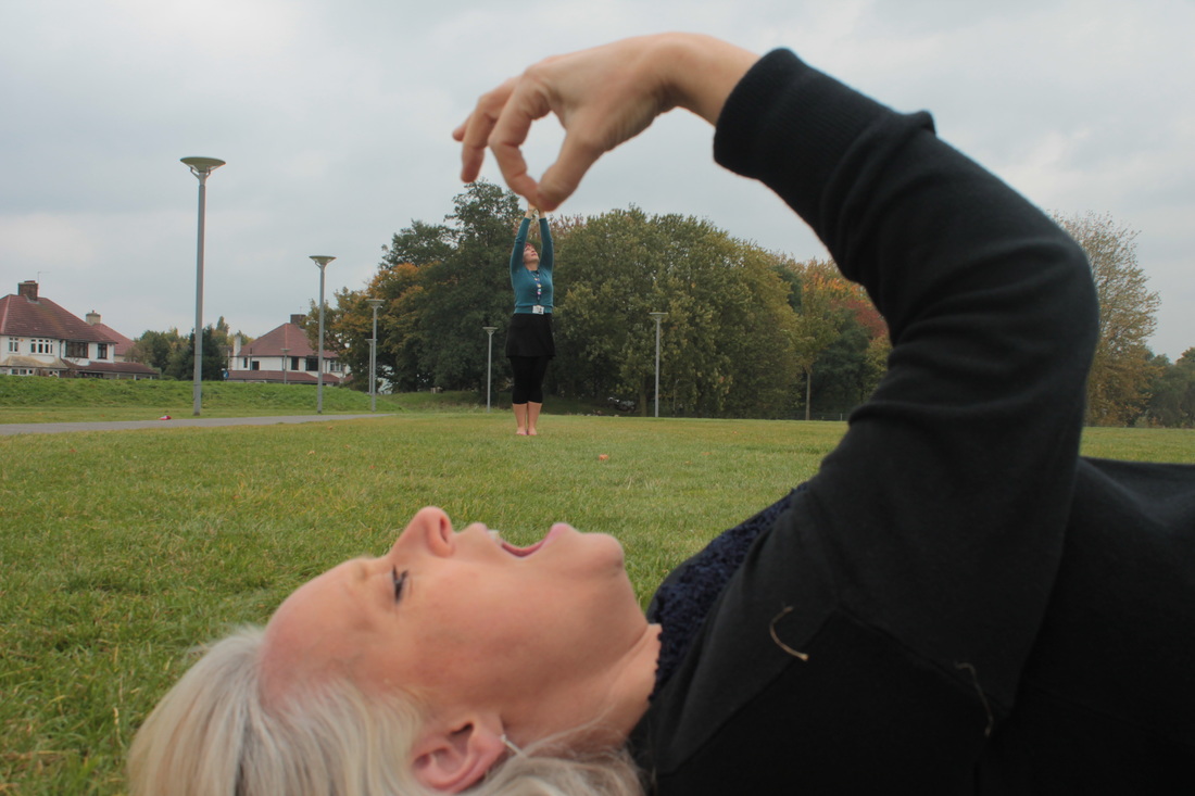
I have chosen this photo because it looks really good and absurd. The characters look like they are really falling and hanging onto things. It's makes me feel strange and confused at the same time because the picture has been rotated.
I could take a similar photo but adapt it slightly so that I am the only subject in the picture. I can achieve this by taking multiple pictures of myself. |
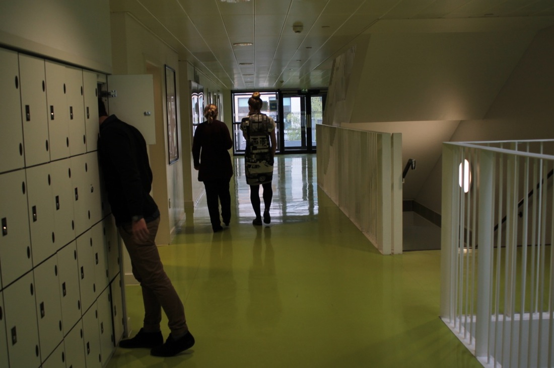
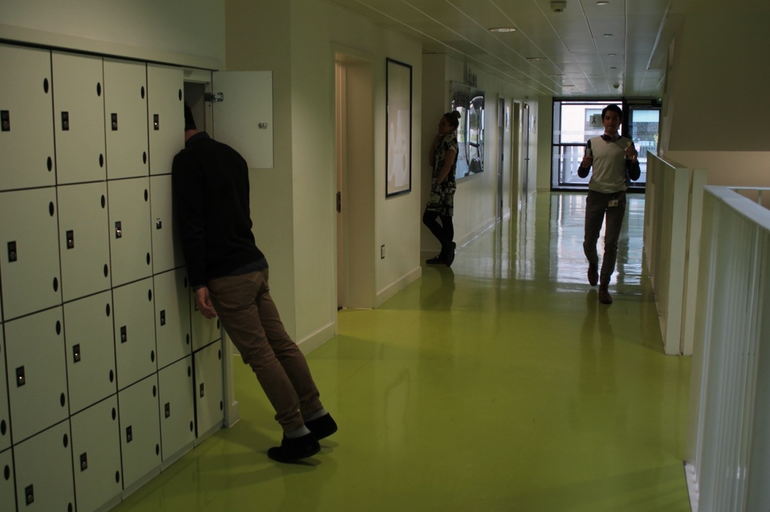
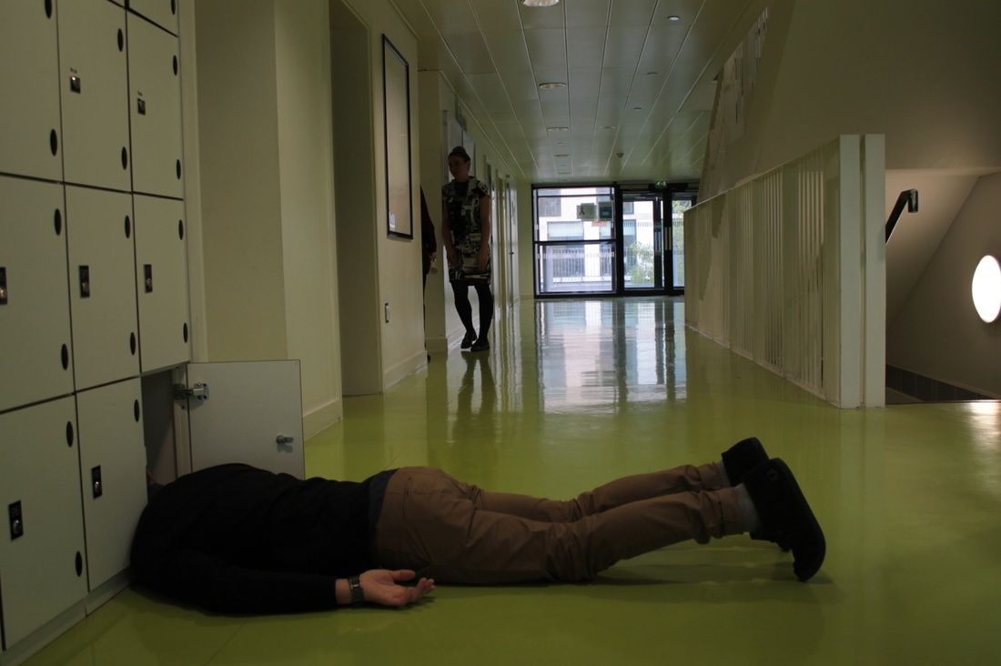
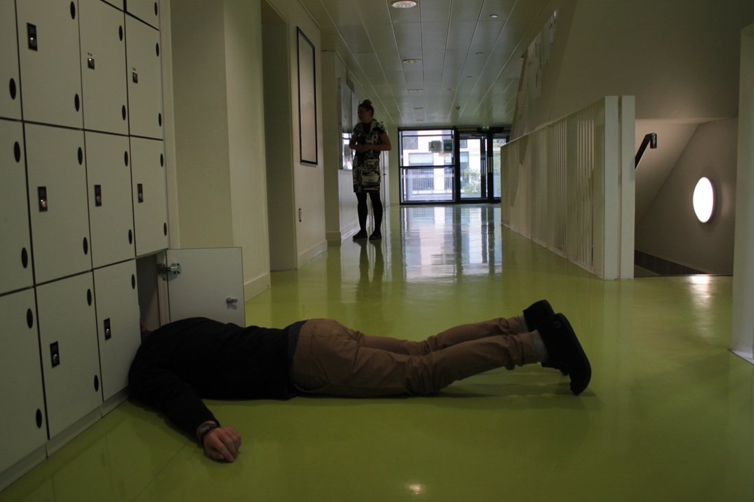
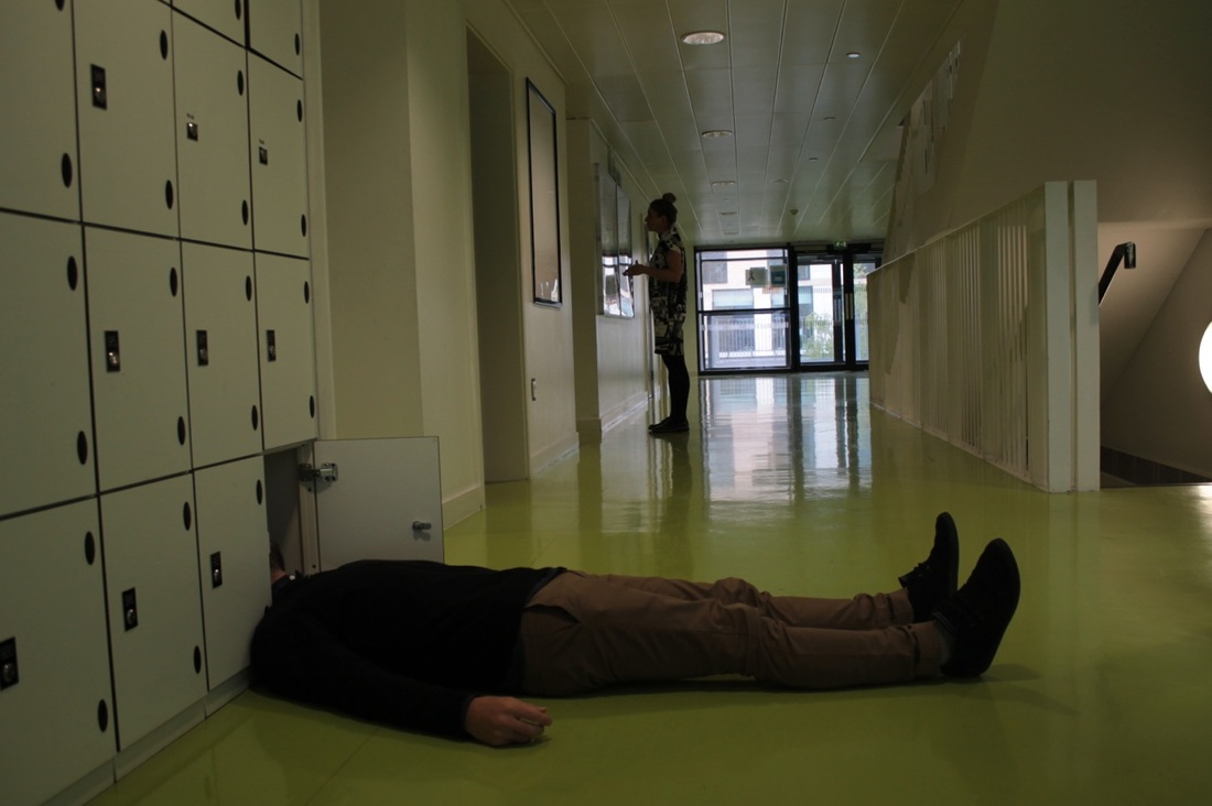
Activity 2 - Hide
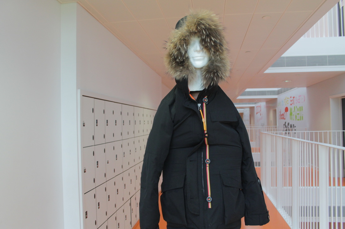
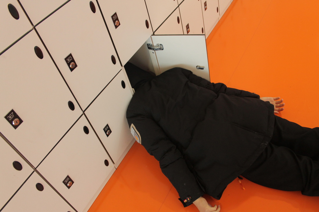
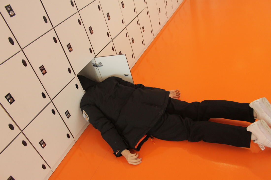

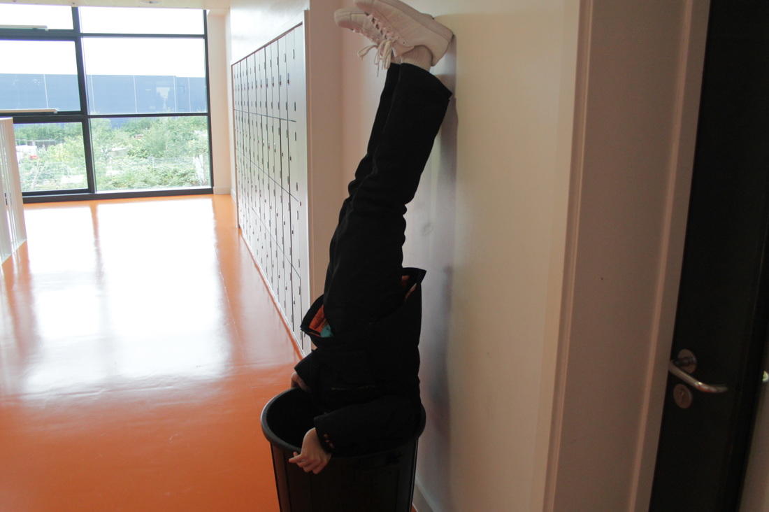
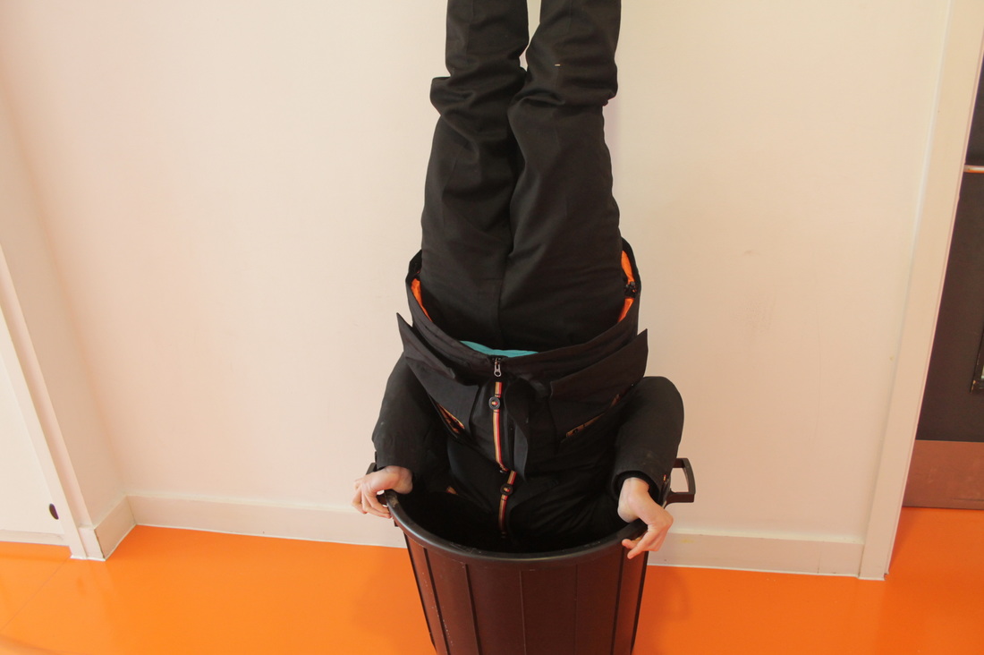
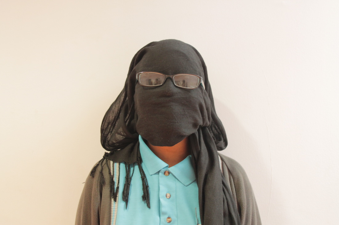
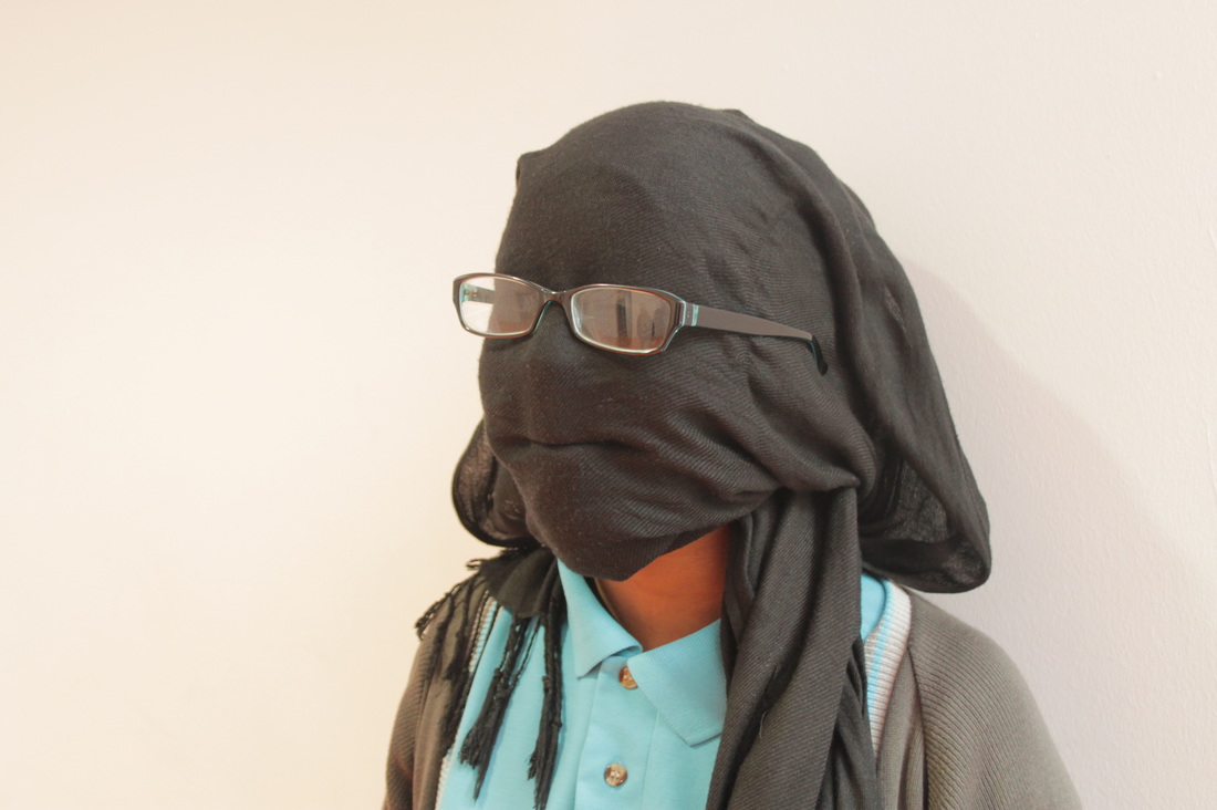
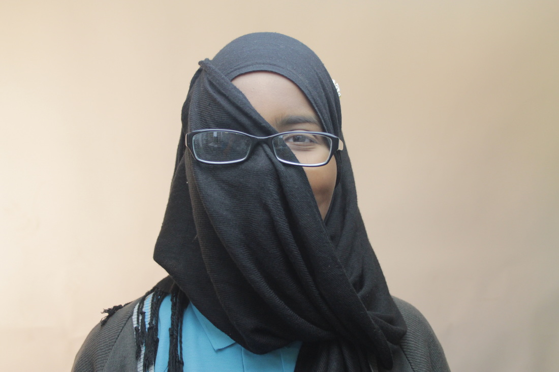
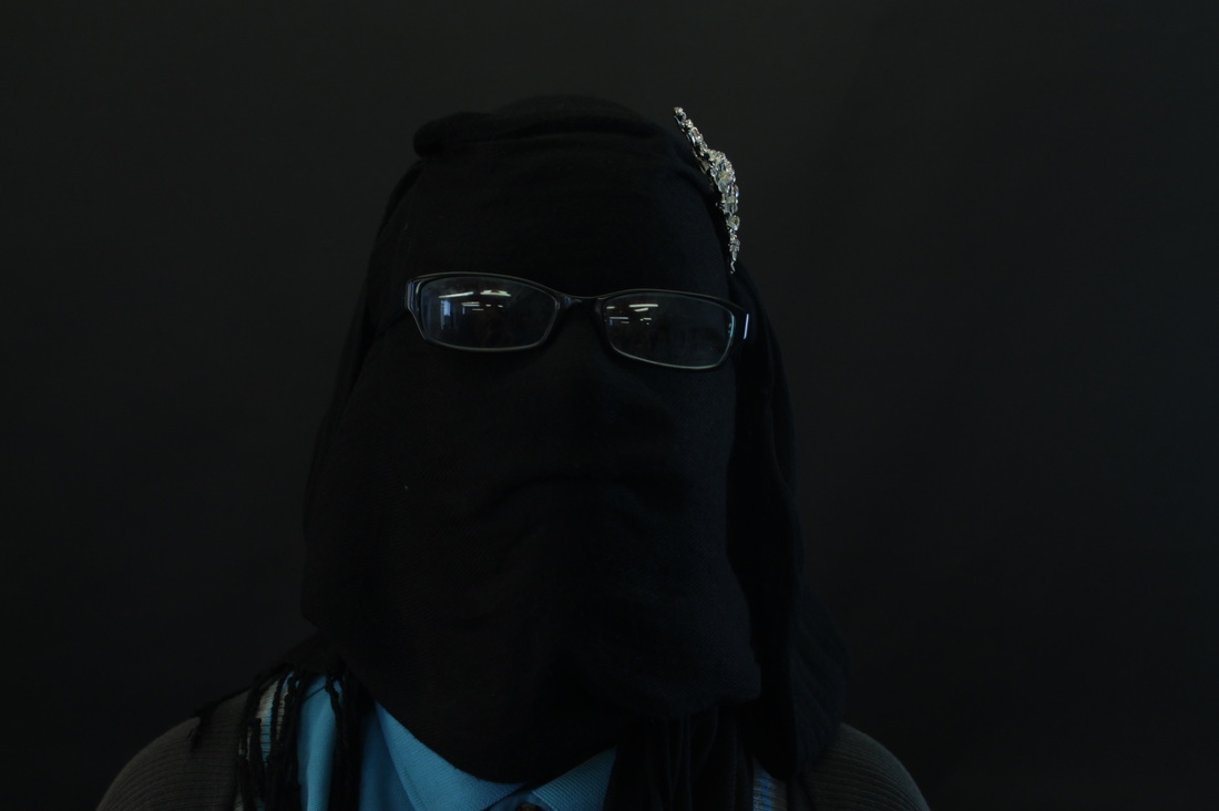
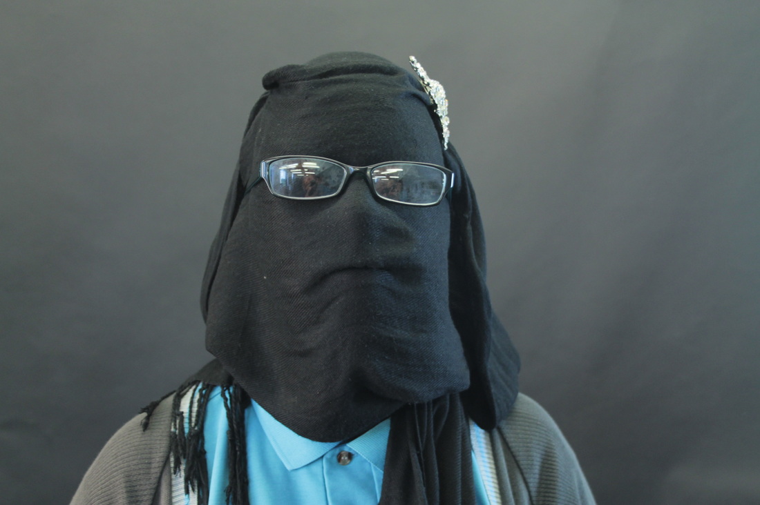
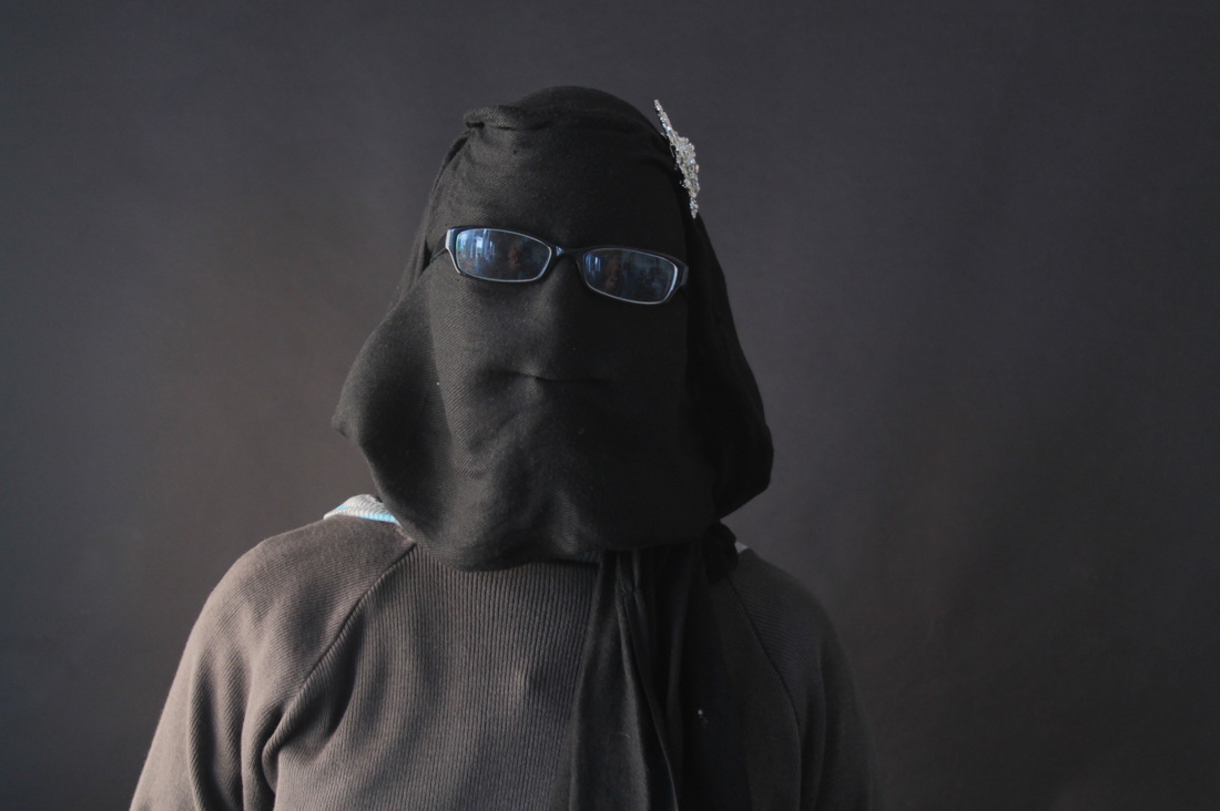
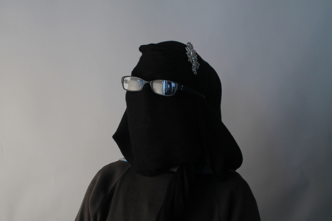
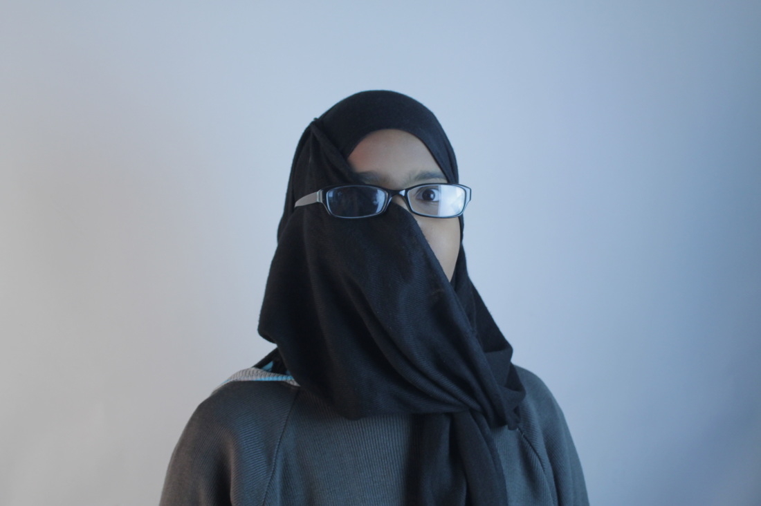
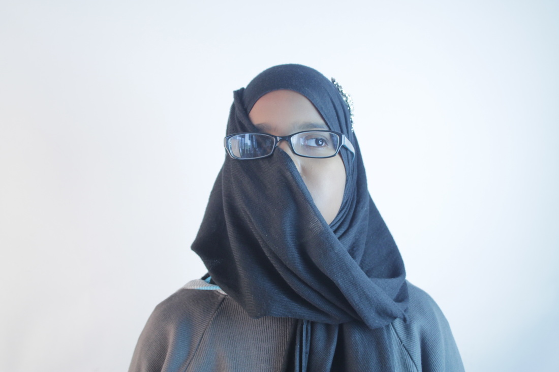
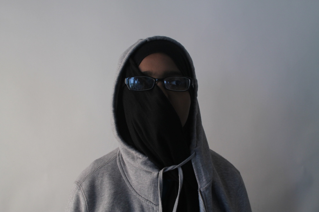
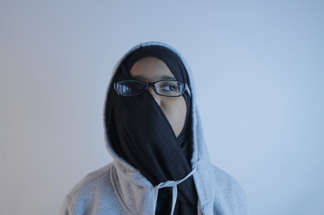
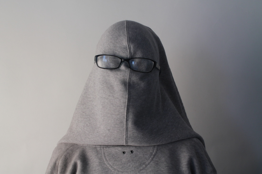
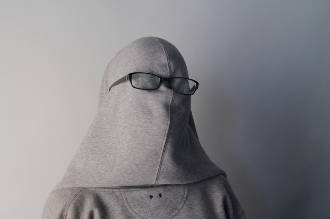
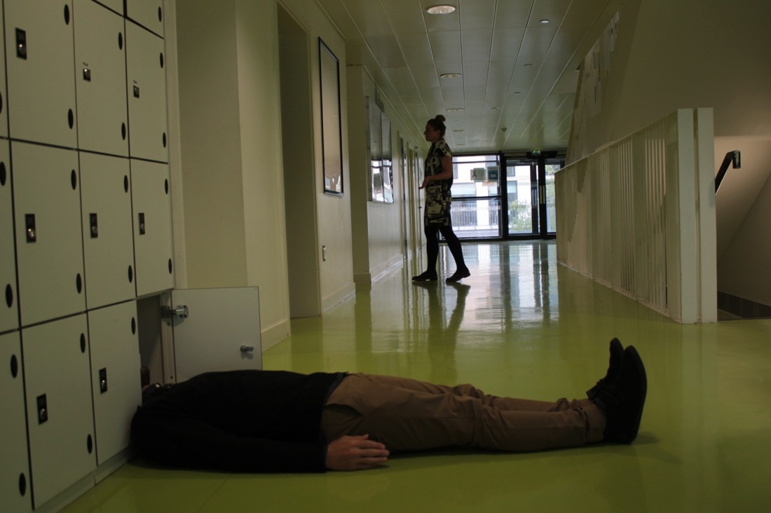
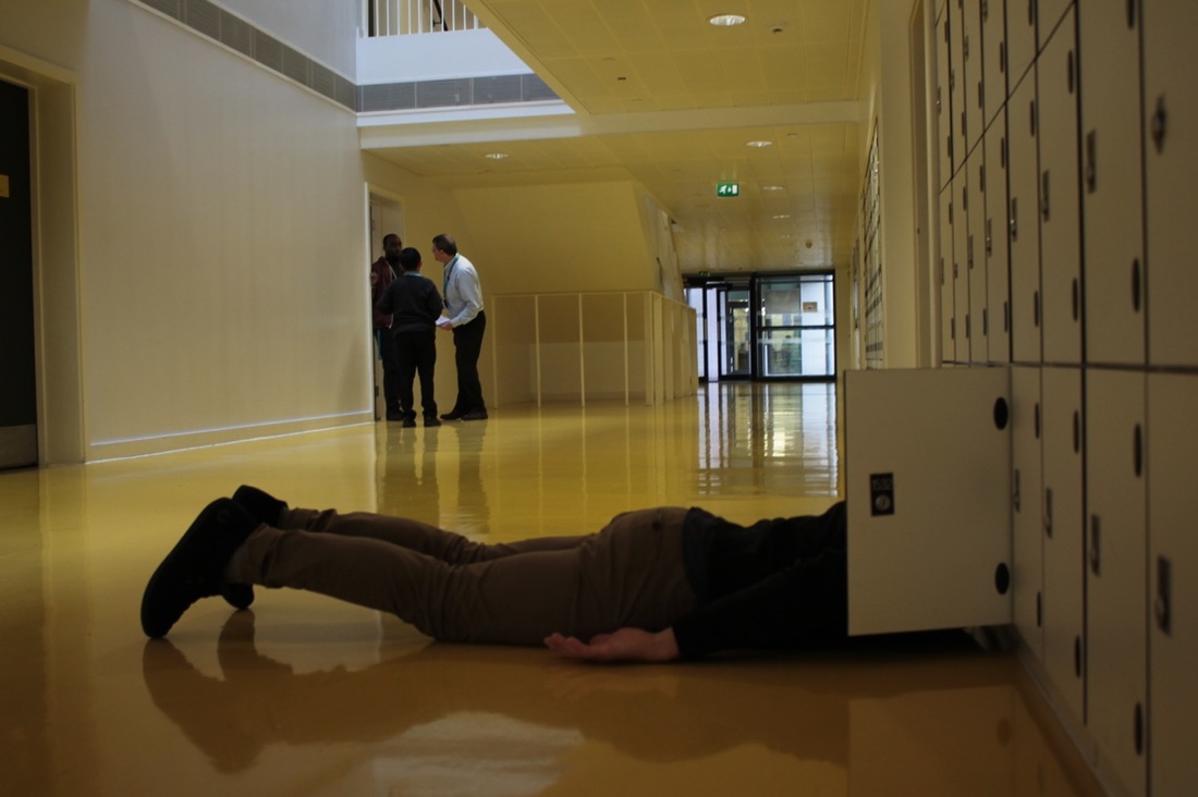
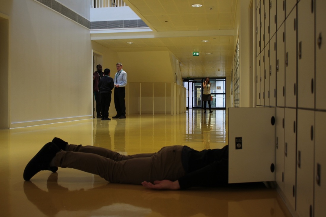
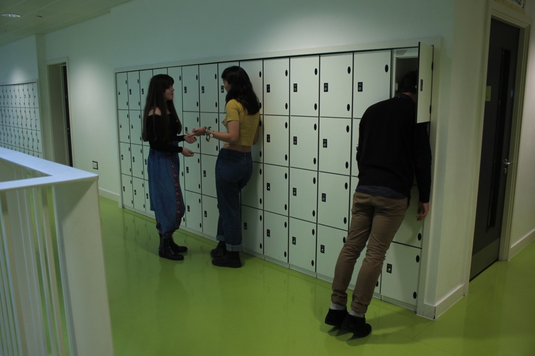
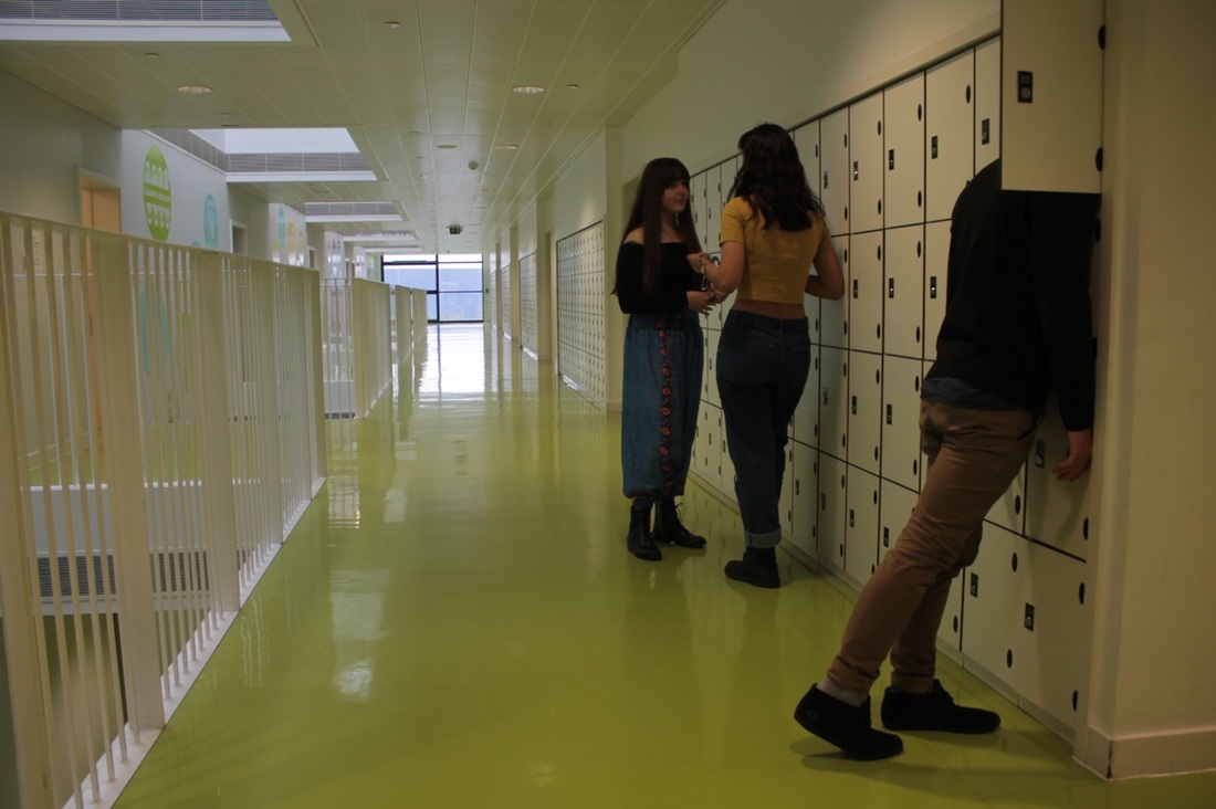
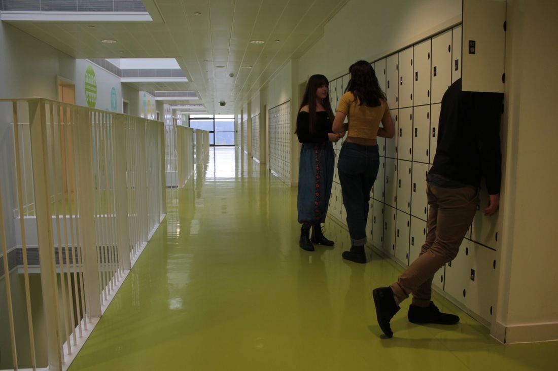
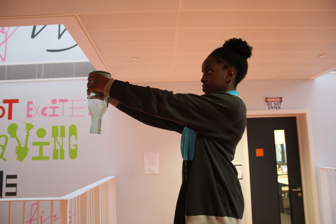
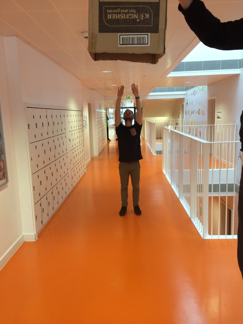
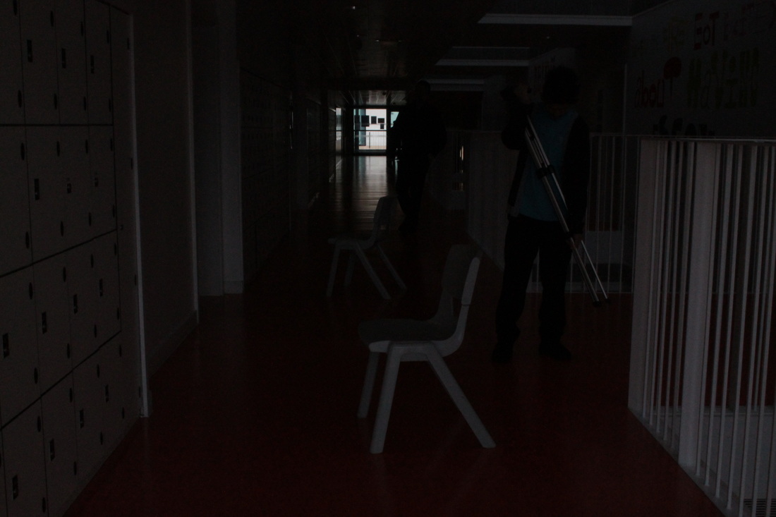
I planned to use something to hide the face so that the face couldn't be seen. I tried taking a photograph of a polystyrene head - placed above my own head - with my jacket on but it didn't look right because the jacket was small. But I just gave it a try to see if it would work. I found a locker which was open and unlocked, so I tried putting my head into the locker. Also, I found a big dirty bin, and tried holding myself upside down with my head on the bottom of the bin (it was quite painful!). I had to hold still, which was hard but I wanted to make sure that I didn't fall out. I maintained my position for a few minutes whilst my partner checked the shot angle. I was thinking, ''Please hurry up; this bin really smells of chewing gum!" Lastly, on at the theme of 'hiding', I had the idea of Soemaya turning round her hijab so that it covered her face and putting her glasses back on, on top, and to show where the opening for the mouth was. I found it really funny and very interesting because you couldn't see the real face; it looked really confusing.
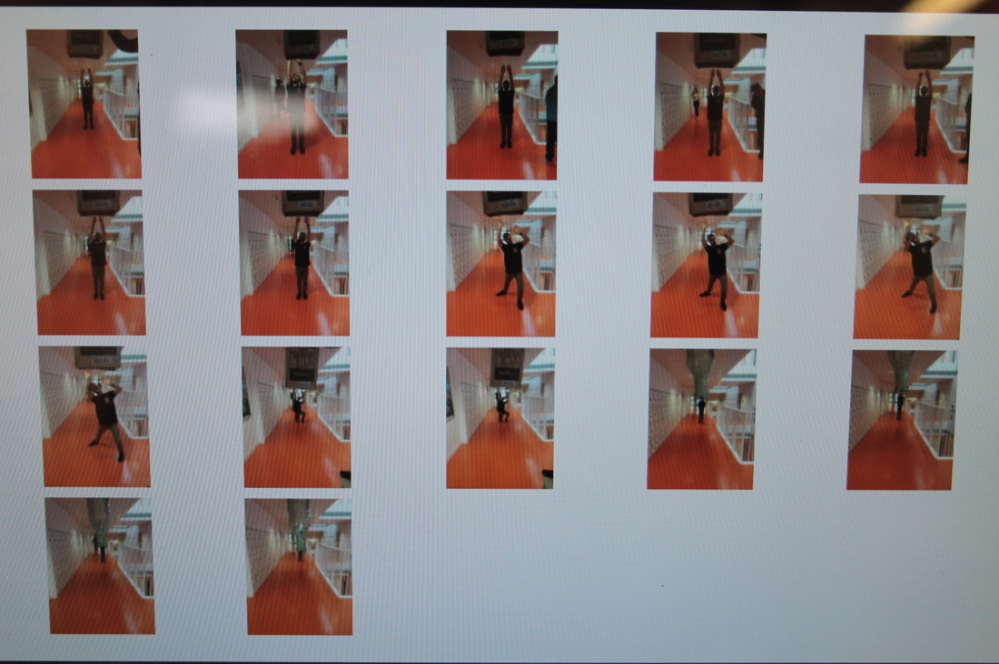
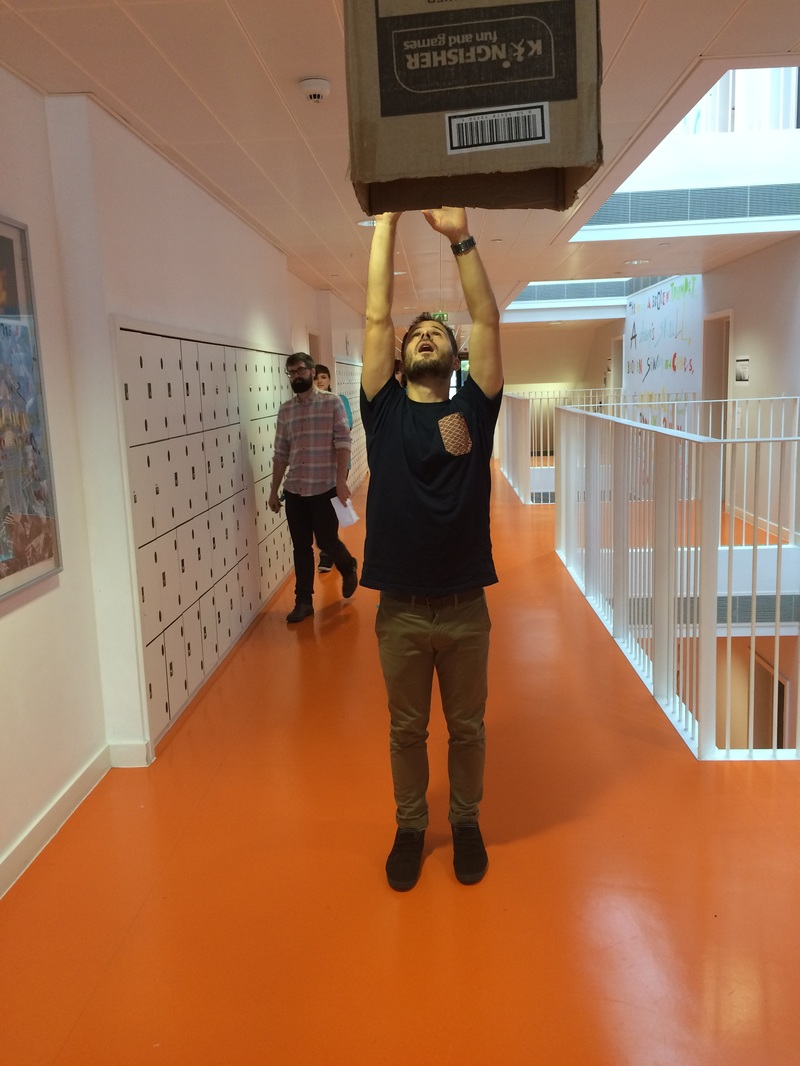
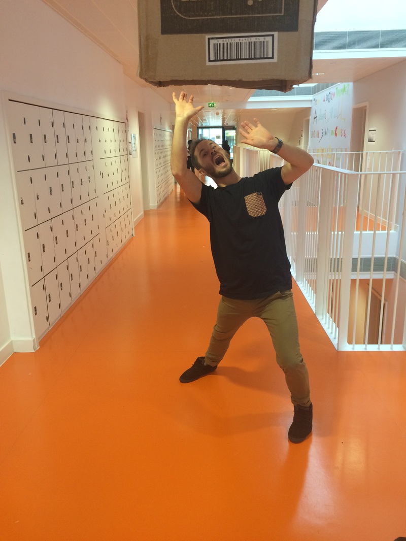
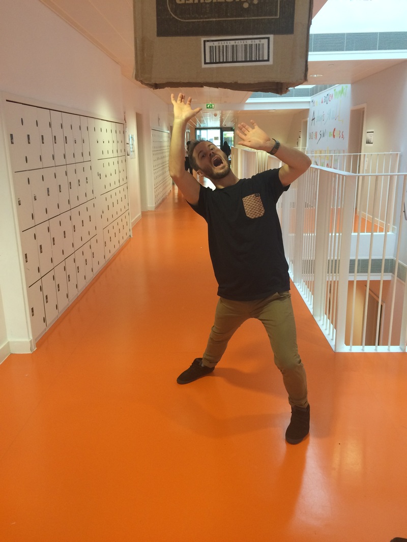
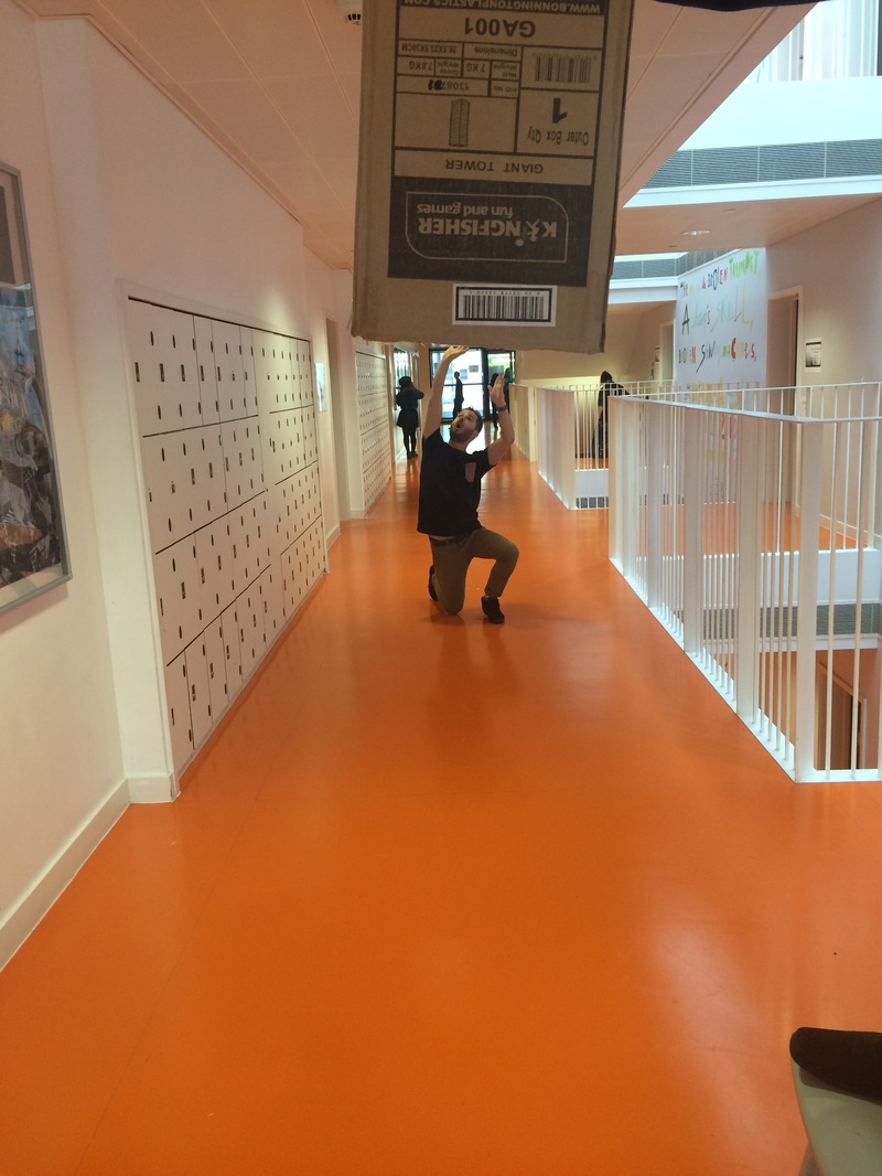
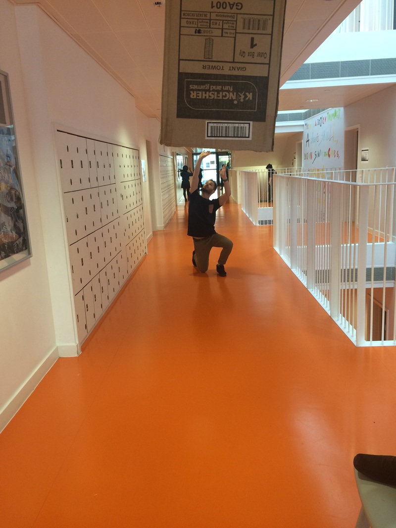
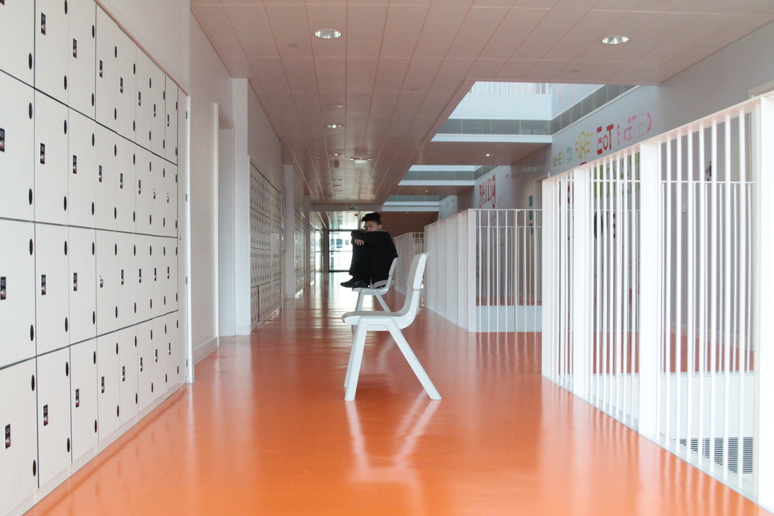
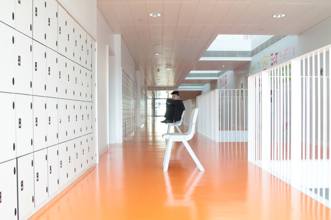
Which one is the best one?

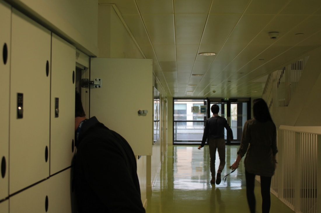
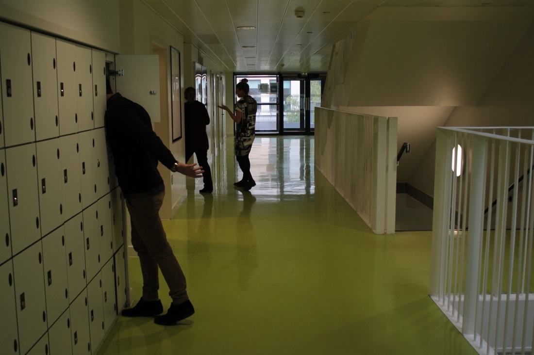
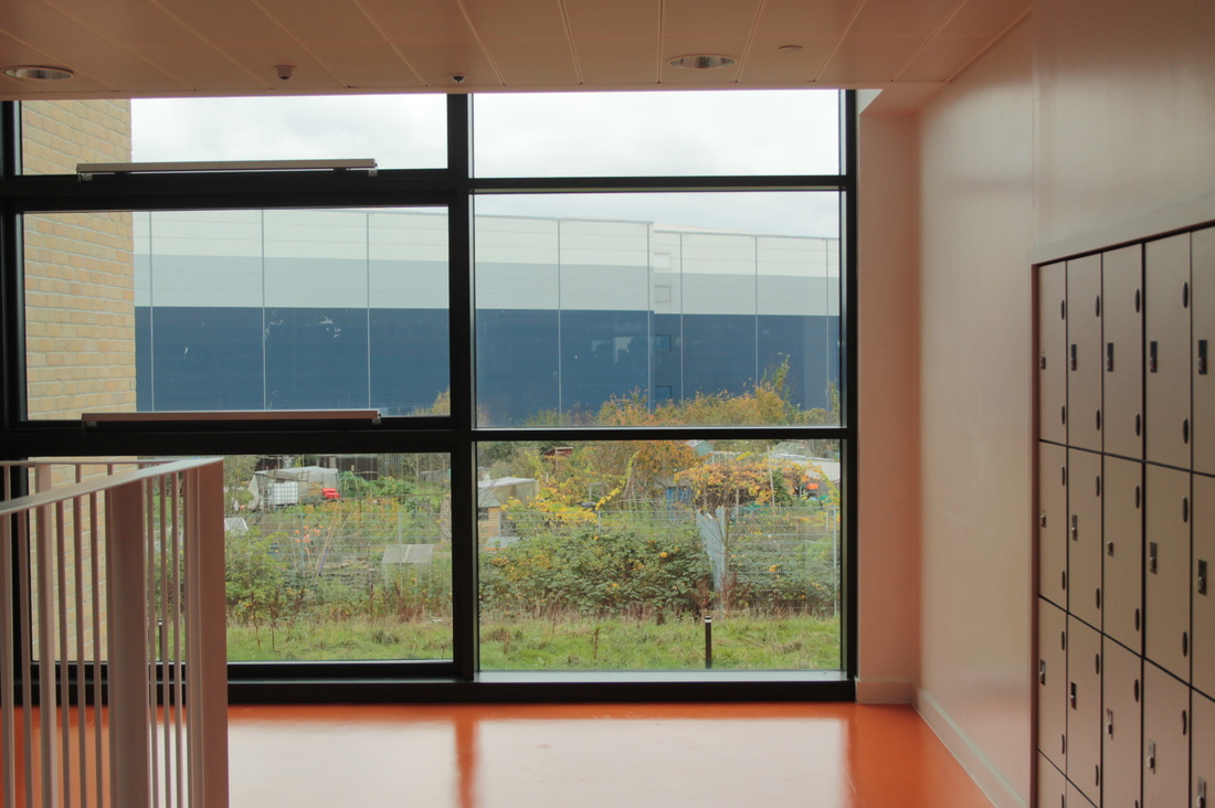
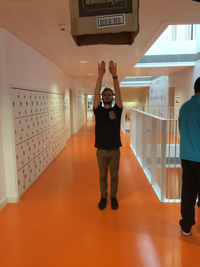
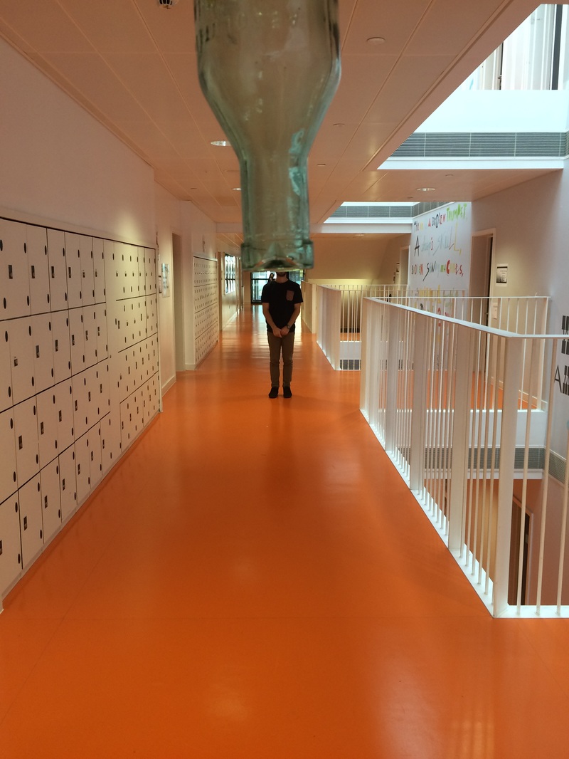
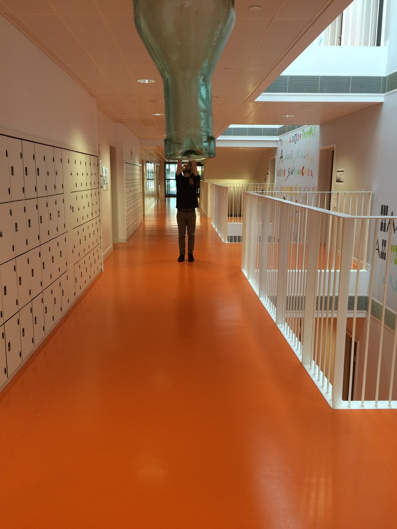
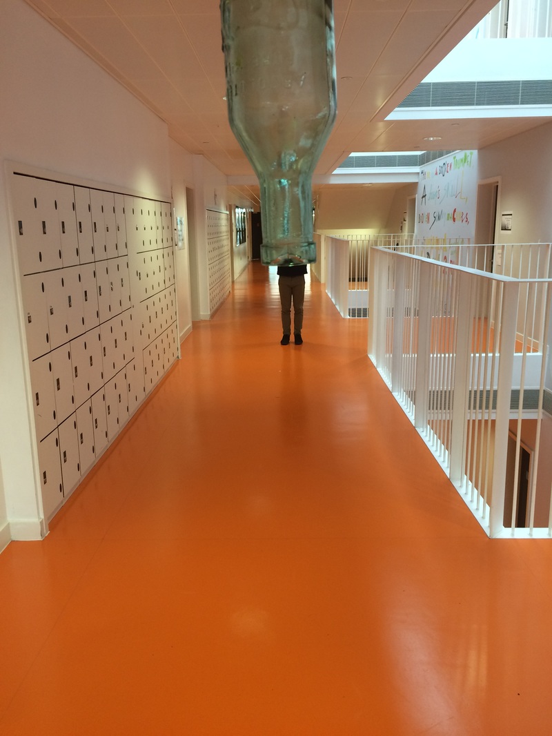
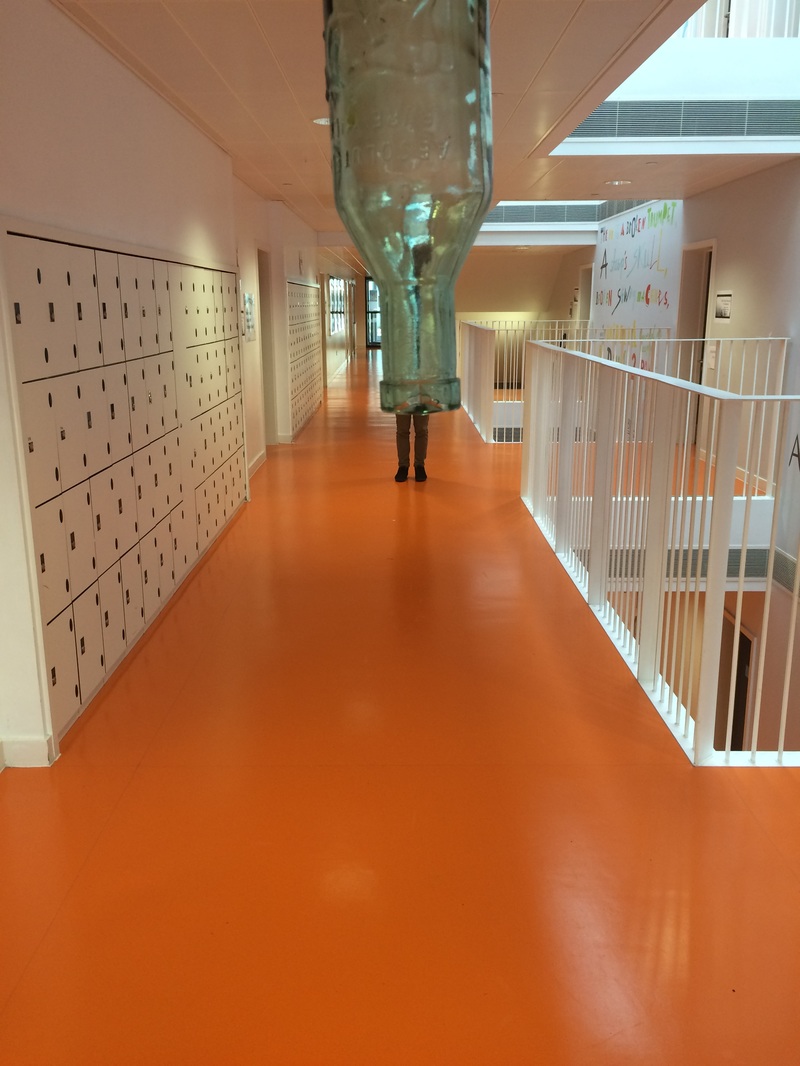
I think this photo looks good because it's a close shot and the quality is good. But it's not particularly absurd; it's just full of lockers and I want to be able to see more of the corridor in the shot.
|

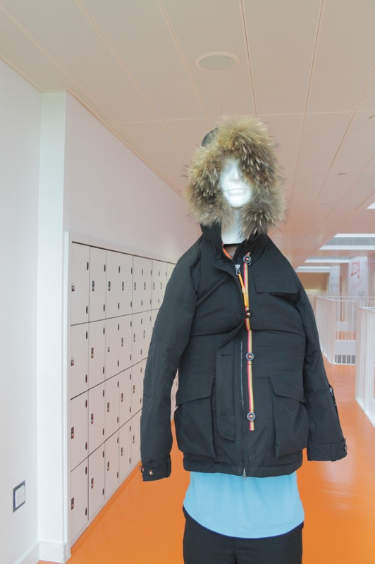
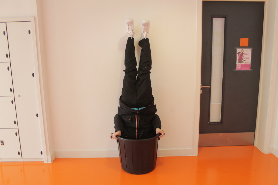
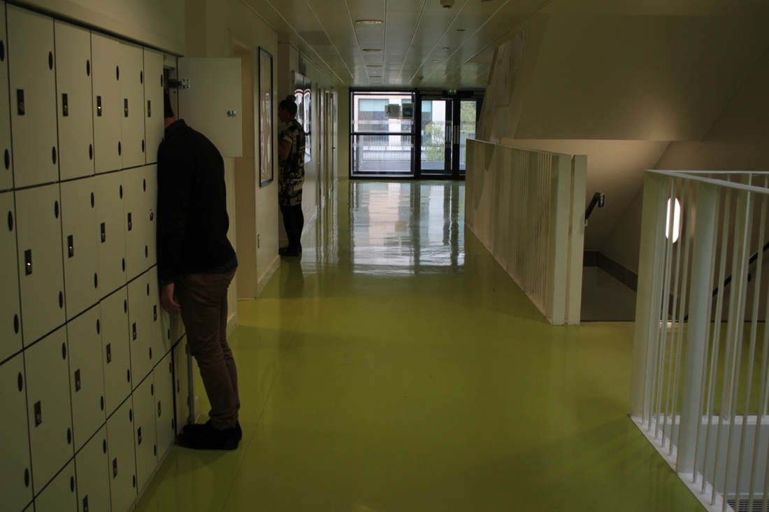
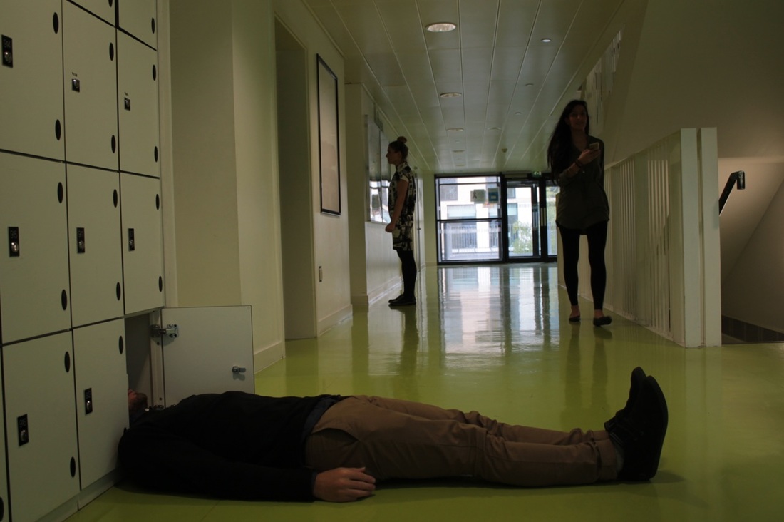
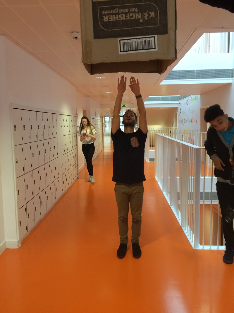
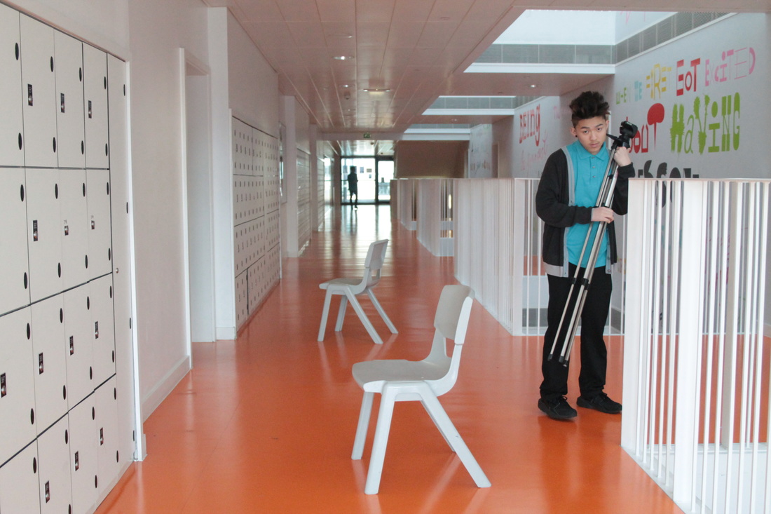
This one looks quite good, but I don't want to see the feet because they don't really link to the absurd theme.
|
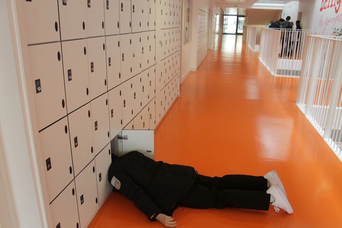
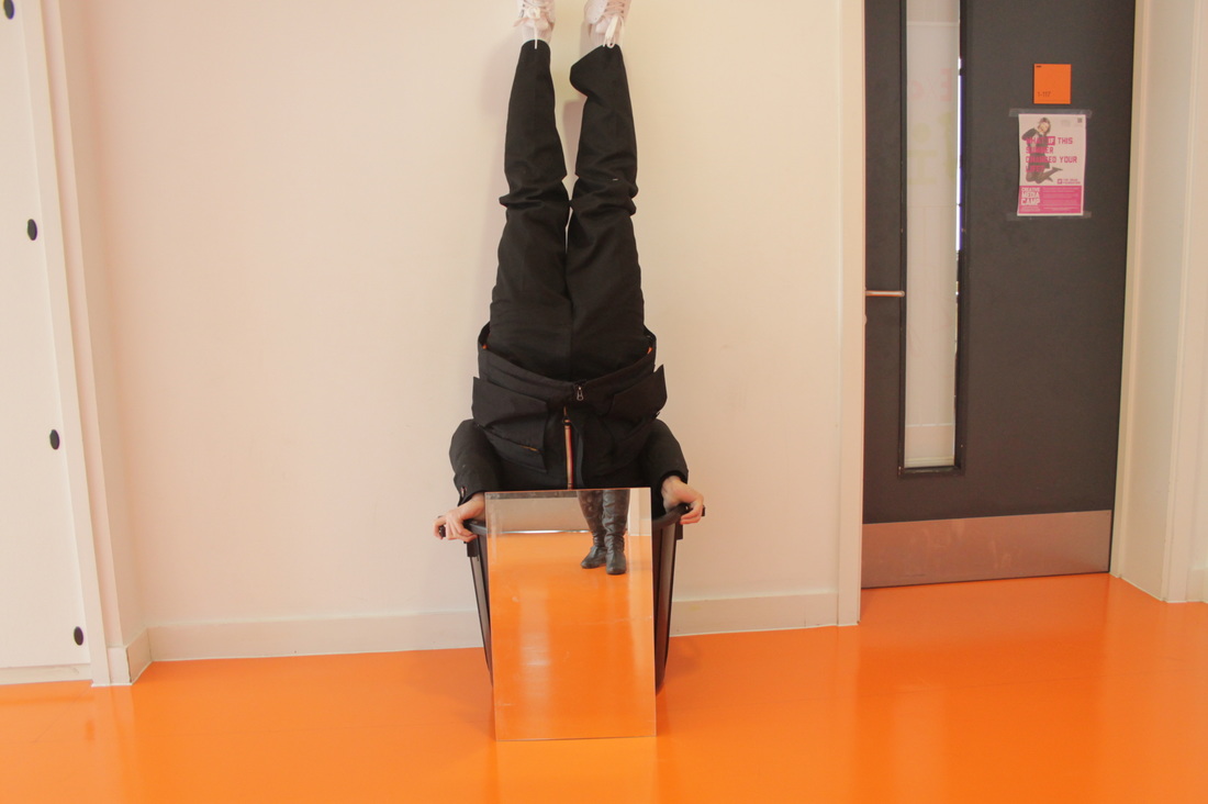
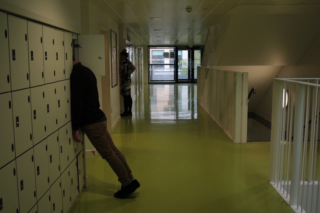
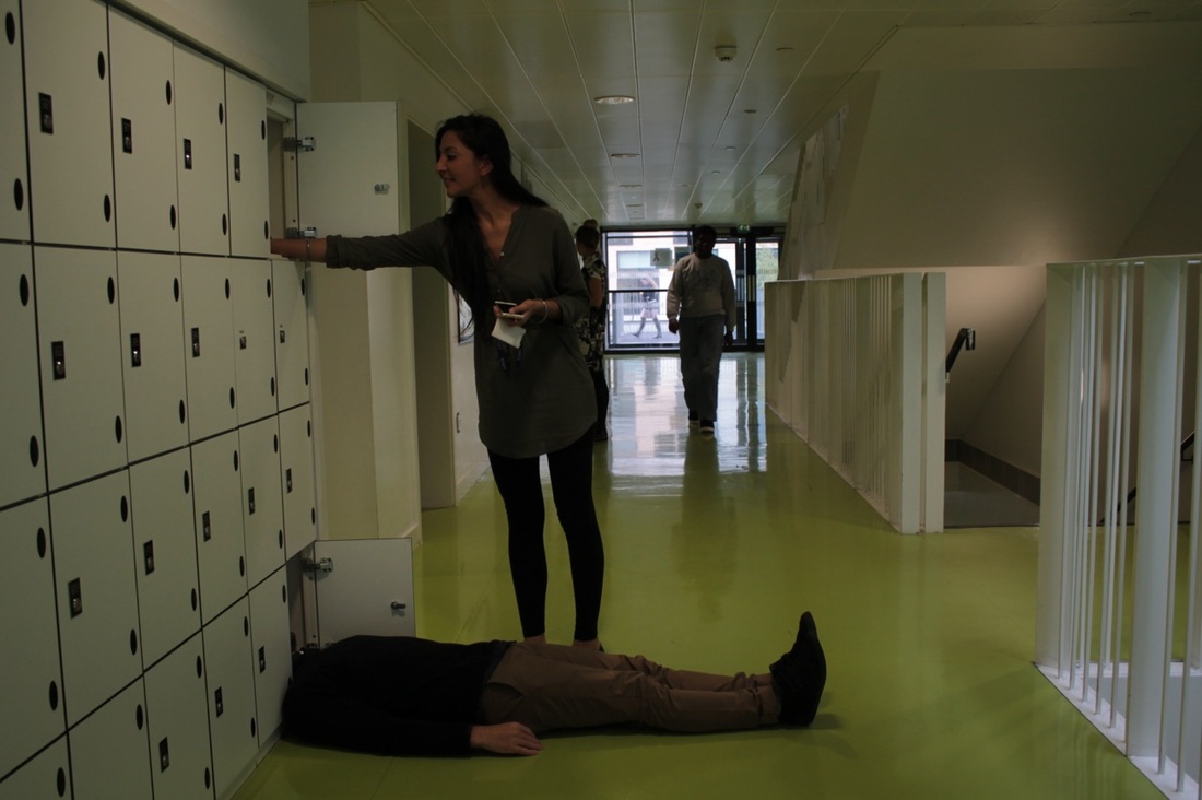
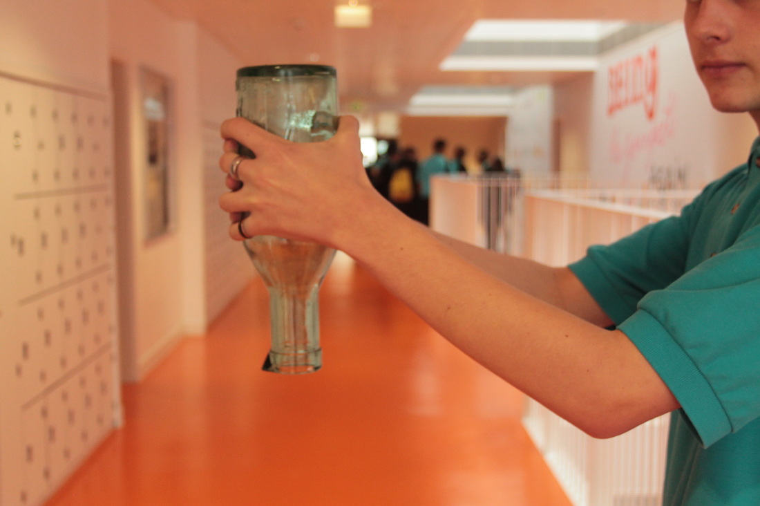
I think this is probably the best one. It looks good because the background is more absurd with people being there, and I like being able to see the corridor and the way light is reflected on the floor. All I need is for the camera angle to be adjusted so that you can see my other hand.
|
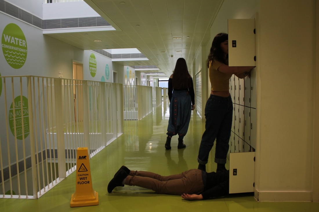
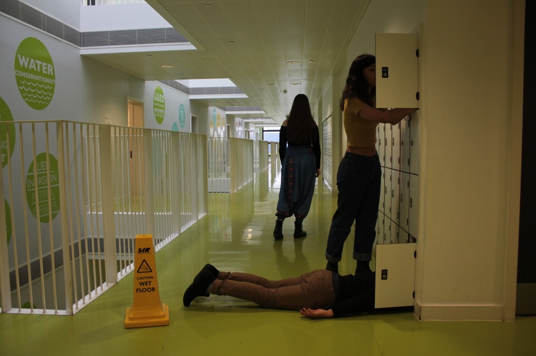
Trying to improving the background
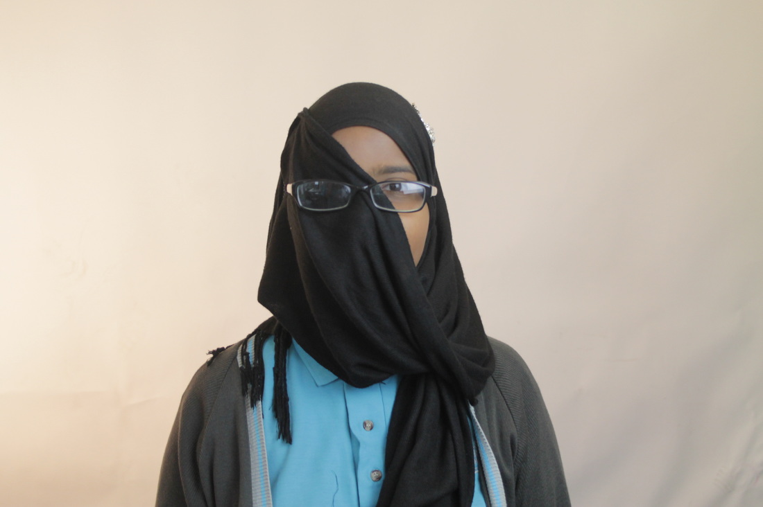
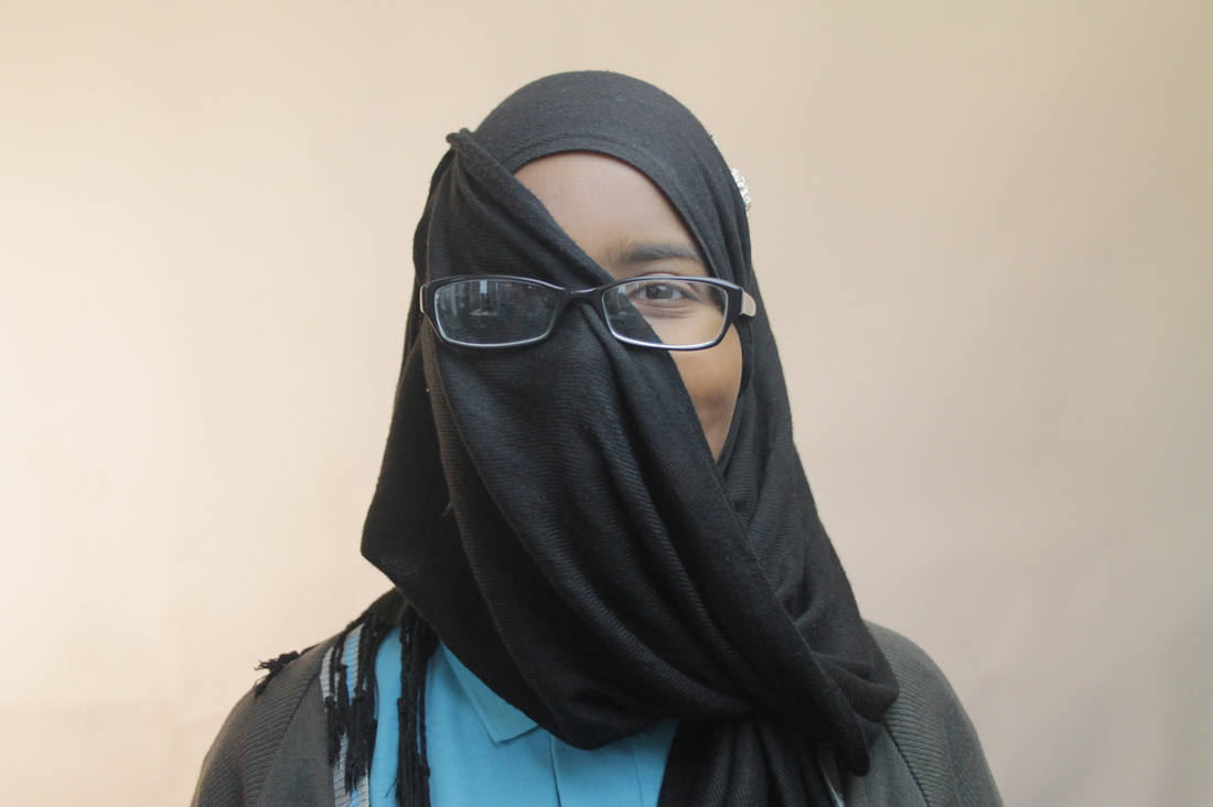
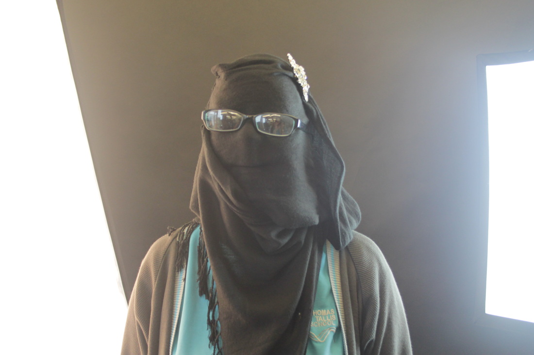
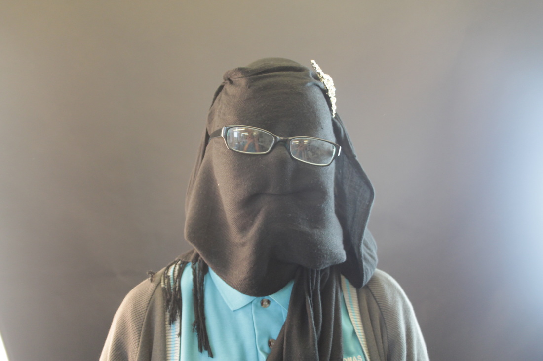
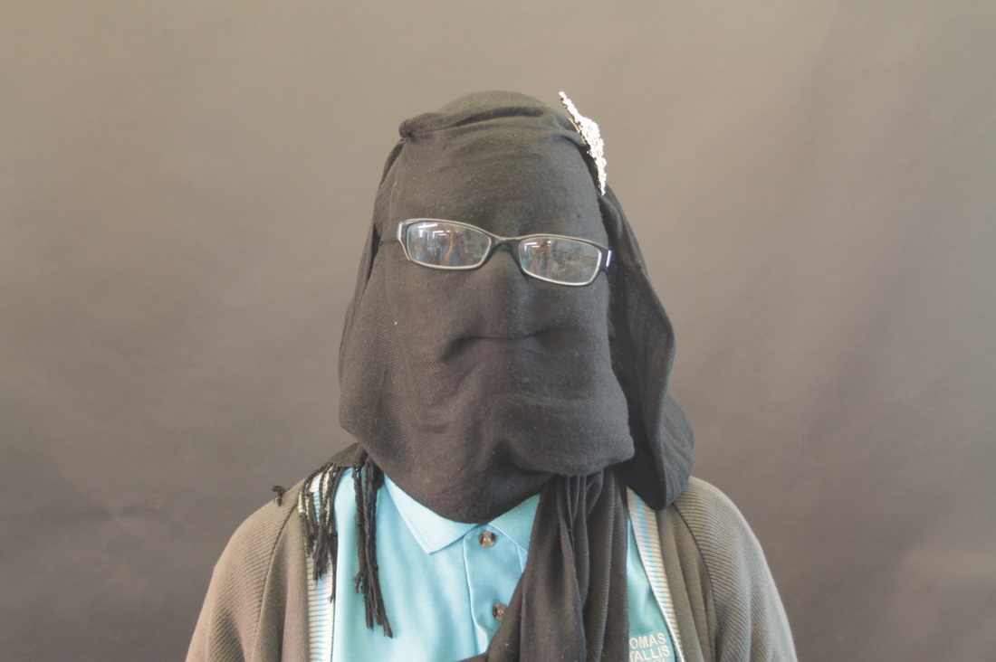
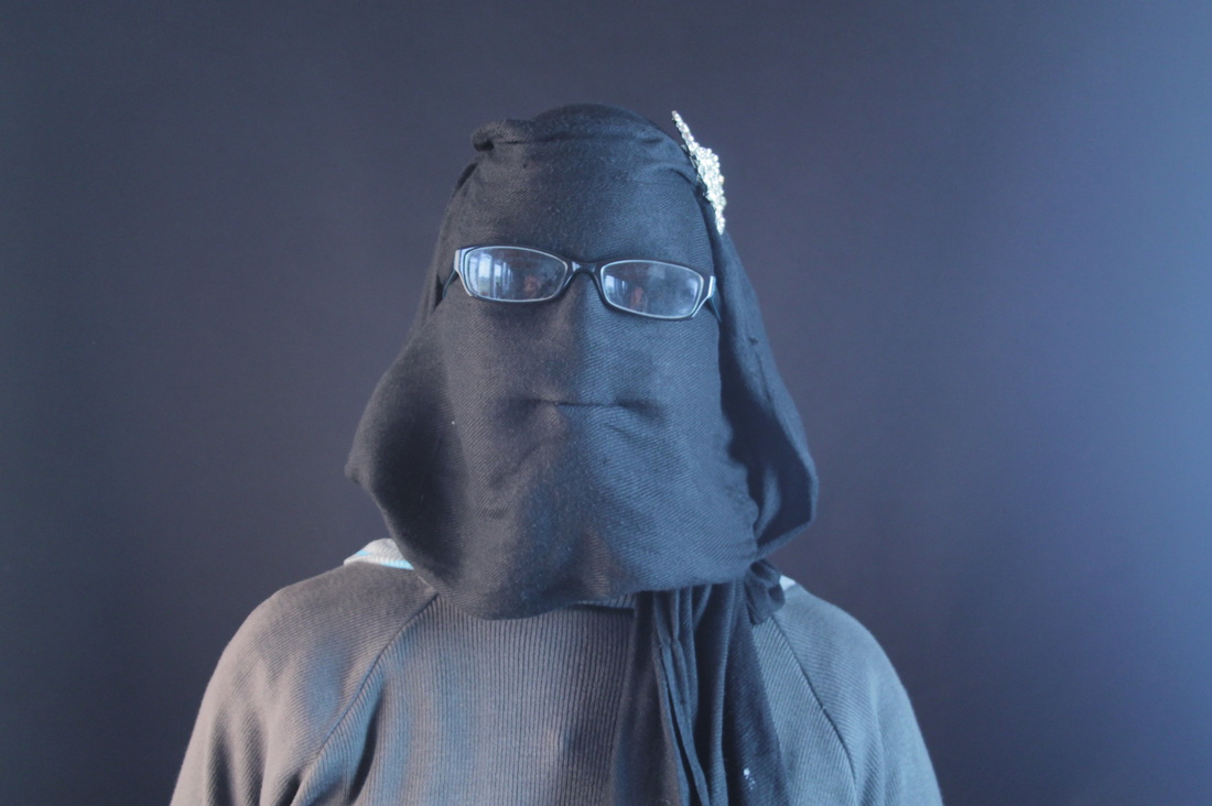
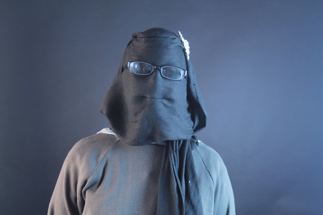
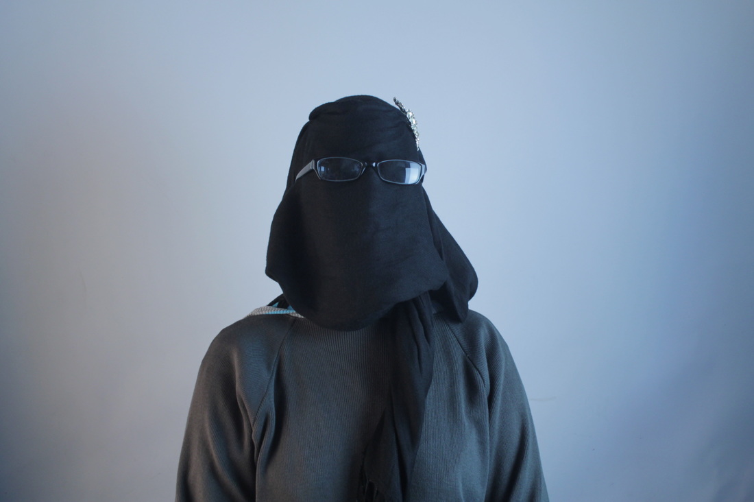
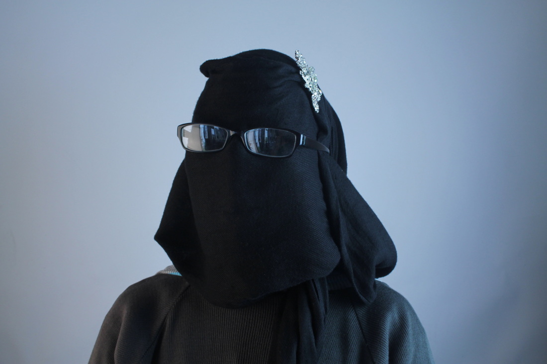
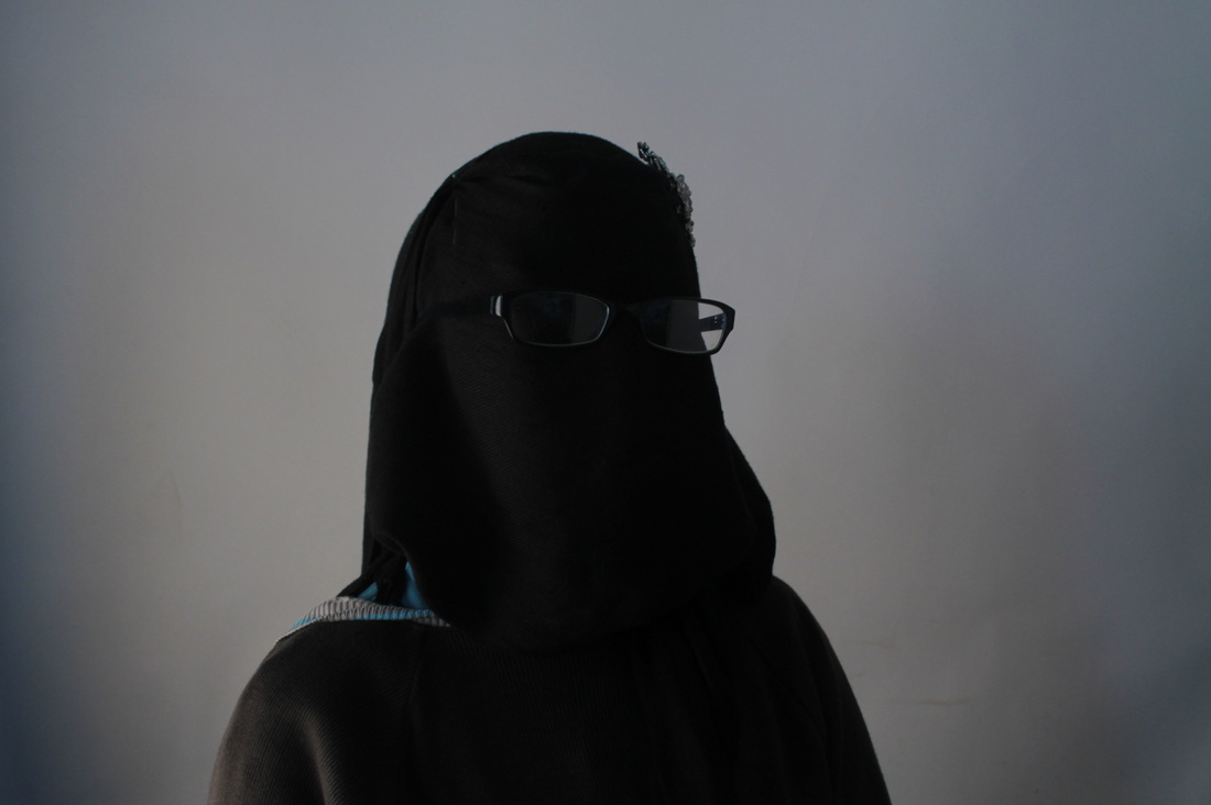
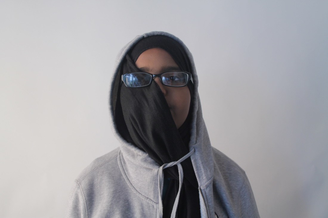
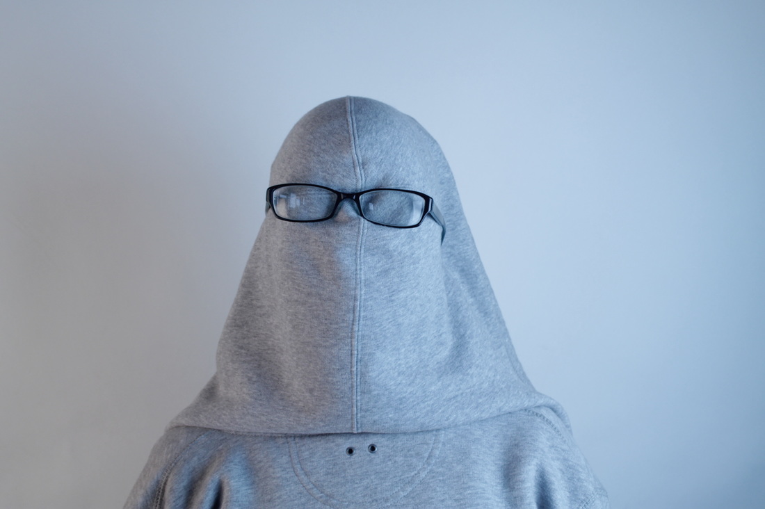
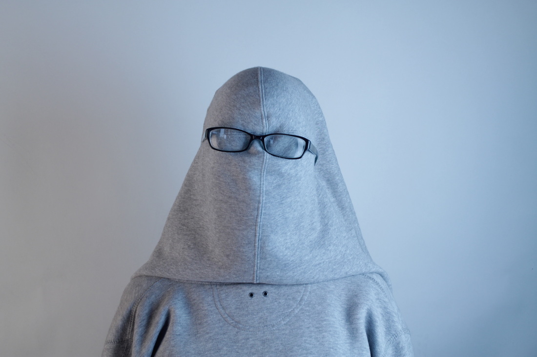
I found the photo of Soemaya a bit distracting because the background had her shadow on it, so I took her to the Photography area. I decided to try different light settings, used a black and a white background and included some props, like glasses, jacket etc.
My tips of Absurd.
|
                    |
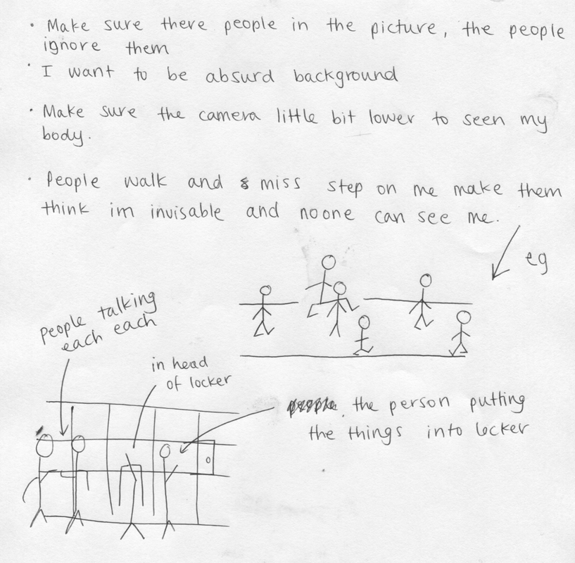
I am writing down ideas on an 'absurd' theme because I need to think about how to do it, how to make it work. Also I'm drawing some lockers with people hanging around and a person with his head in a locker. Hopefully, it will work!
WWW: I am happy that's what I been wanted because it's good thing as I asked some of sixth form and teacher, to get involved the picture which I wanted the photo.
|
EBI:I wanted to make sure the photo needs to be little lighter which are bit distracted photo, I can do that in Photoshop to get better effects to matched.
|
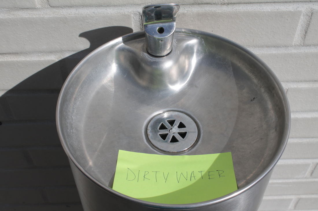
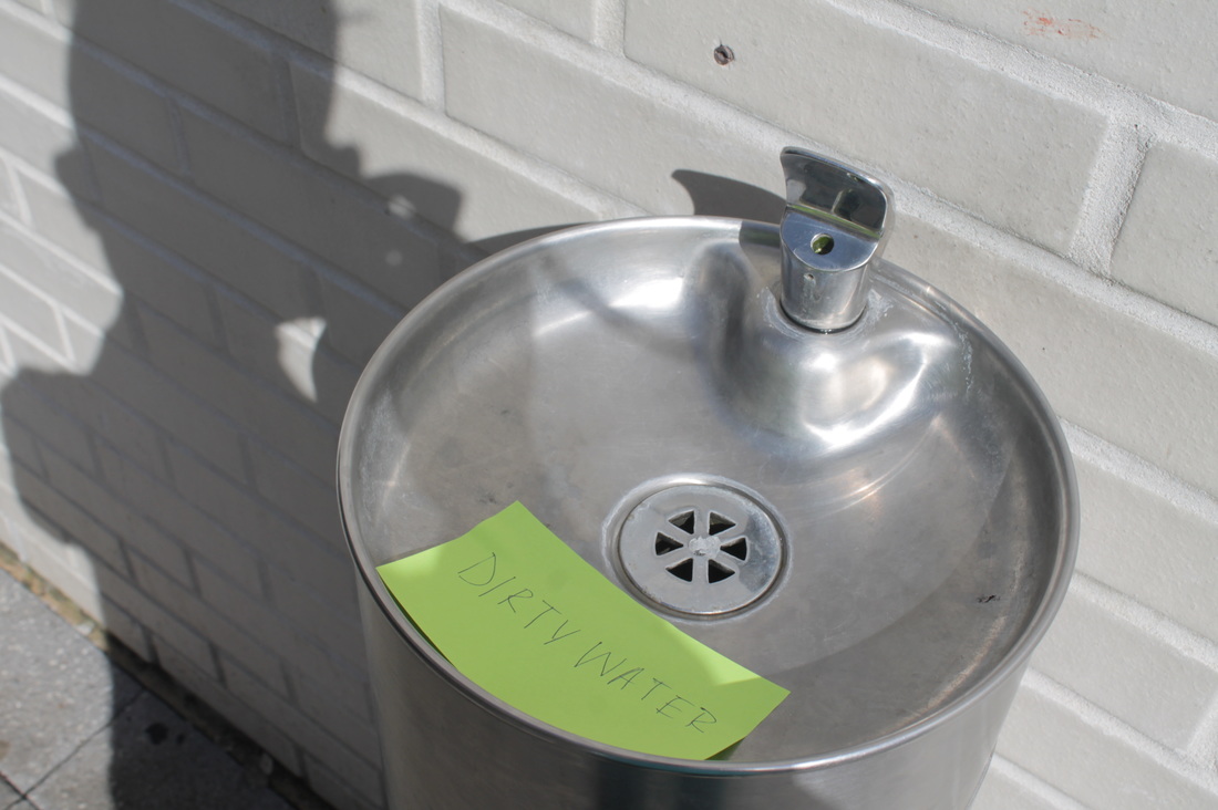
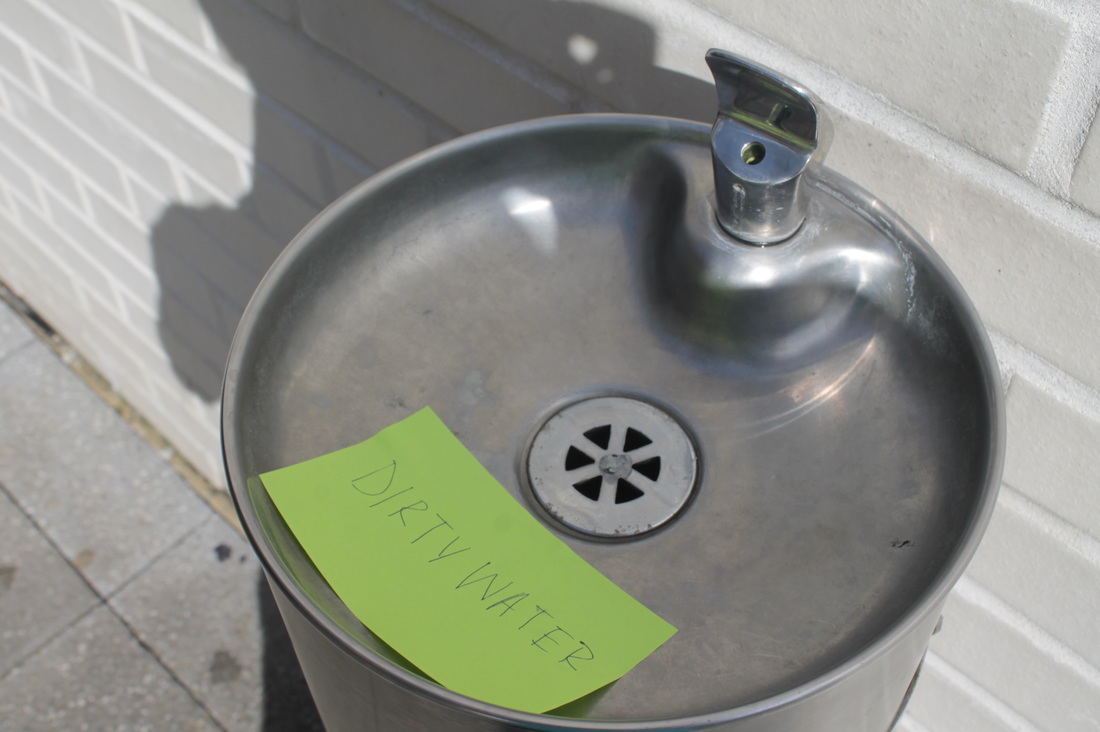
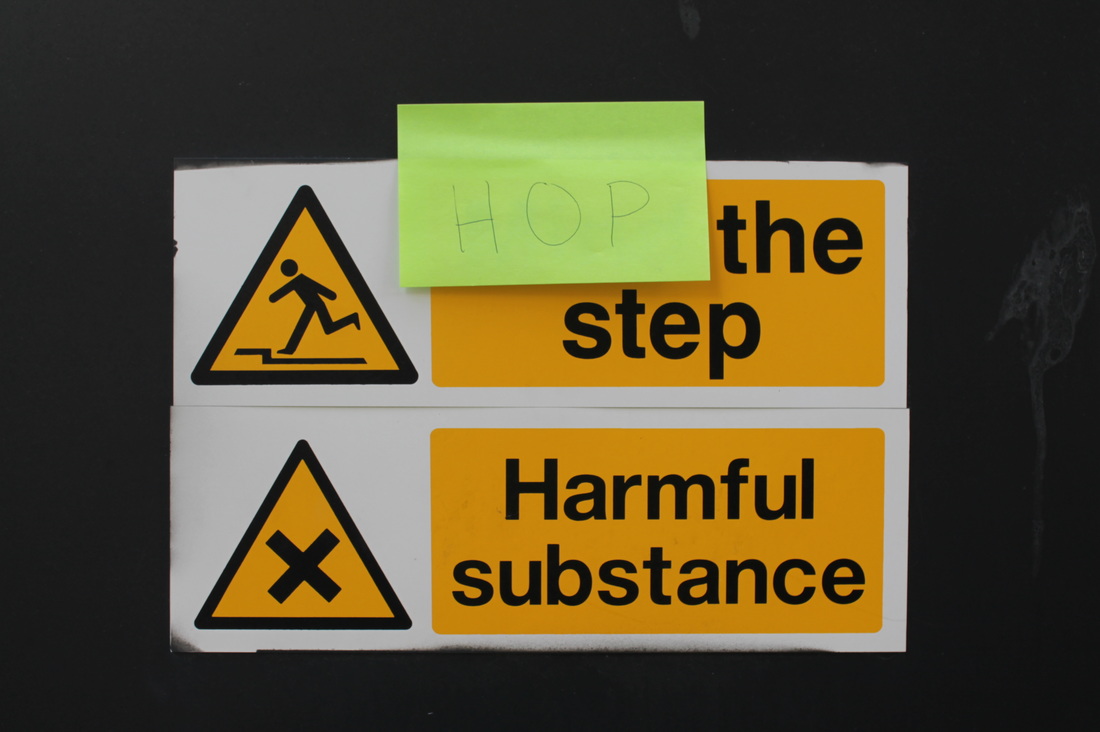
Activity 3: Signs
The artist: David Shrigley
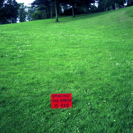

David Shrigley is a British visual artist, he captures absurd images of objects and animations etc. Though he has a wide range of photographs, i've decided to focus on his collections which shows very weird and creative signs. His images are very simple and minimalist, since he captures just a singular object in the foreground, alongside a white plain background, allowing the object to stand out. One of his images include the one on the left, which depicts a sign hanging from the wall with a sign saying 'hanging sign'. This is something very obvious and pointless, yet it still provokes a sense of creativity and absurdity. Though this image is very basic, he has made it seem more interesting my writing in an irregular font, instead of a formal neat one, so the sign seems quirky.
i have been inspired by Shrigley to capture similar kinds of photographs, by making signs with post-it notes, and handwriting obvious yet creative signs.
i have been inspired by Shrigley to capture similar kinds of photographs, by making signs with post-it notes, and handwriting obvious yet creative signs.
|
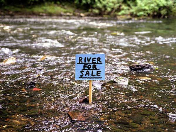
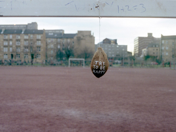
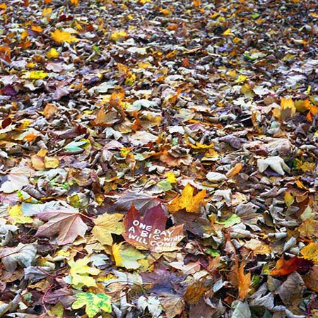
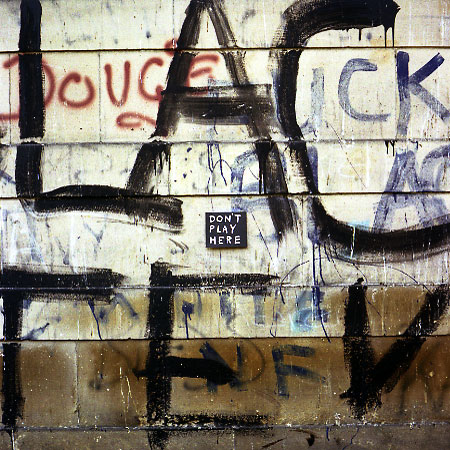
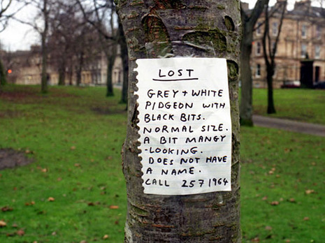
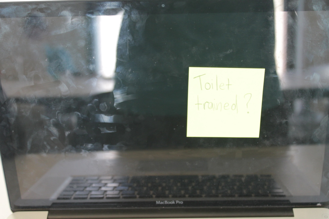
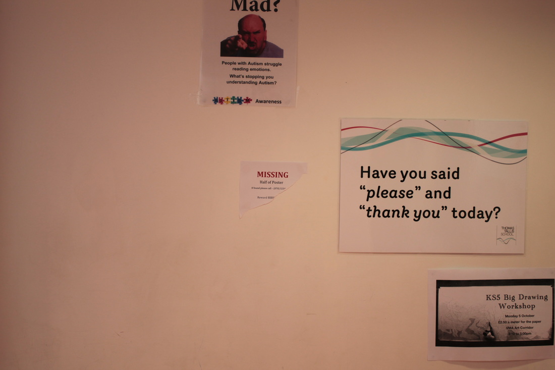
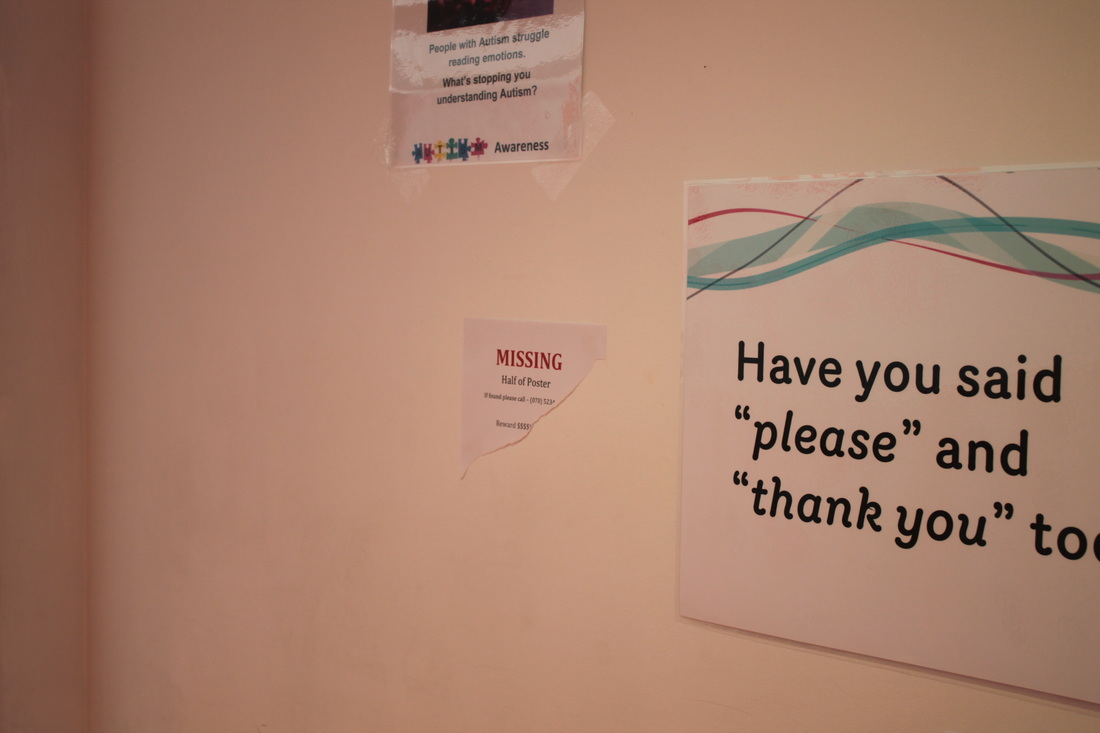
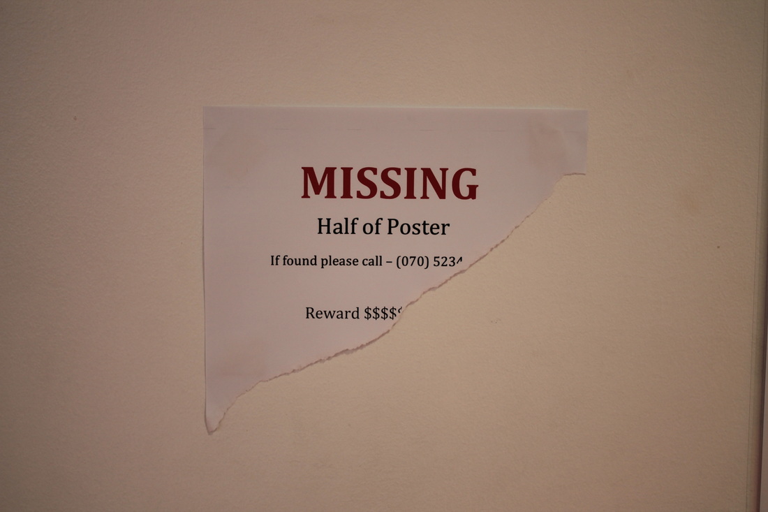
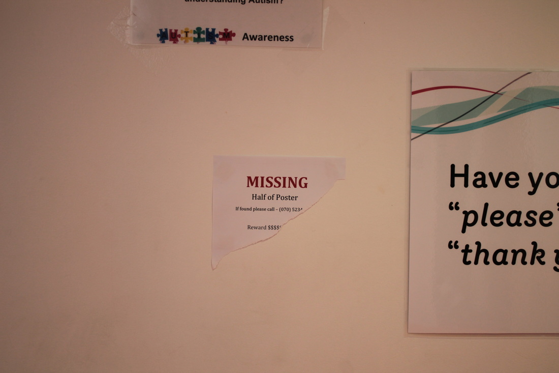
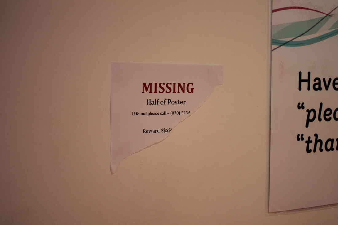
When I saw the picture of those make me look really confused and like 'what the hell' because I have no idea why they doing like that? For example, when I saw the image of 'LOST Grey and white pidgeon with black bits. Normal size, a bit mangy looking. Does not have a name' make me feel it's doesn't really helpful to find them because all of the pigeon are exactly same colour of skin also that poster won't be giving a award if you actually found them.
The man artist motivation is to trying make people look dumb because when the people looking at the images and it does make give you extra idea of those images. It is important to take photograph of the sign because it's make you wanted to know more about this images, also the artist take a picture of this images before everyone having seen it before. |
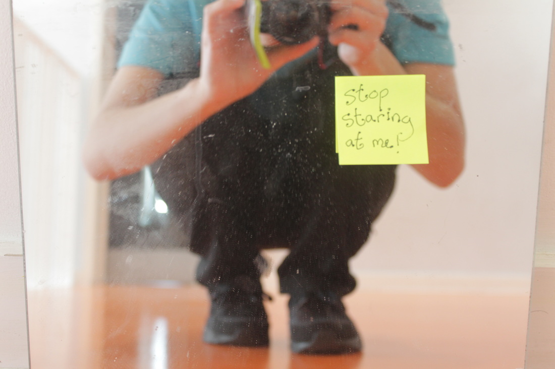


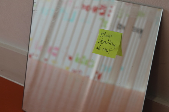
When you're always on the mirror and check if everything your face or hair look fine, so I am putting 'stop staring at me!' because imagine the mirror is a person and everyone staring at this mirror.
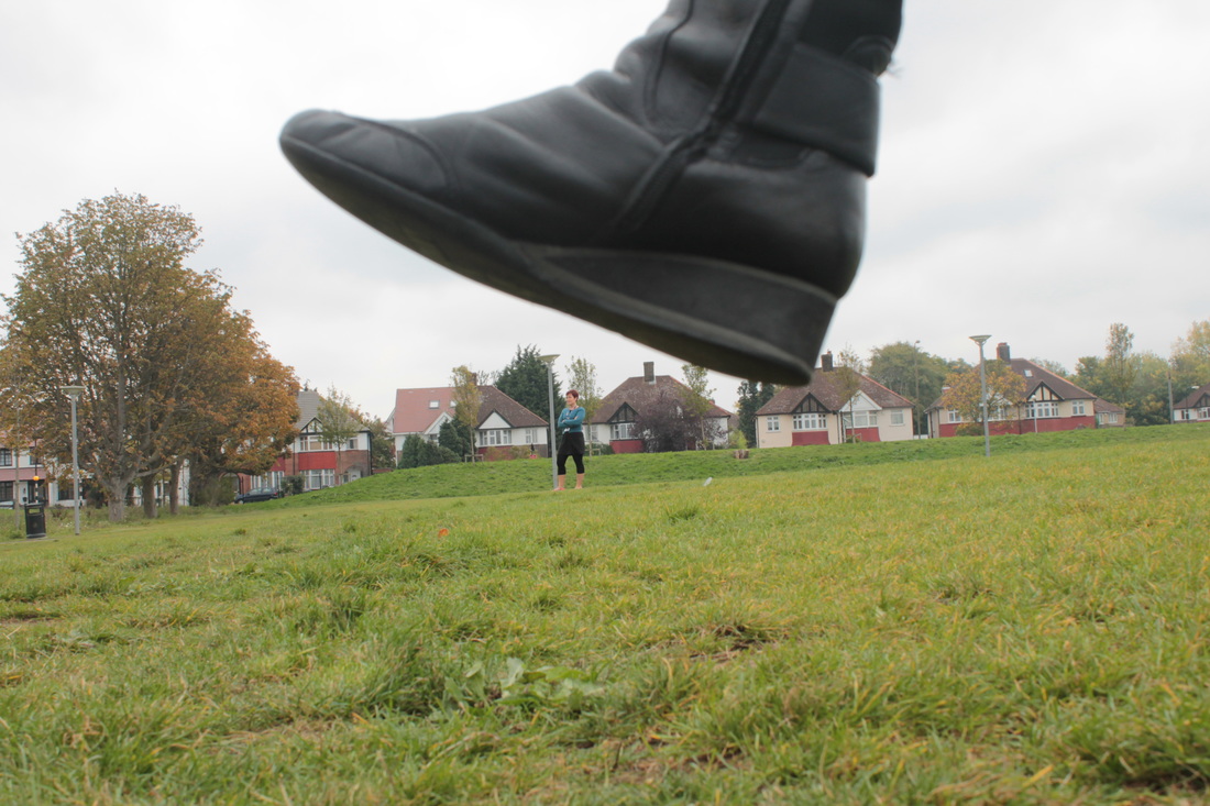
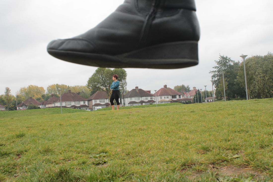
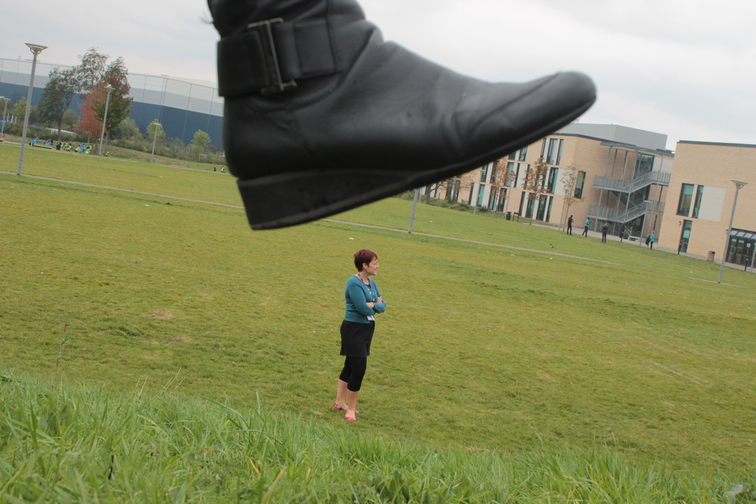
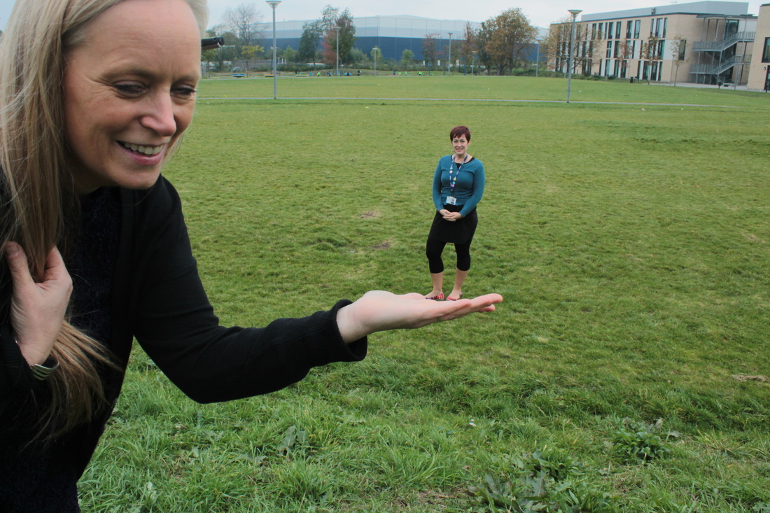
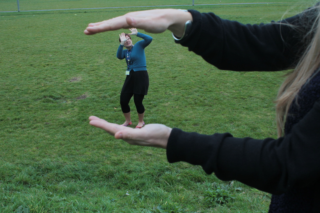
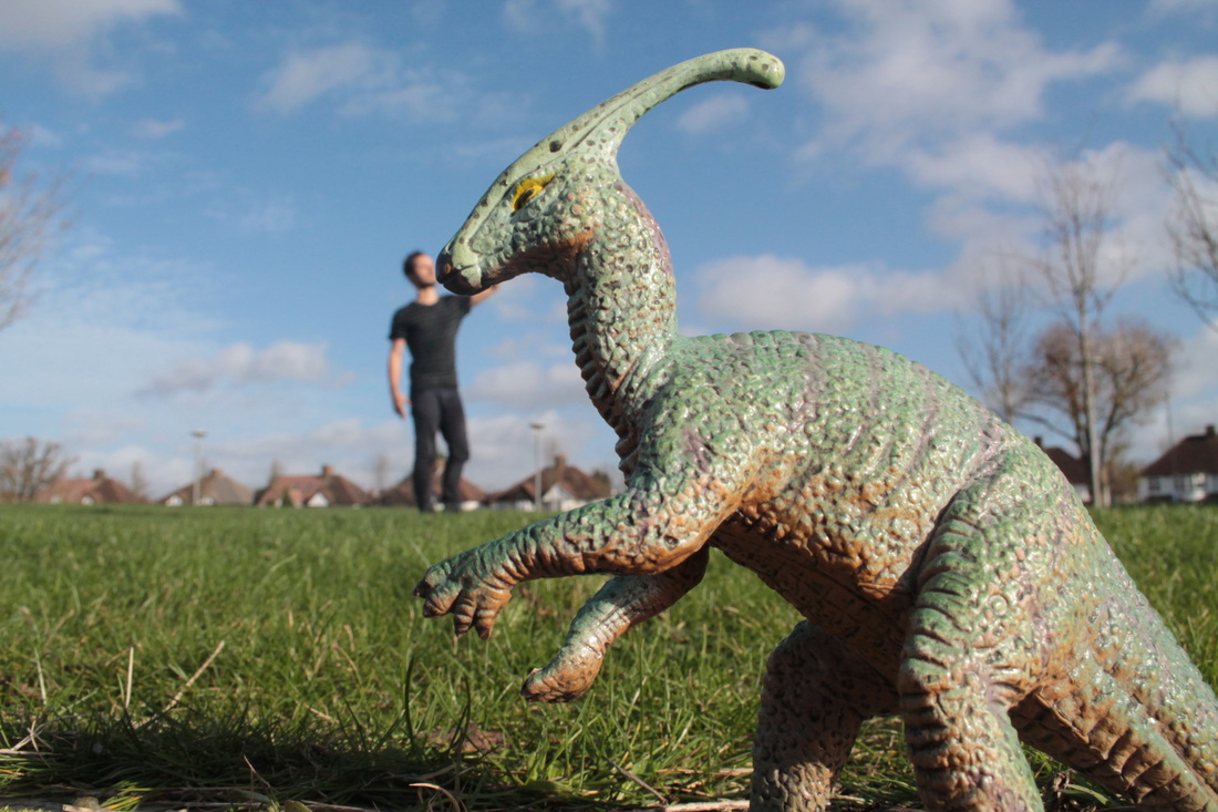
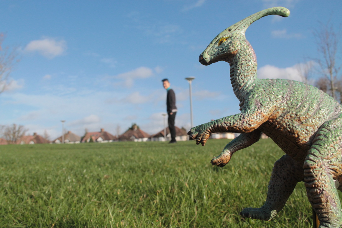
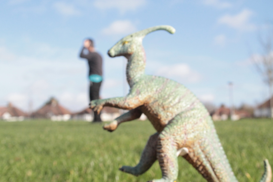
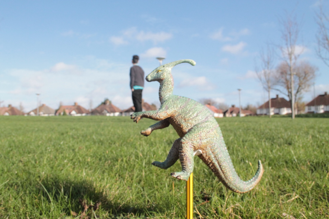
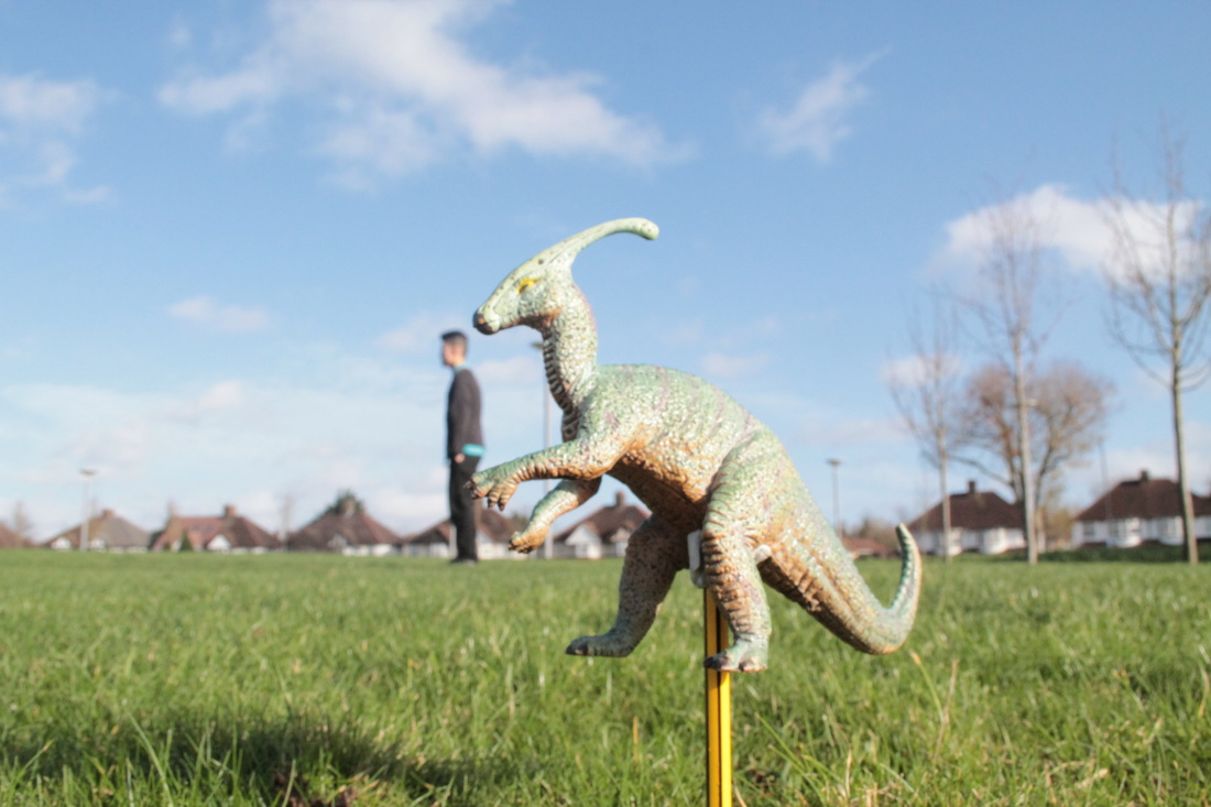
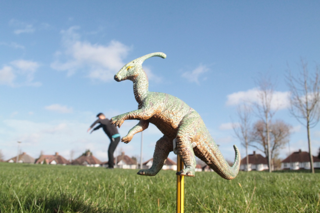
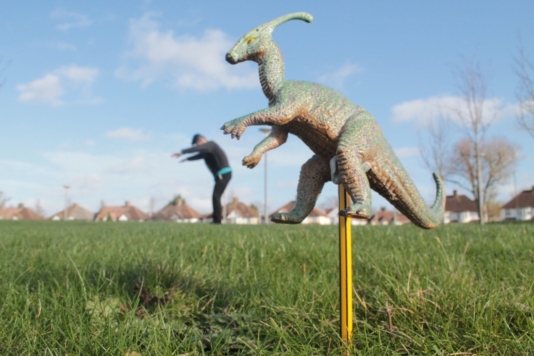
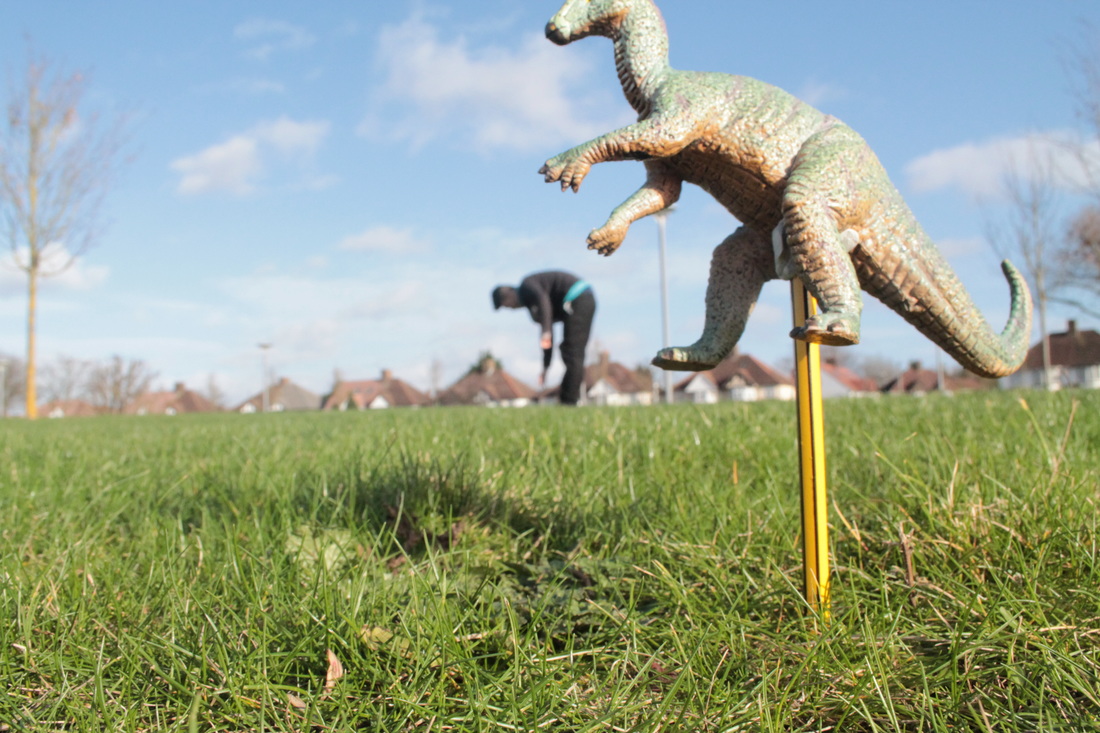
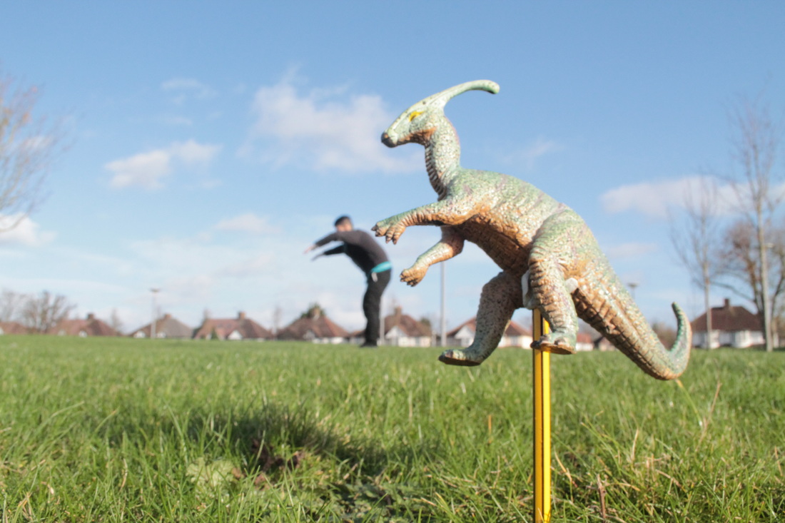
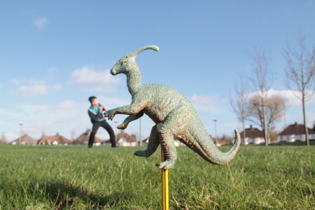
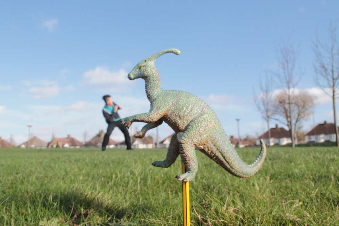
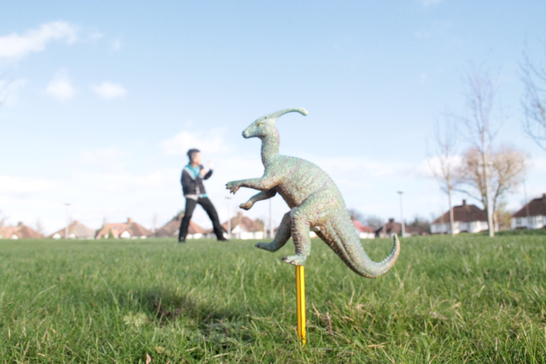
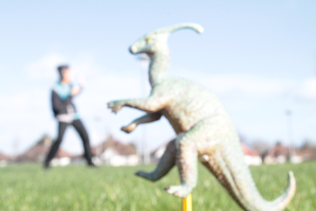
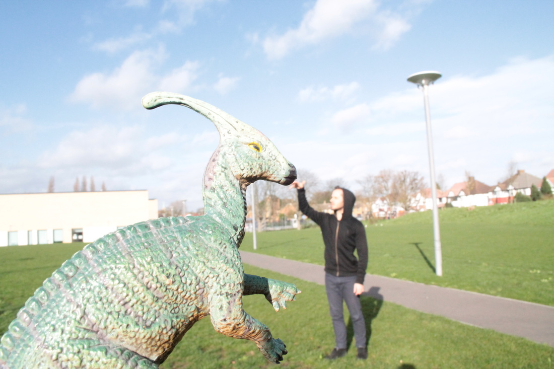
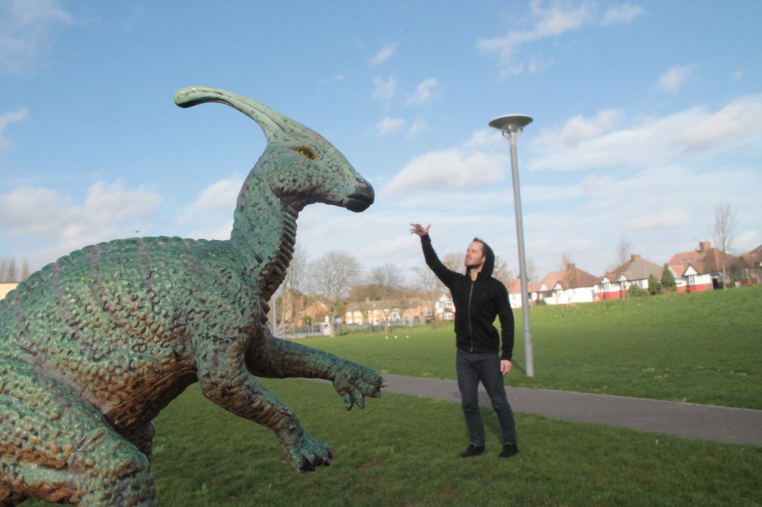
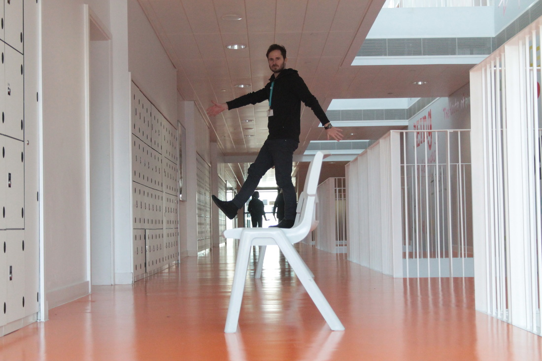
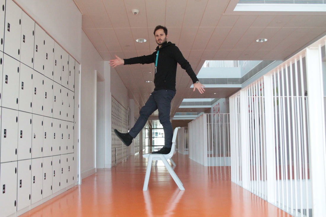
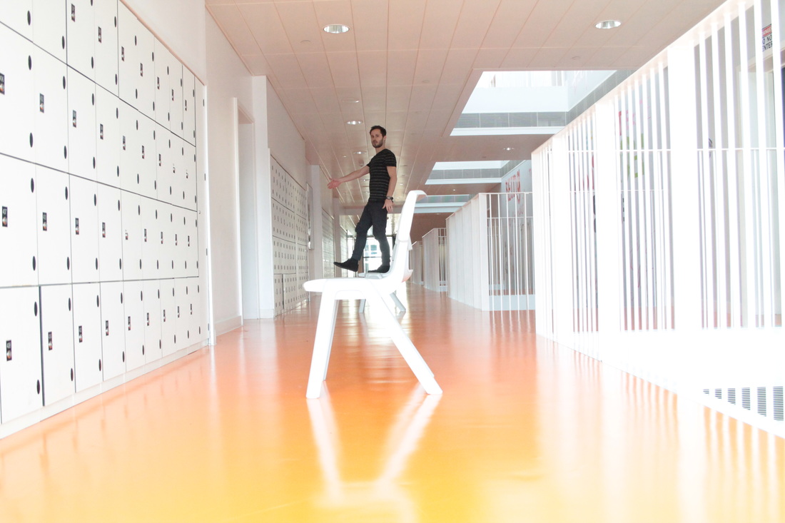
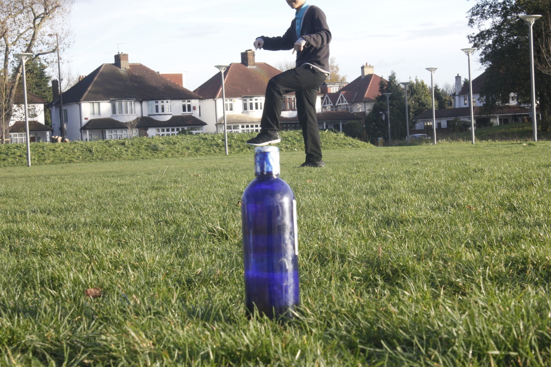
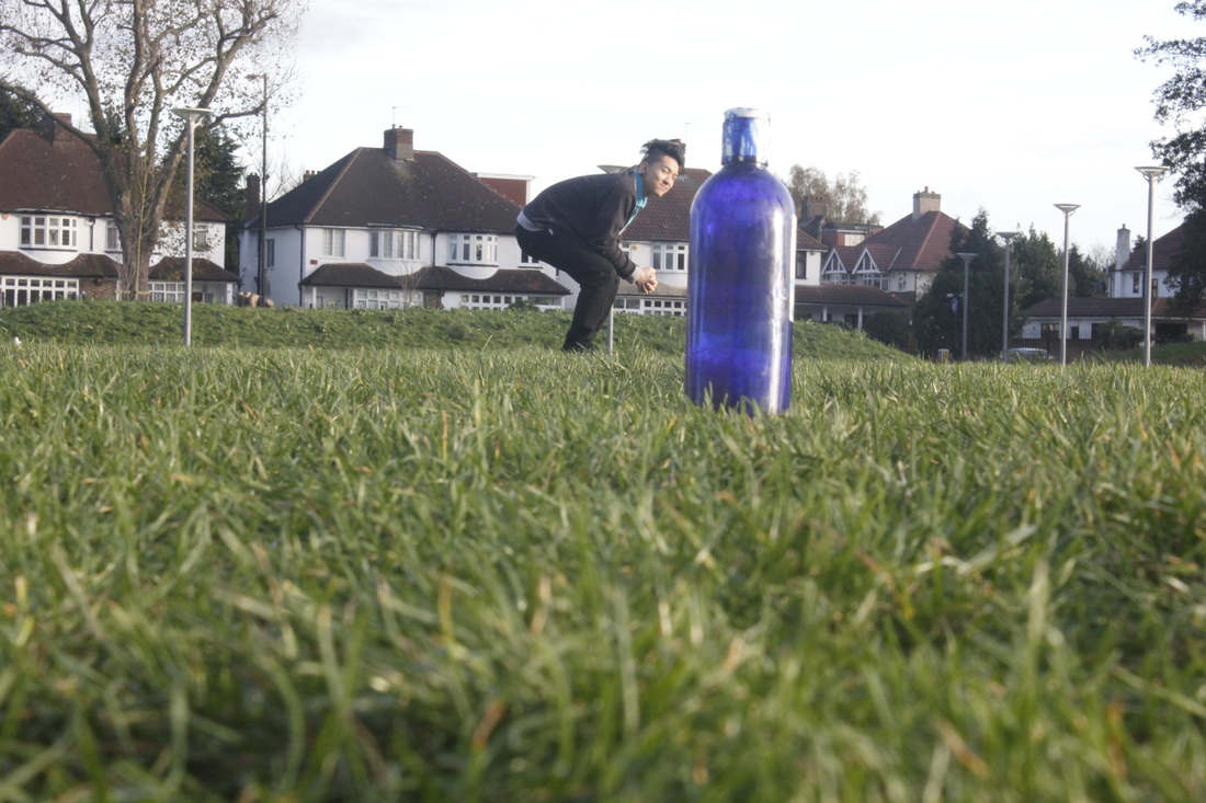
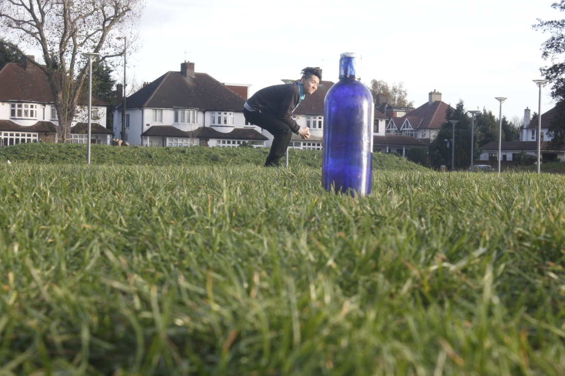
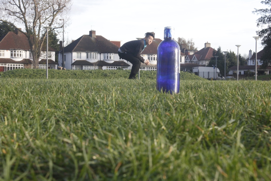
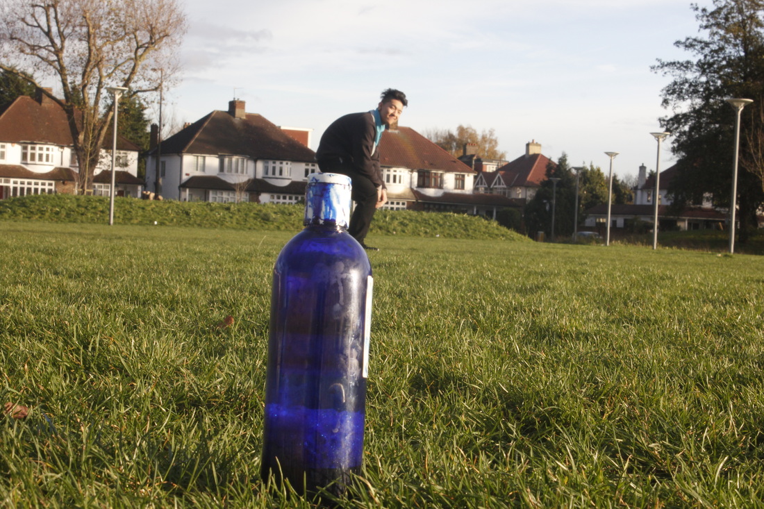
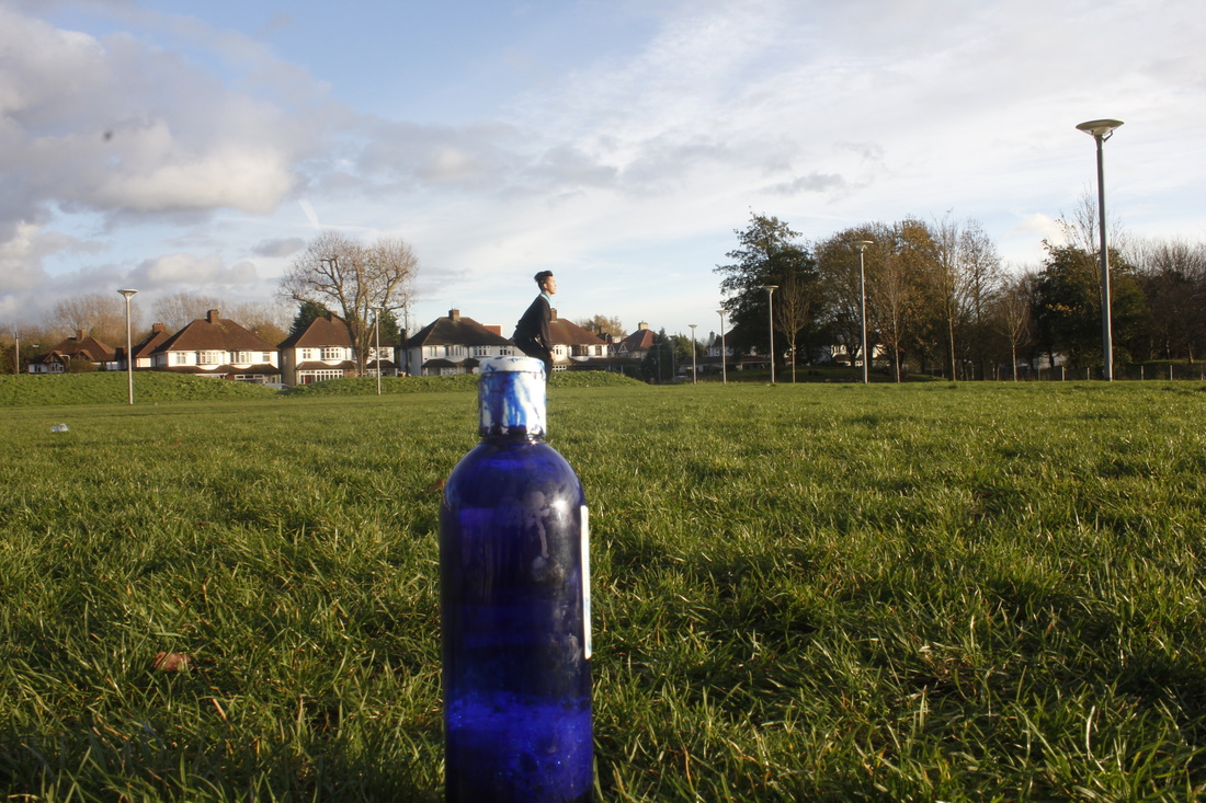
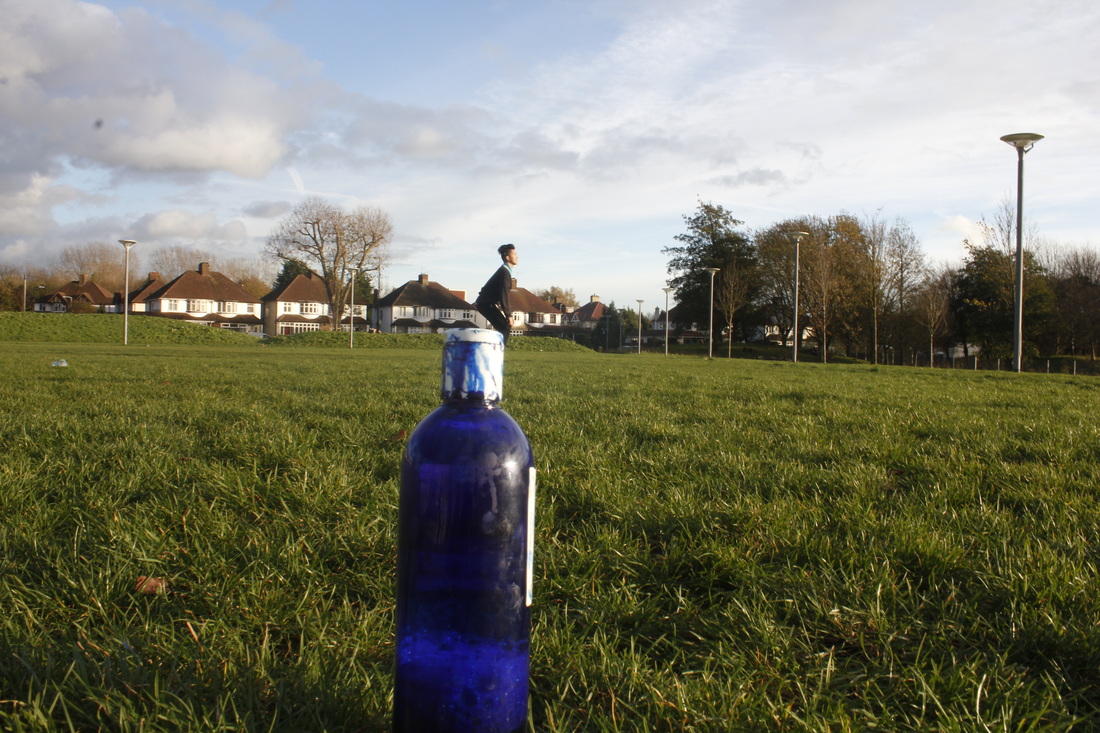
Forced Perspective
Forced perspective is a technique which to make an object appear farther away, closer, larger or smaller than it actually is. It is also human visual perception through the use of scale objects and the correlation between them and we use a spectator or camera.
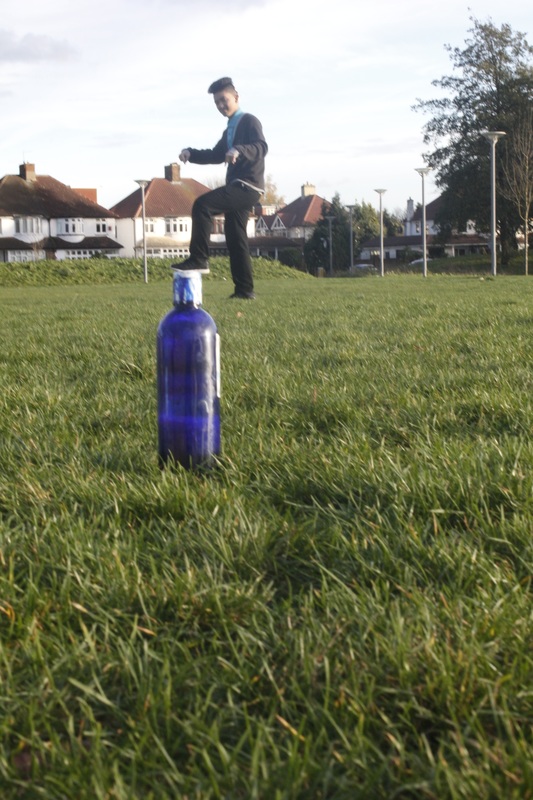
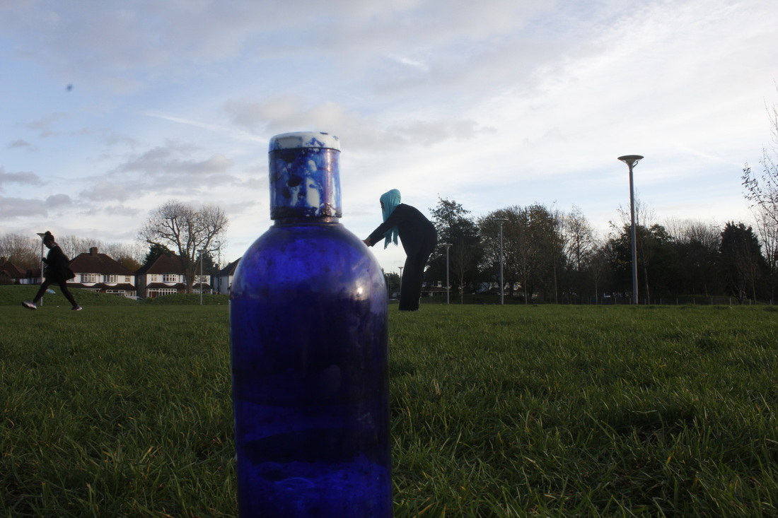
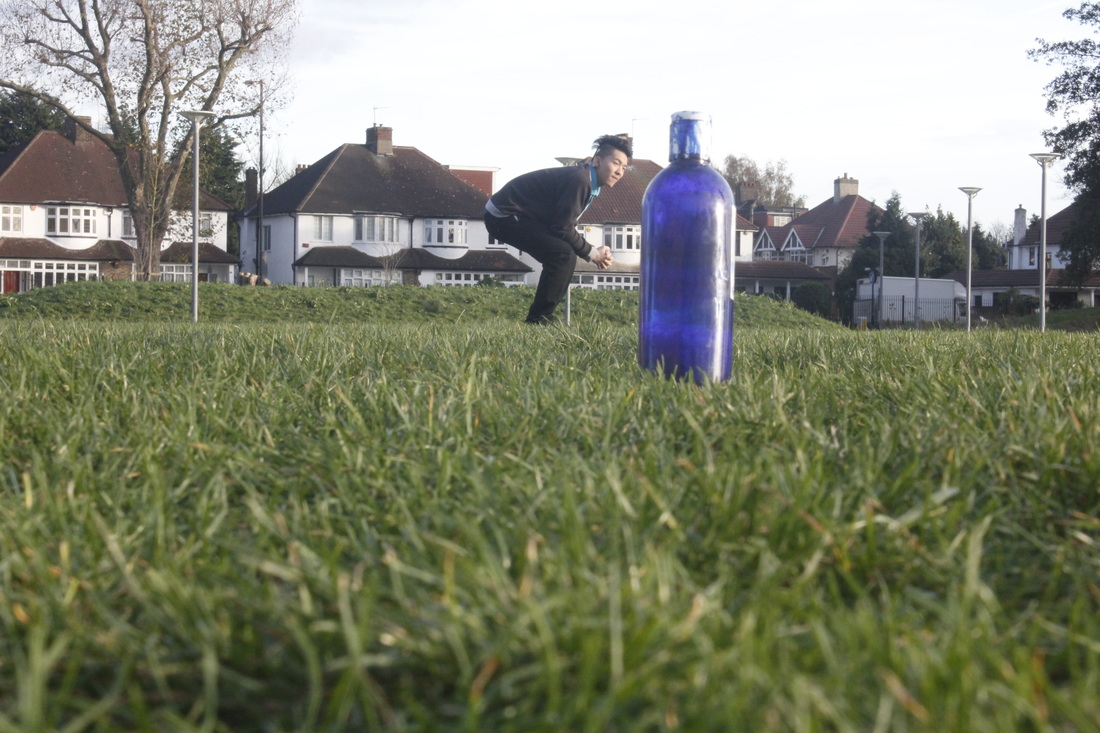
Step to step instruction
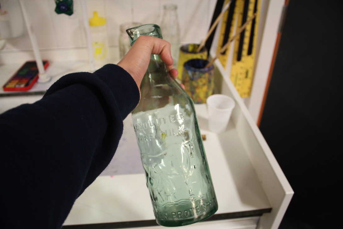
1. Pick any boxes or bottle.
|
2. One person for holding the box (standing on chair) or bottle, one person standing and one person for photographer.
|
3. I had to make sure that I didn't include the person holding the box eg. like the arm.
|
4. While when the picture have interrupt the background like effects the light and the photo looks dark then pick a better background.
|
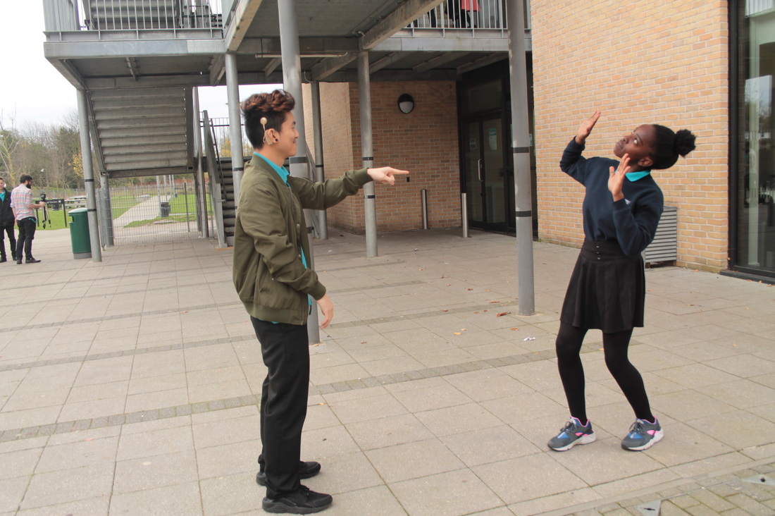
5. Being direction like tell them what to do, body language makes look more forced perspective.
|
6. Take a many photo as you possible.
|
7. See the photo which are not forced perspective, start again and try to polish.
|
8. Goes to different place and take picture.
|
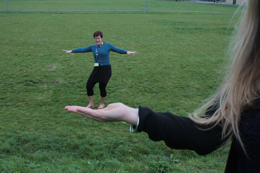
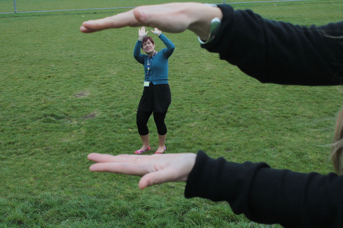
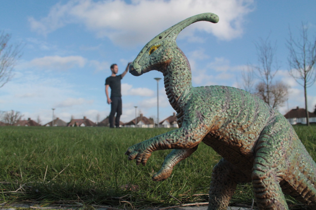
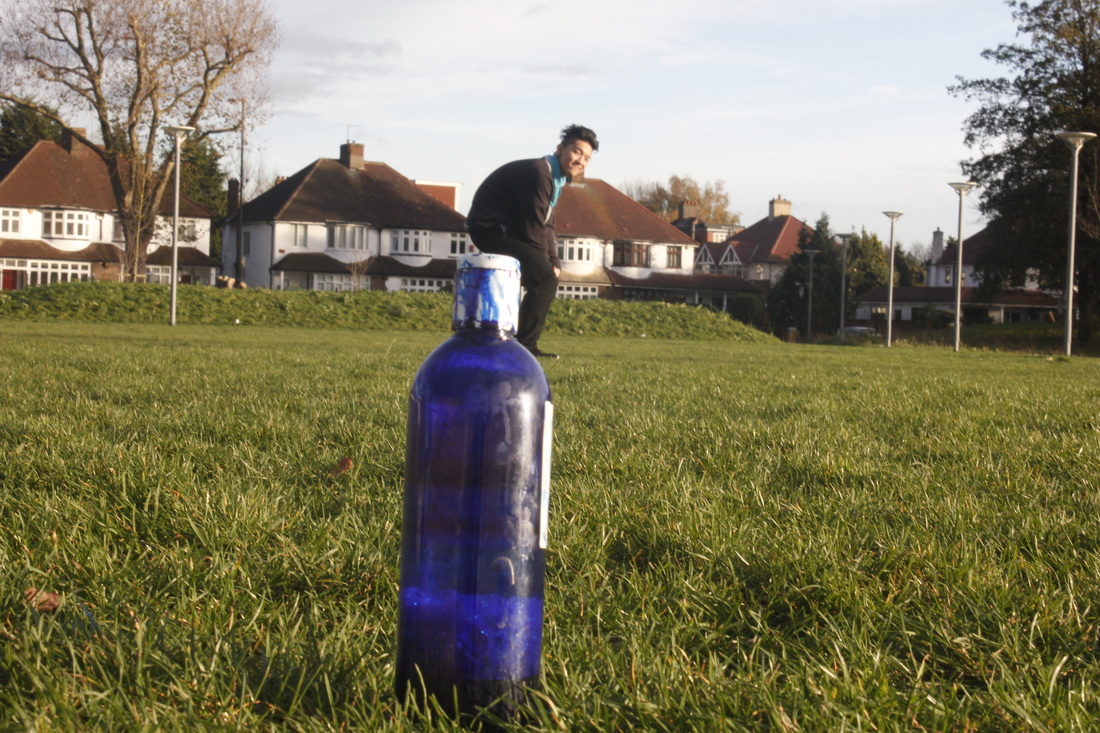
Image 1
WWW:I think I have been so improve from the bad start to end.
|
EBI:At the start of photo wasn't that good because it is my first time to doing forced prospective.
|
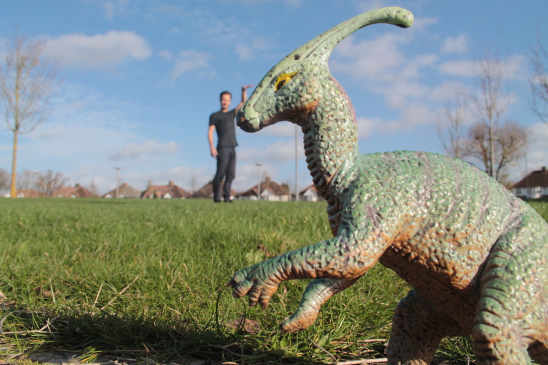
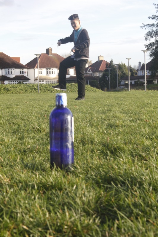
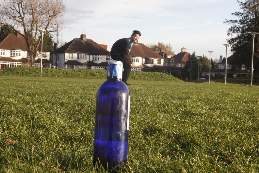
Image 2
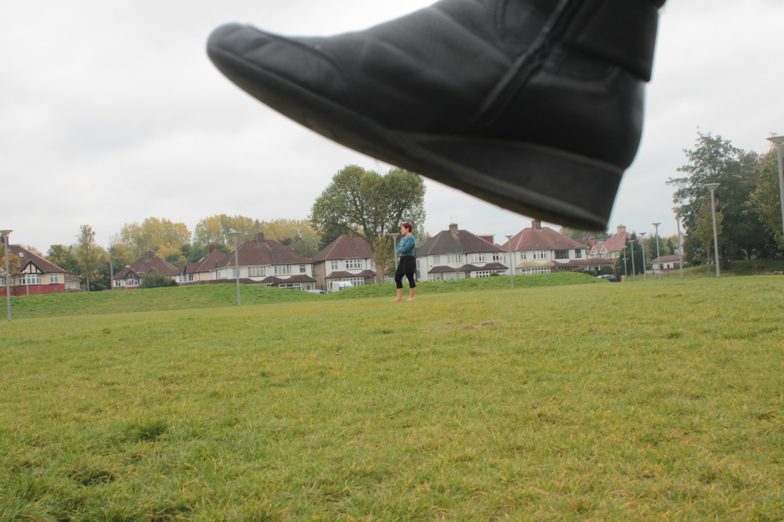
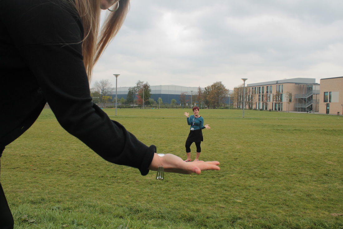
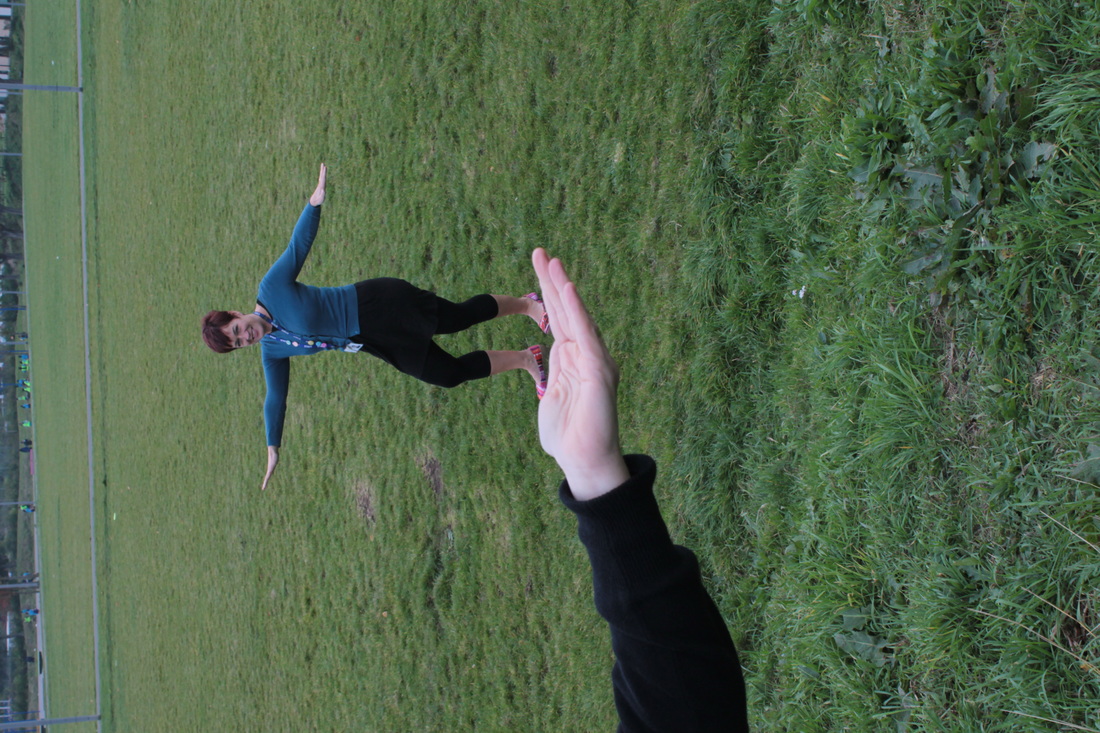
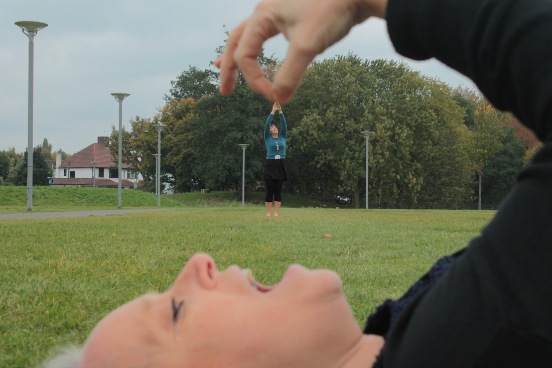
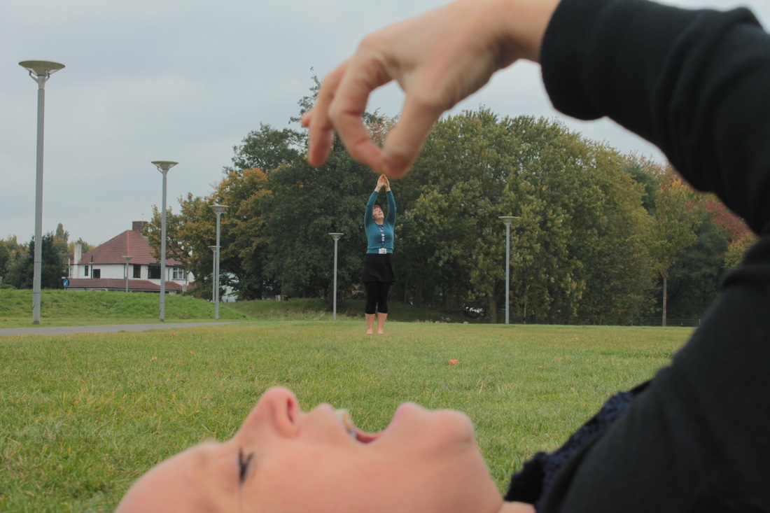
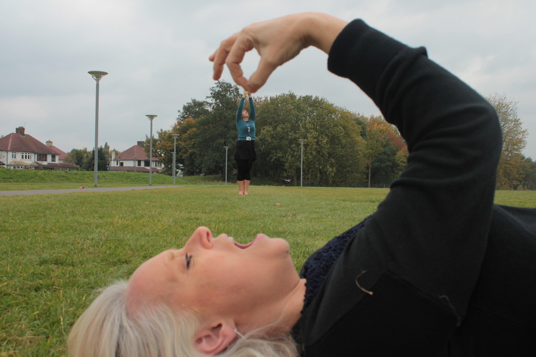
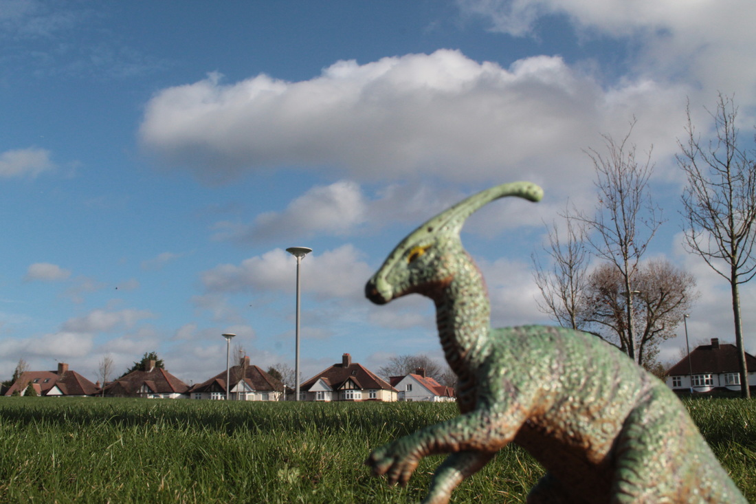
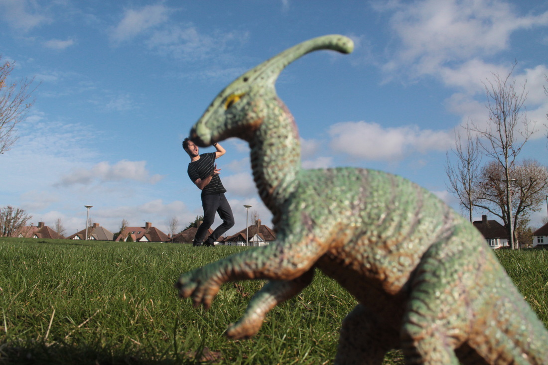
WWW:I do like how feel I am doing so far, I am keeping practice to make right for forced perspective. When I saw the photo from the bad start and I've got been so improve become a better photo. I want to take a picture a ground and try avoid the building, house etc.
|
EBI:At the start are quite not good because it's too small and too far and big foot, it's don't make any right forced perspective. It's quite difficult to take a picture with a person on the grass because normally I do want a person standing on the other person's hand but I can see the feet on the grass, I want to improve stand on the hand and avoid the grass.
|
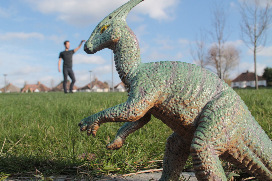
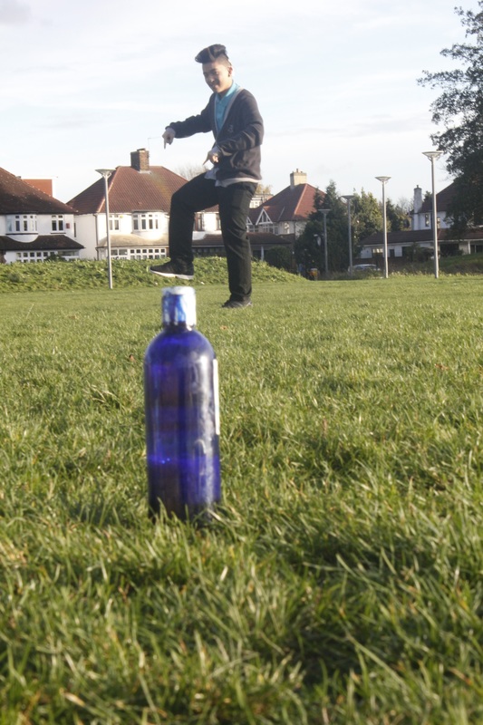
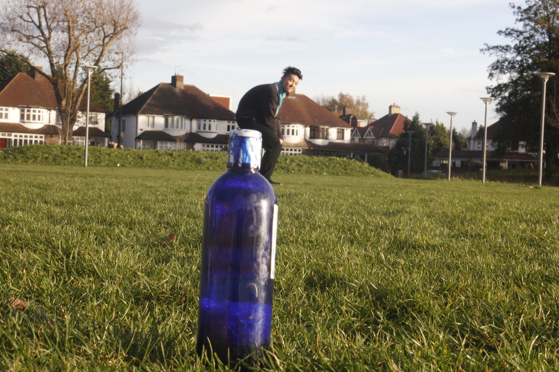
Image 3
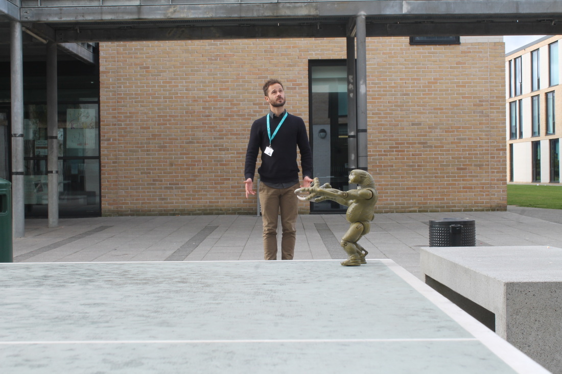
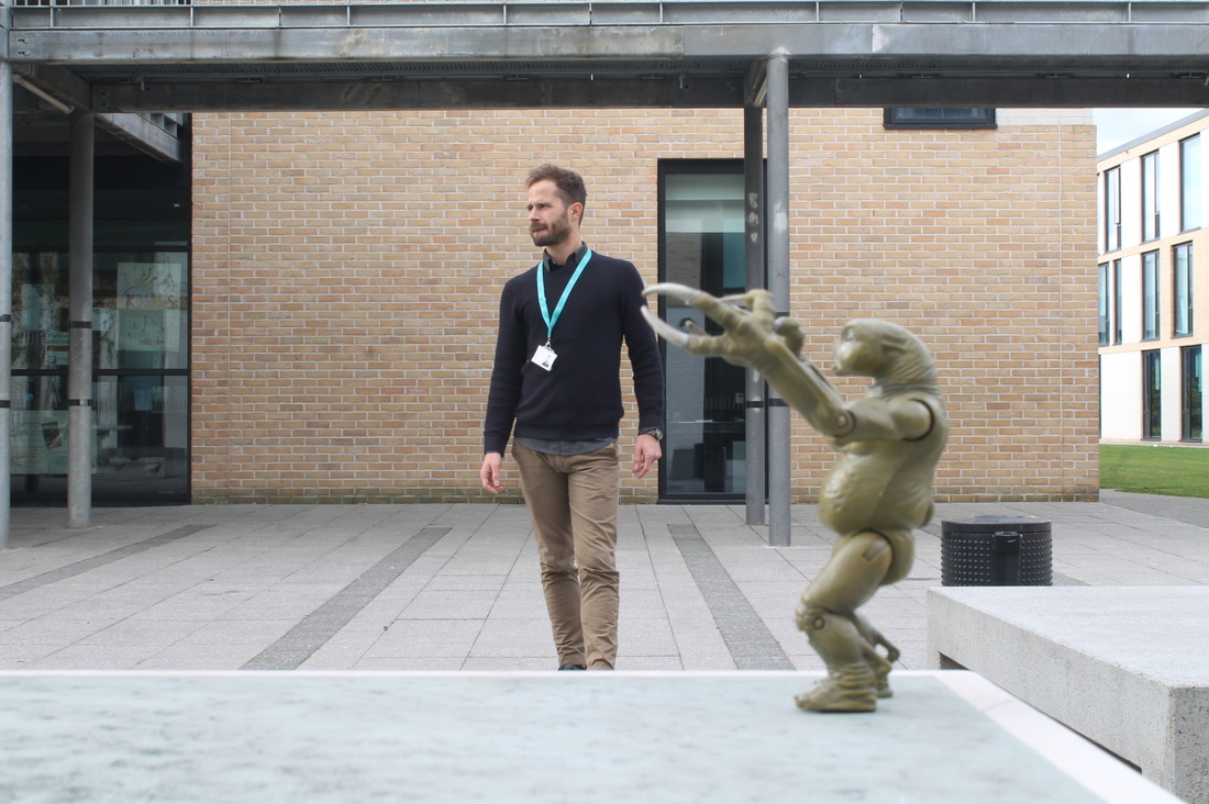
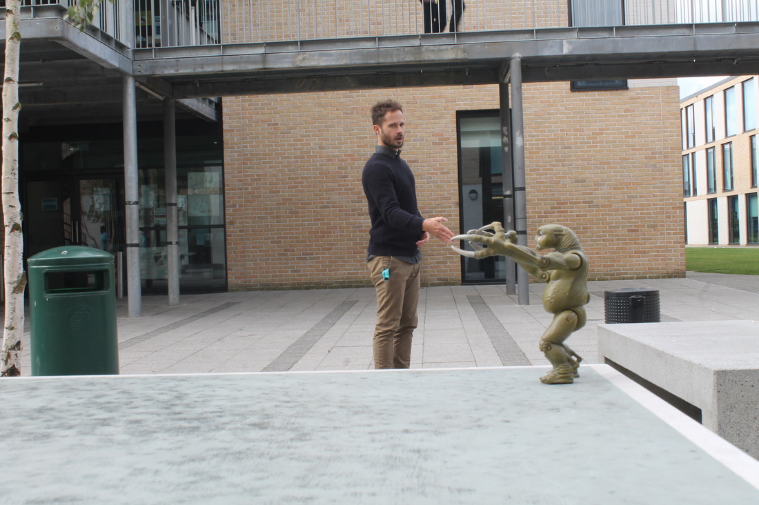
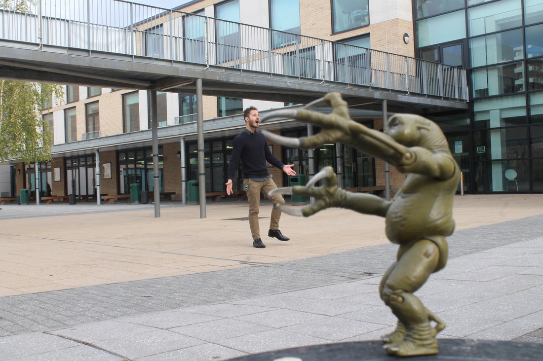
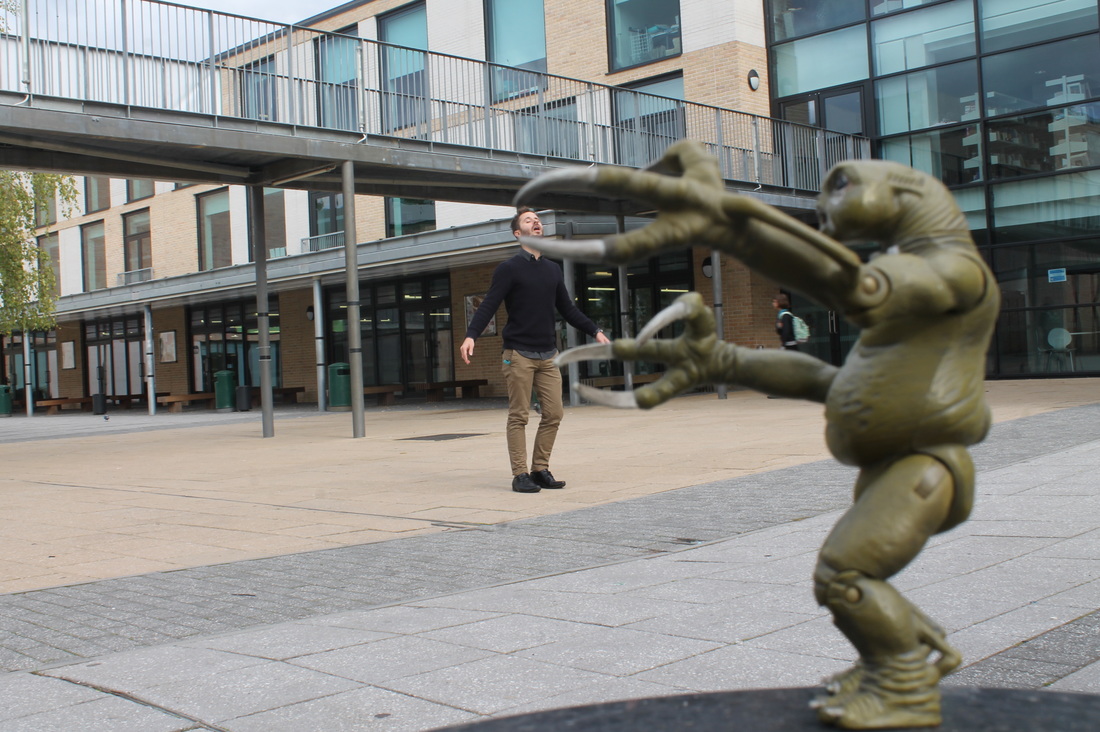
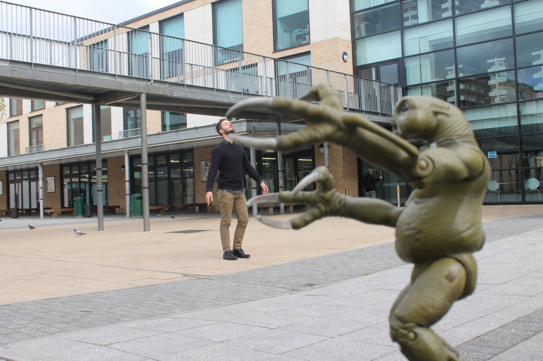
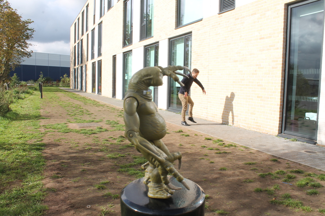
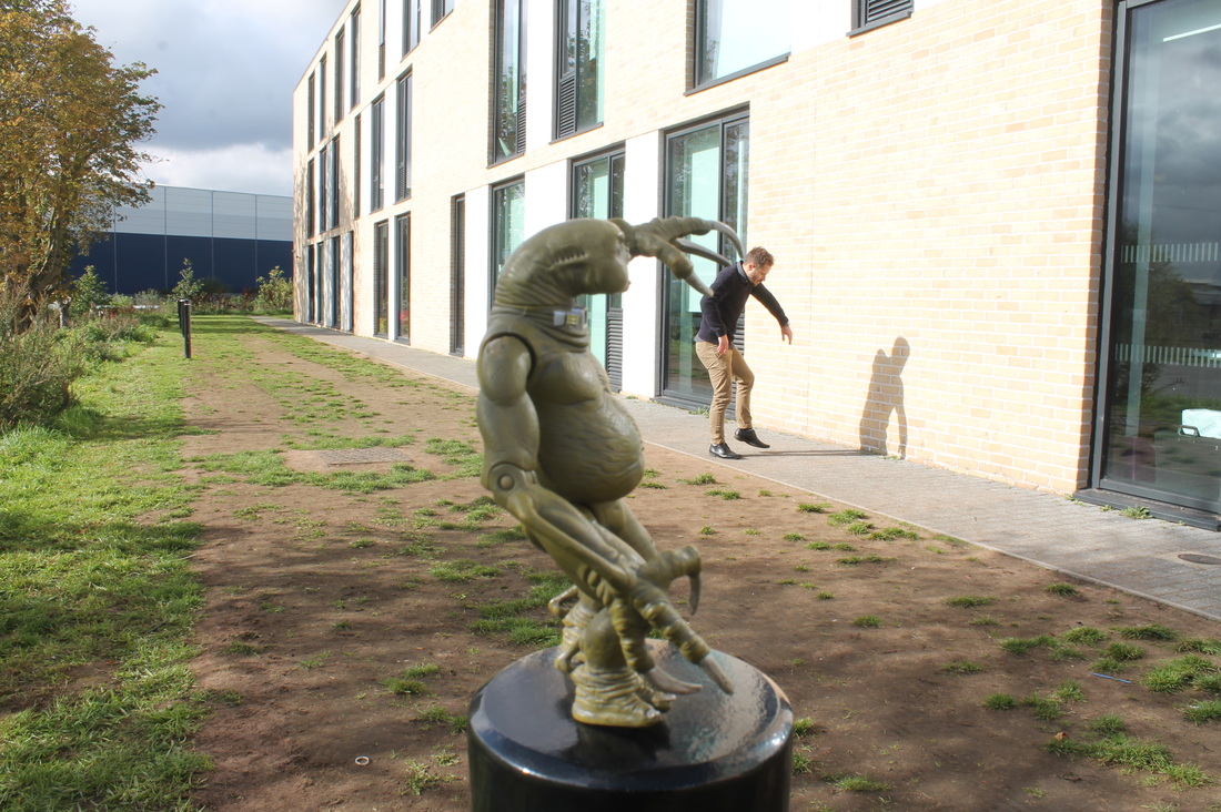
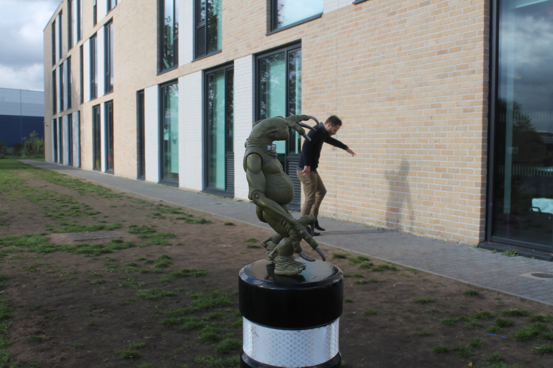
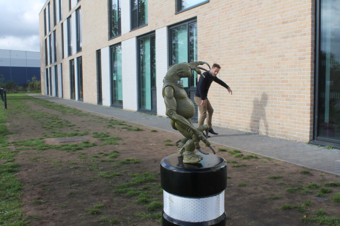
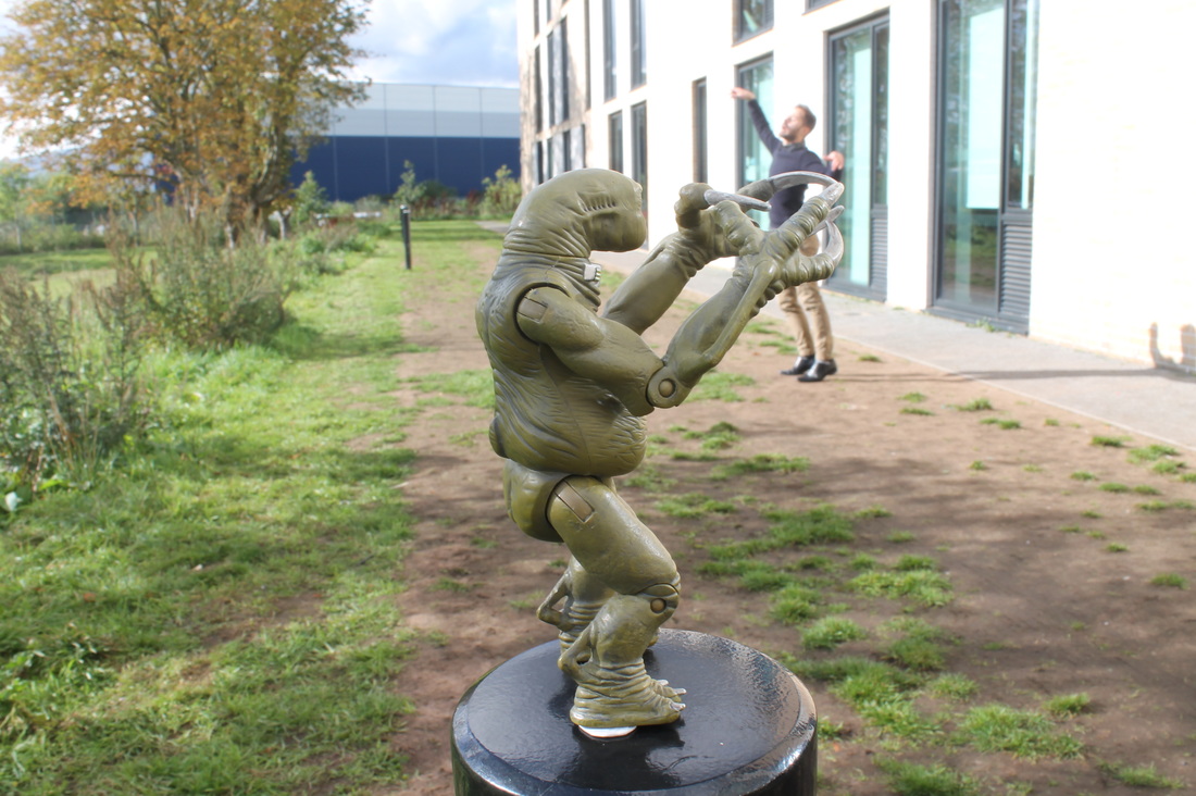
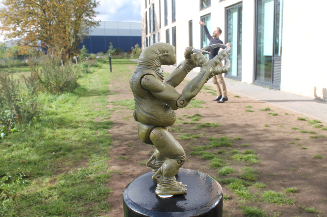
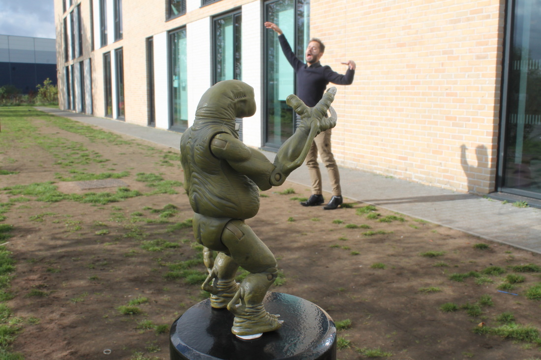
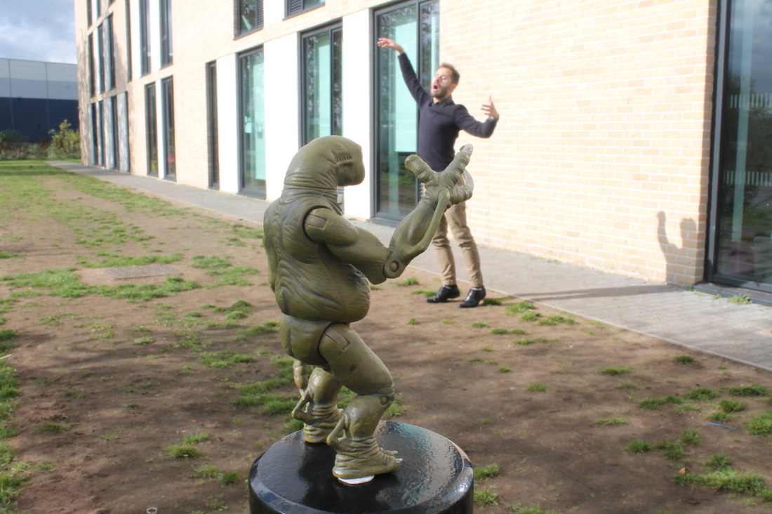
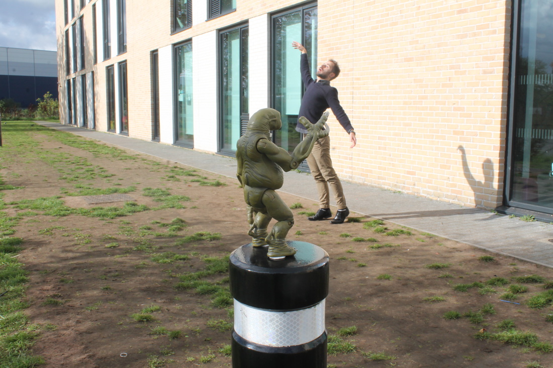
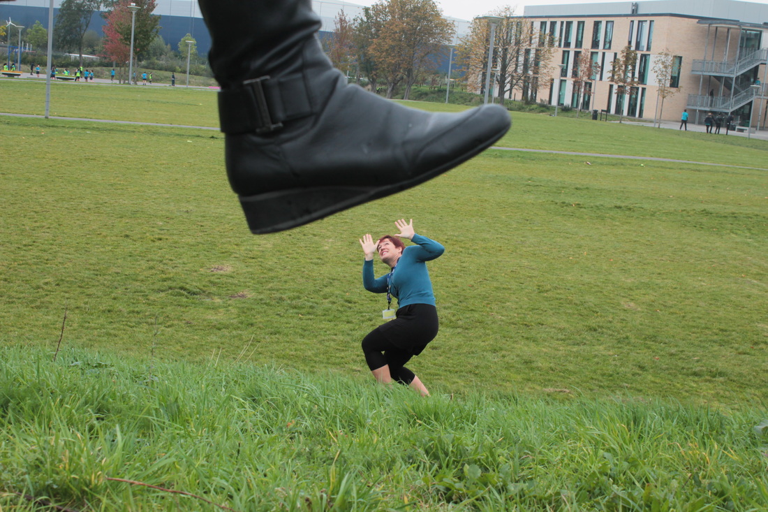
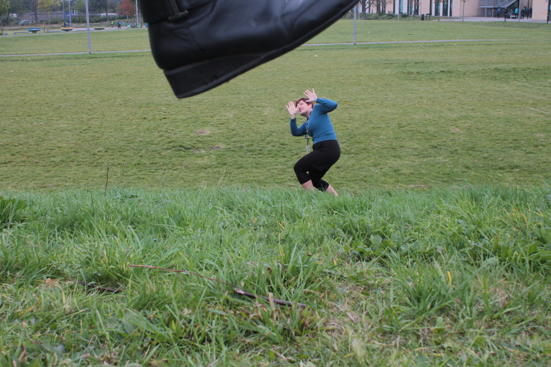
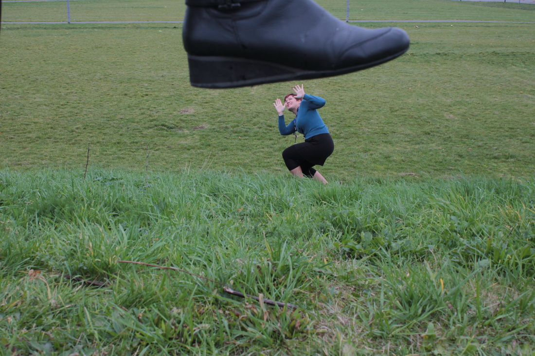
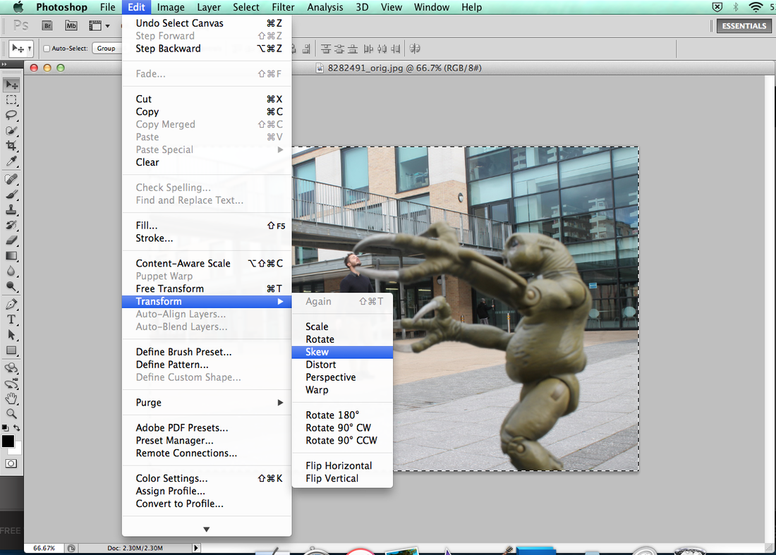
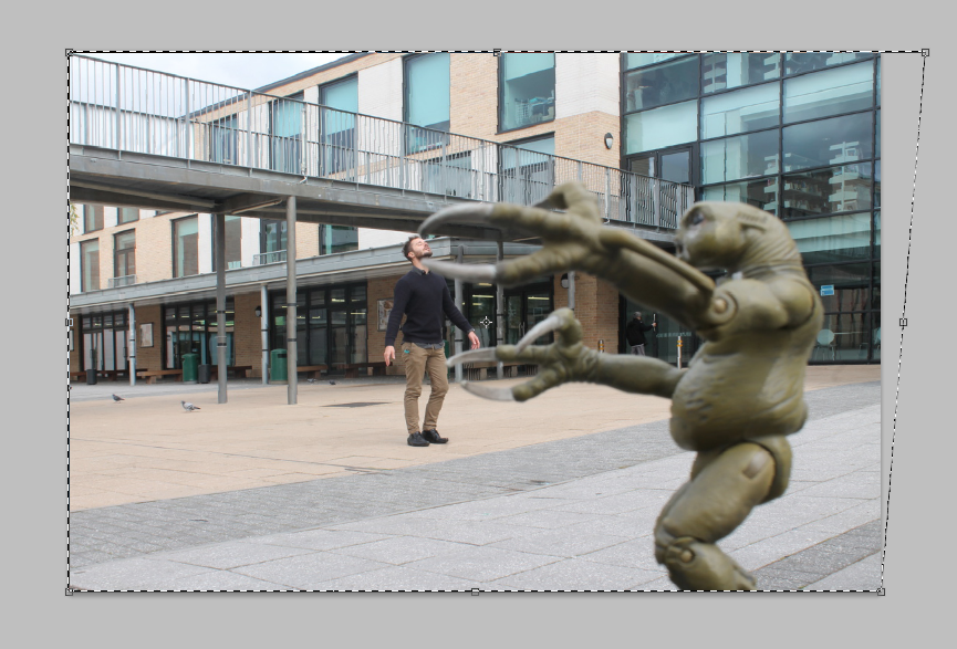
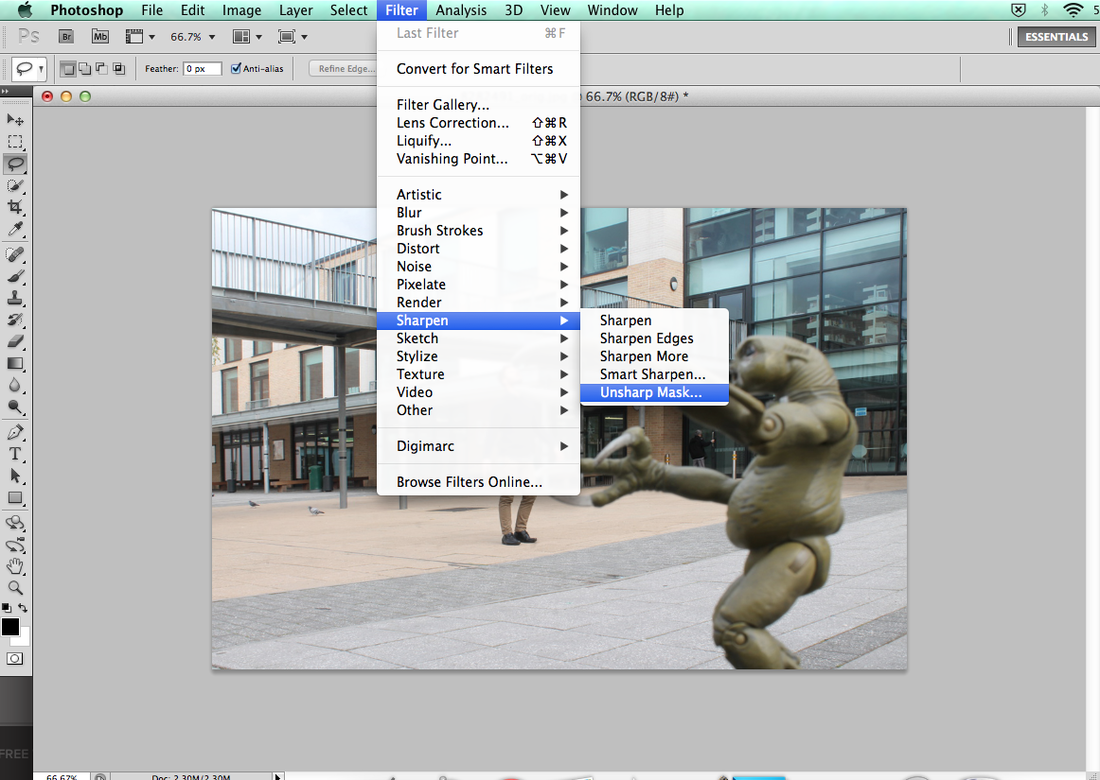
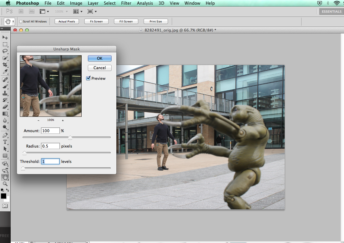
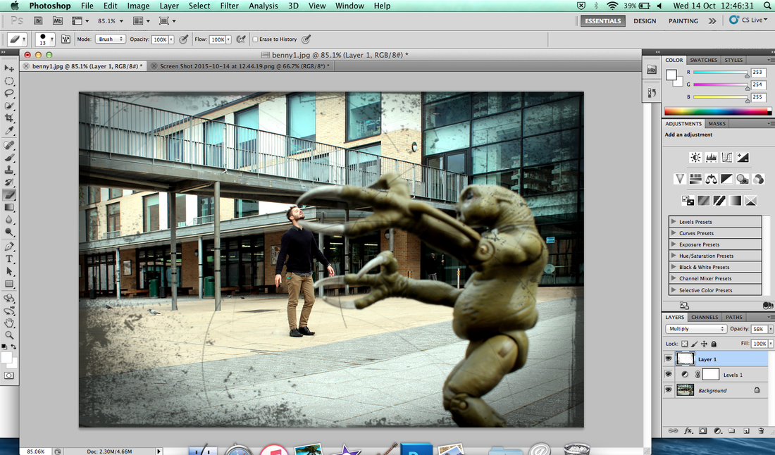
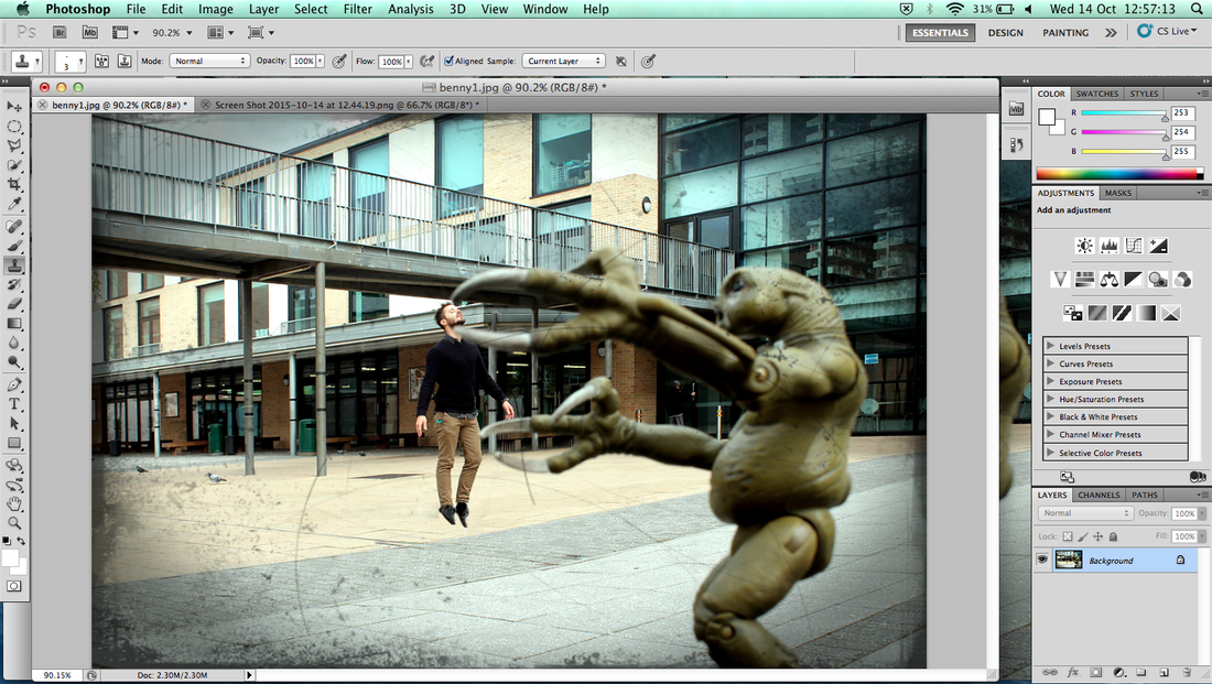
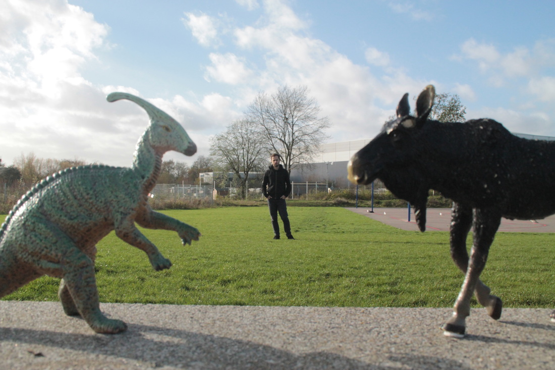
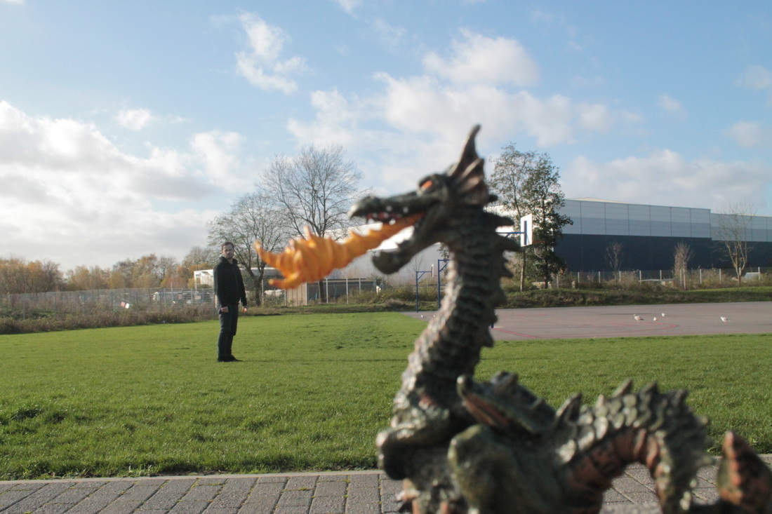
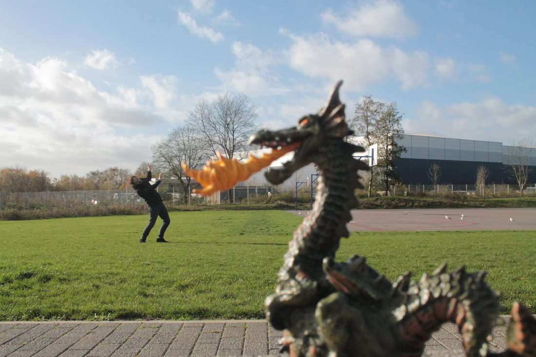
At the first, I want to doing forced perspective with a monster which is picked up the man also grabbing the body. At the first picture row, aren't good because it's hard to shake the hand, touching his shoulder. Also the monster need to be bigger which is make sense to touch from small man.So next time I can to improve a better location because I need whole grass floor which is looked real and standing the lane which mean that photo look not real enough. Sometimes I need to change the camera apps (Like F11, F22 etc) because the photo is mostly too bright photo, all I need to be right light set. Also I need the arrow on zero middle
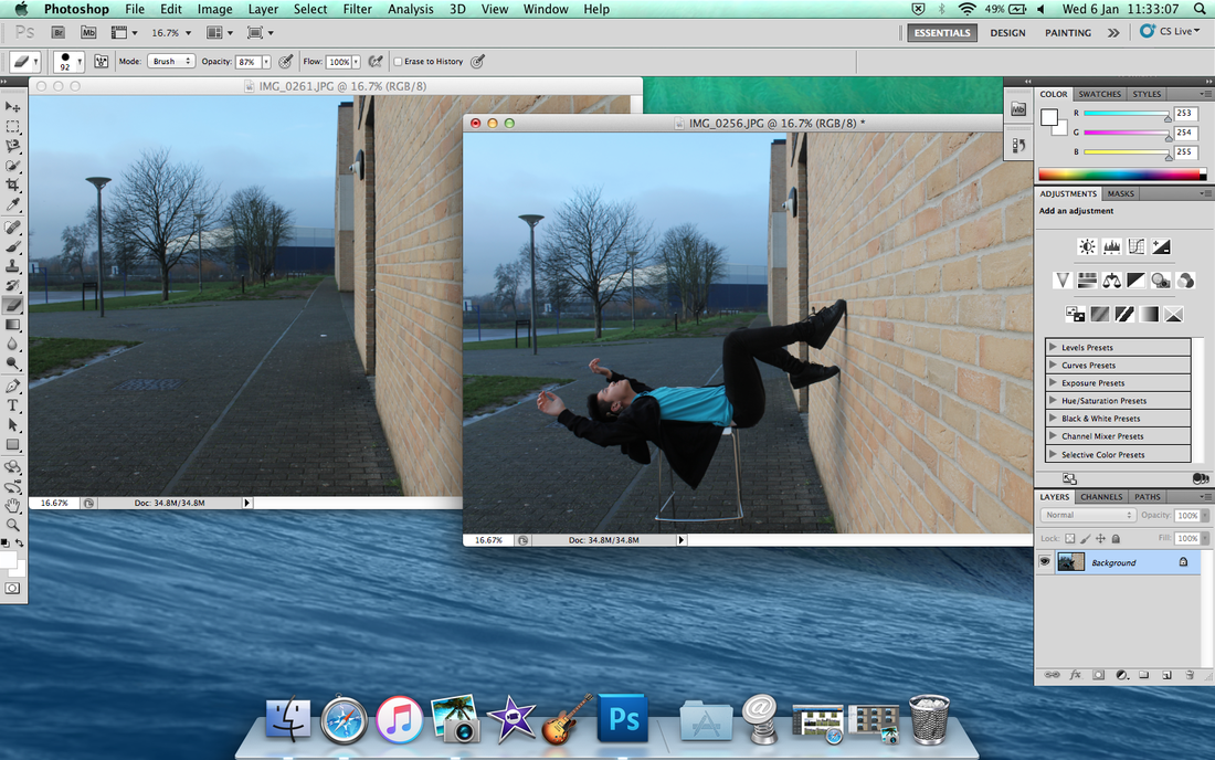
Photoshop

Post it protraits
|
|
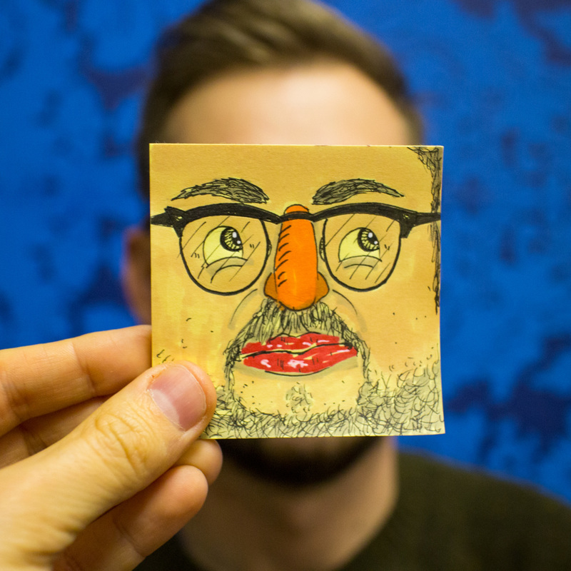
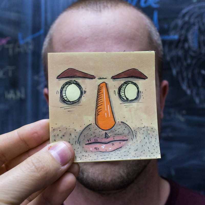
The artist is Erik Rva - StickyHeadz (http://stickyheadz.tumblr.com)
I chosen the photo of 'Post it Portraits' because I like the way of their photography and drawing the sticky note also look match the face of drawing. Watch the video of how to make it.
I chosen the photo of 'Post it Portraits' because I like the way of their photography and drawing the sticky note also look match the face of drawing. Watch the video of how to make it.
Poster Signs
This video is giving me a lot of ideas, it is talking about how to do effects with forced perspective. It shows you how to do it, starting with 2 chairs, 1 close to the camera and 1 far away.
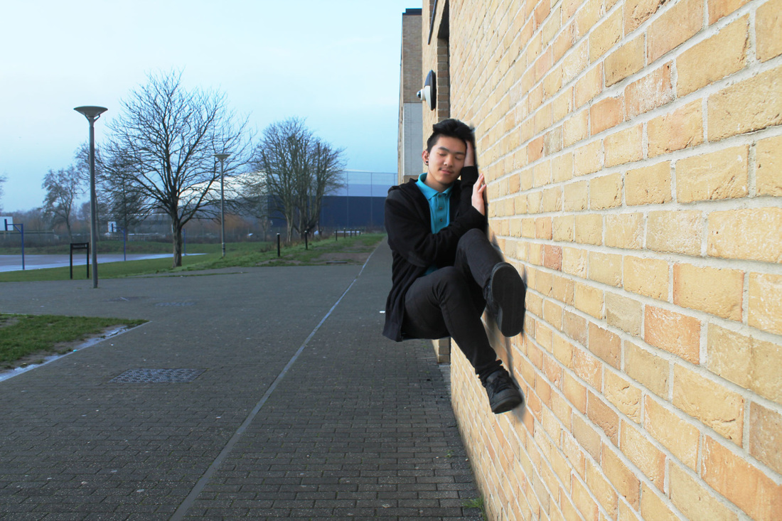
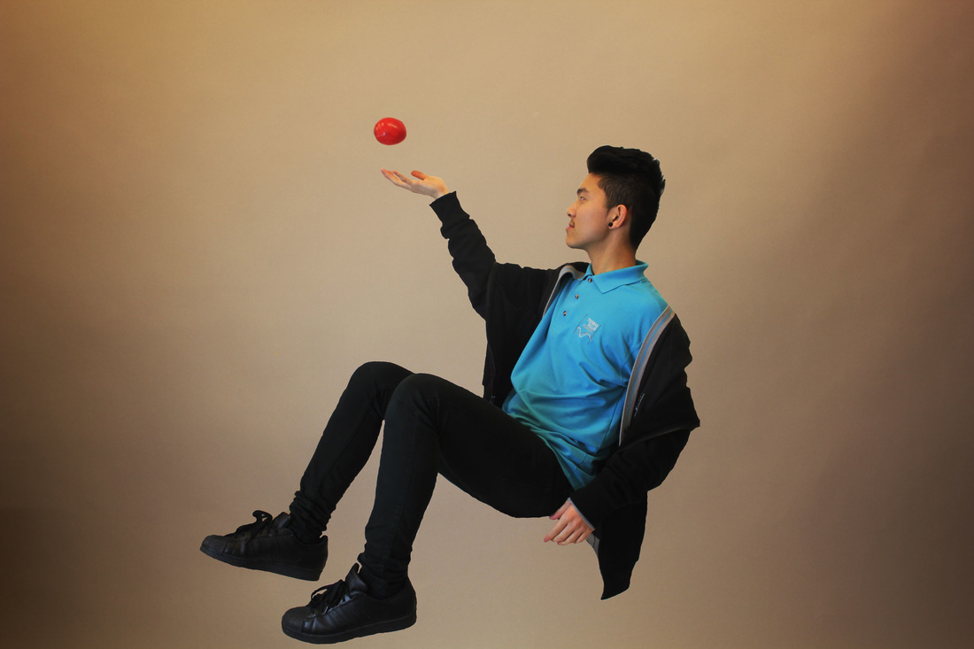
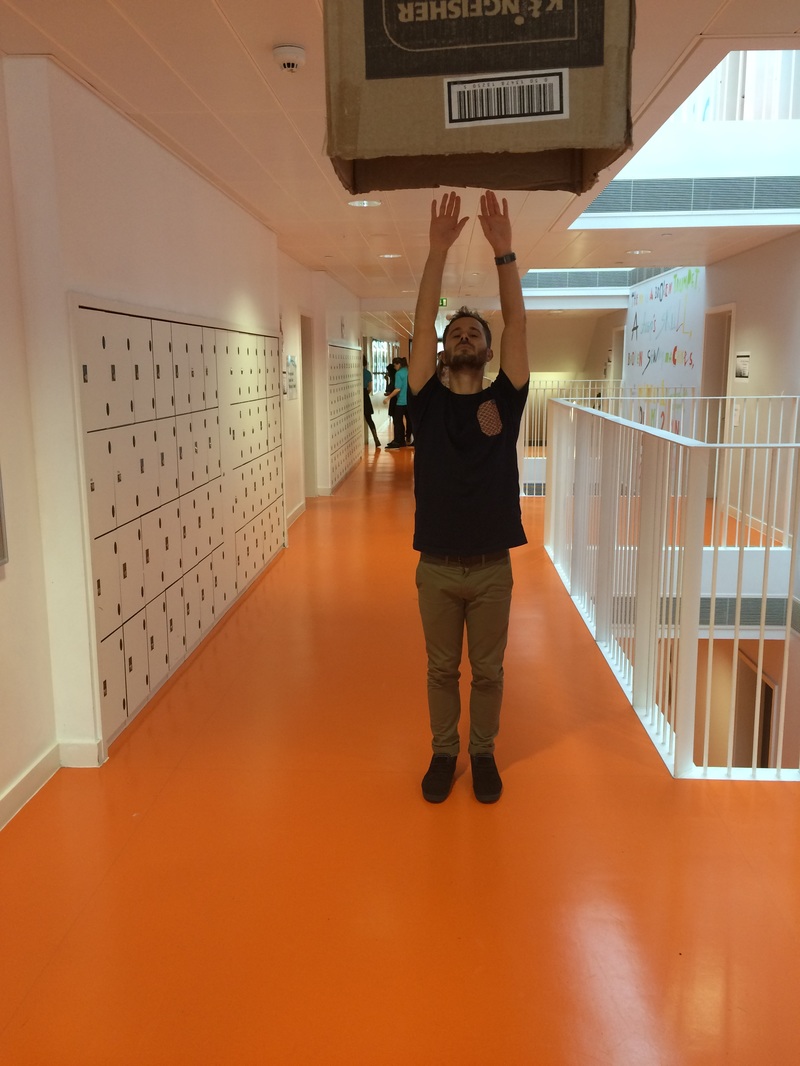
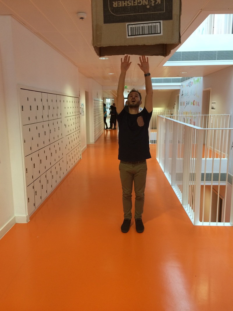
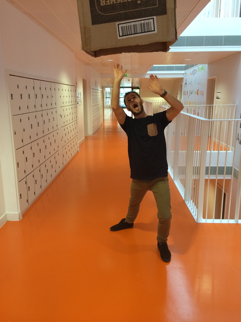
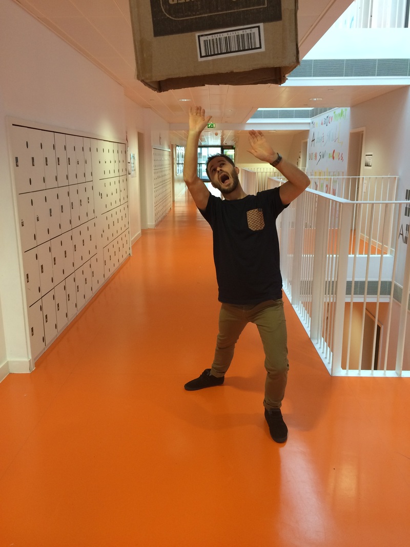
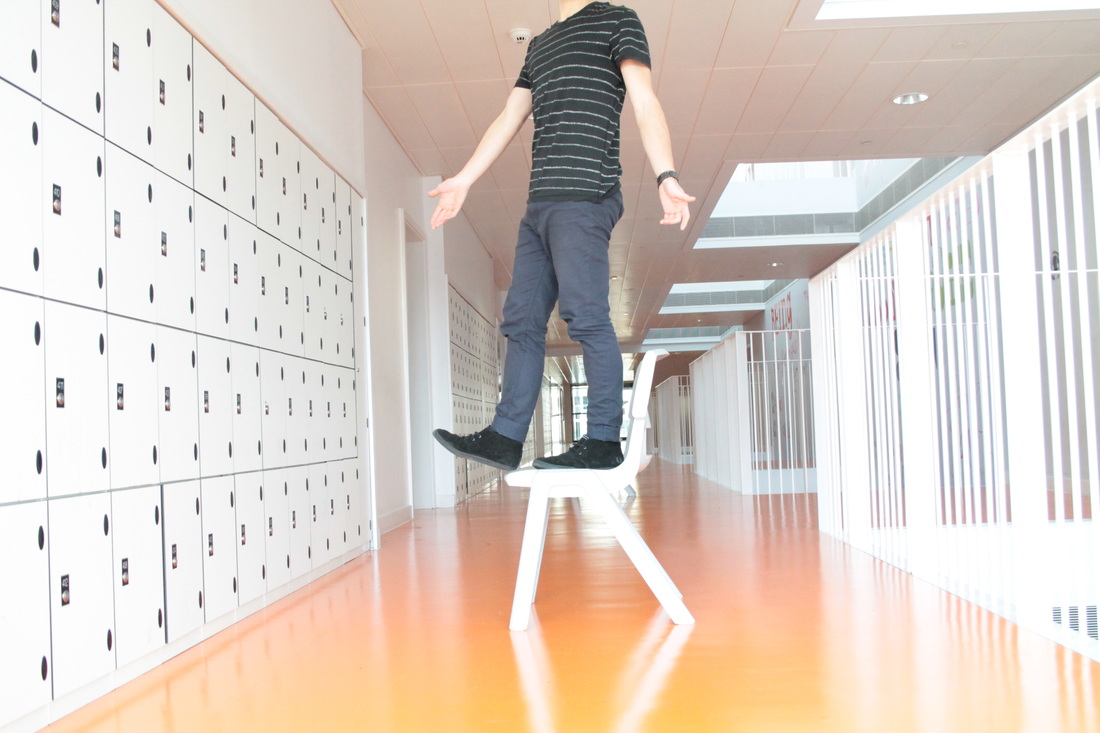
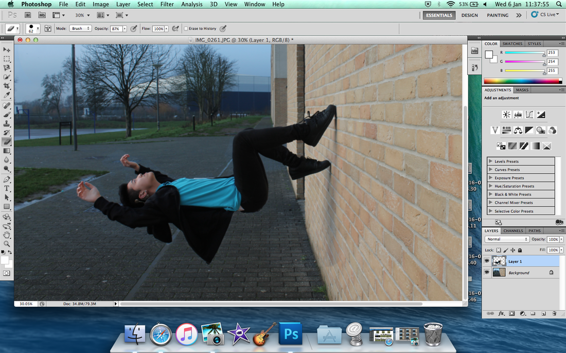
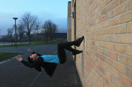
Levitation

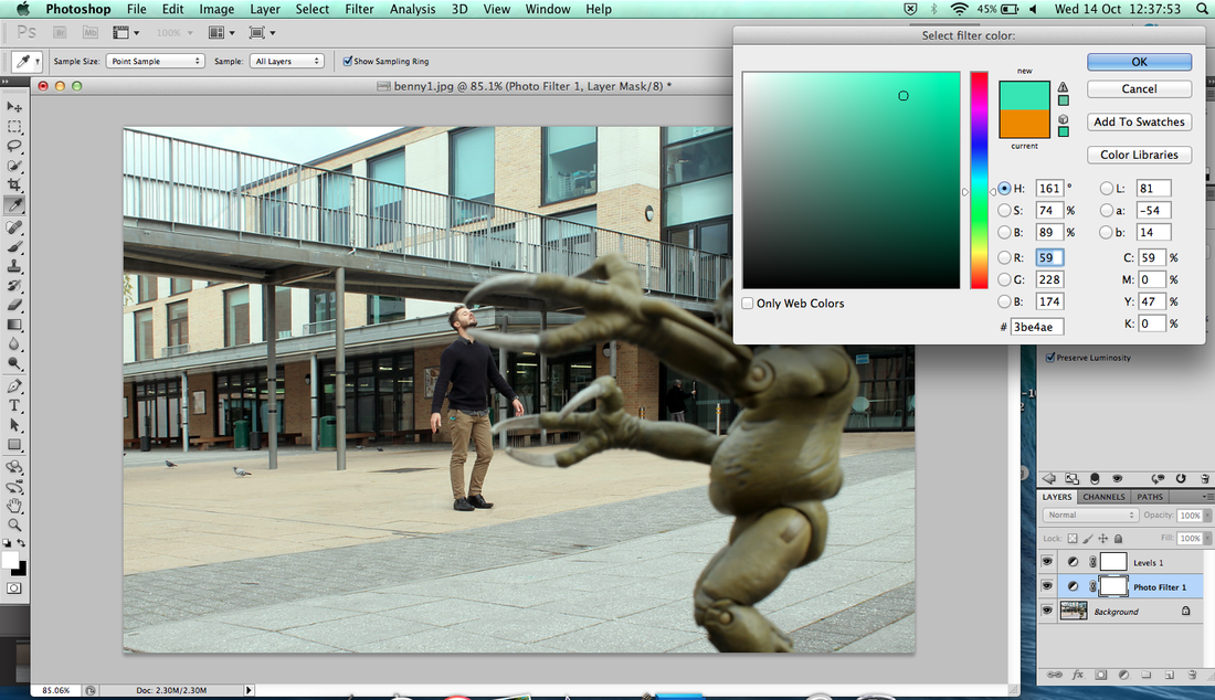
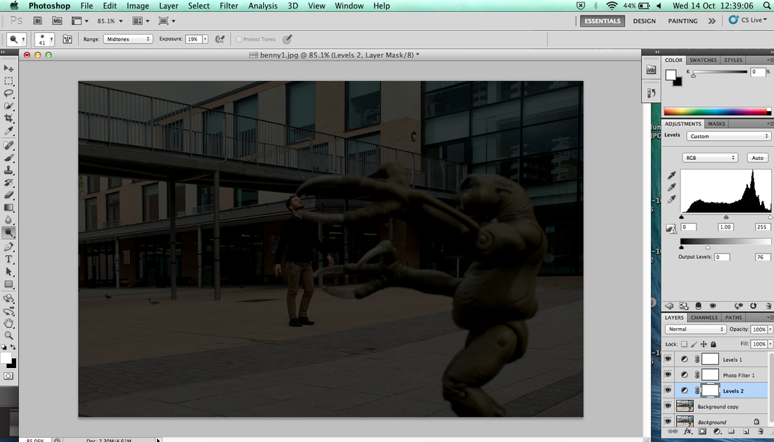
Step by step Photoshop
|
|
|
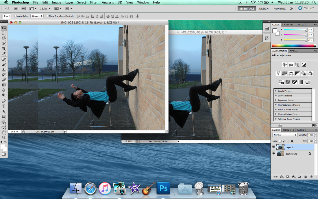
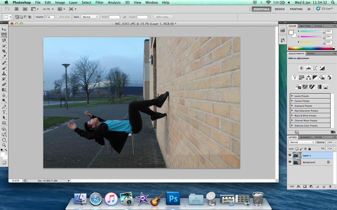
First take a picture of empty background with nobody in there. Then take a picture of yourself. The equipment you need a chair, tripod and camera.
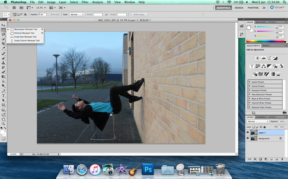
Click the square on the tool and click and hold, it'll pop up and use ' Rectangular Marquee Tool '
|
Move to other image, merged together.

Put toolbar to the chair only and removed it.
|
After that you did removed it and do toolbar the chair leg, make sure edit around the jacket.
|
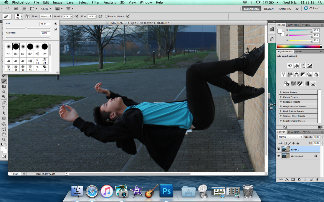
Then click the Rubber tool and click the size of rubber to removed the background.
|
So everything is empty including the chair.
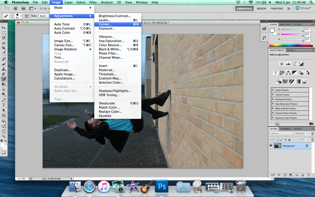
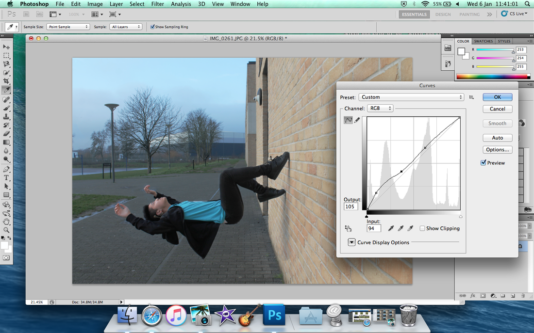
After when you done it, then click 'Image' to 'Adjustments' to 'Curves'.
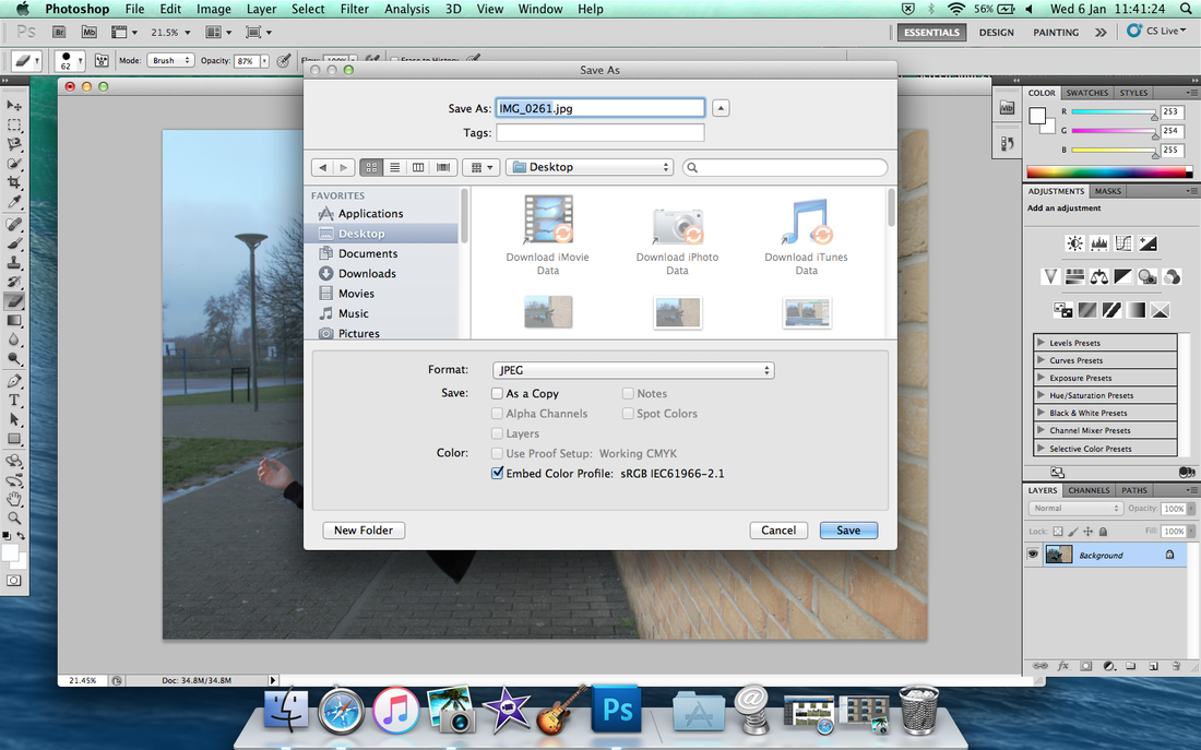
Save as and save in Desktop first.
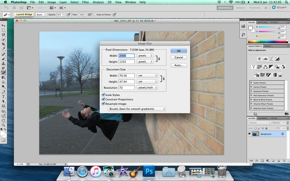
Change the Width number to 2000 then click 'Ok'.
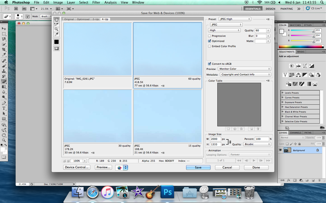
Click (4-Up) then click 'JPEG'
|
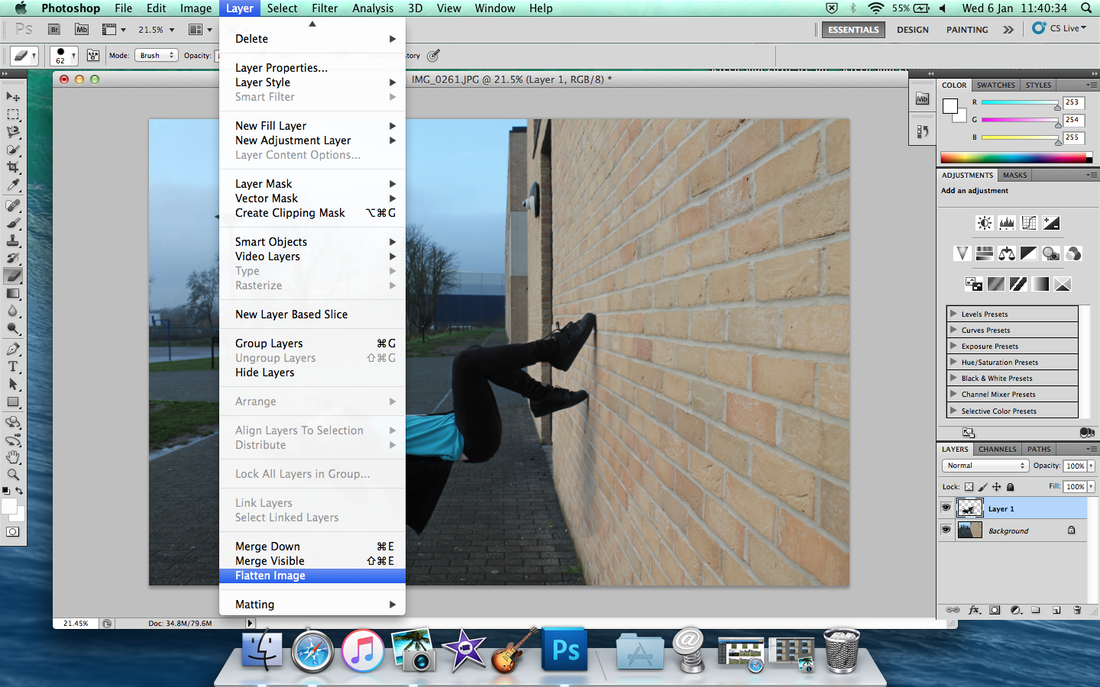
Click 'Layer' to 'Flatten Image'.
Change the colour of background, light or dark up to you.
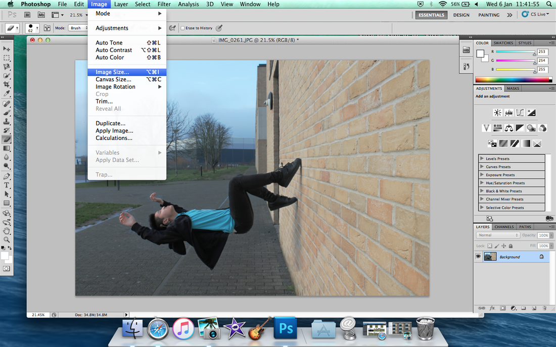
After you save it then click 'Image' to 'Image Size'
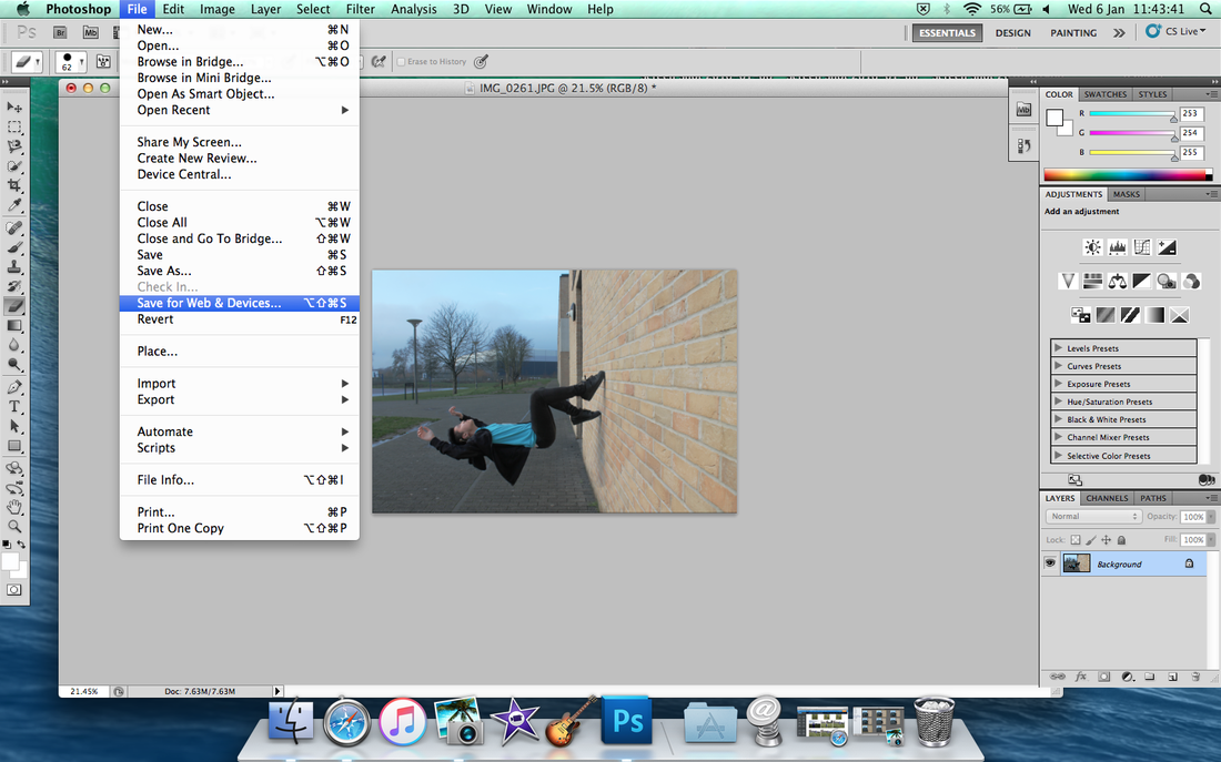
Click 'File' to 'Save for Web' to uploading Weebly only.
Done!! Make sure use Save for Web Image only on Weebly. 'Save As' for print only.
|